SUMMITS, Inc. — Venice Beach, CA
SUMMITS is an AI-powered nutrition fulfillment startup building what they call the operating system for AI nutrition. The engagement began narrowly — brand triage on a logo element carrying real reputational risk — and grew into a six-month, end-to-end effort: full brand system and investor pitch deck, as the platform underwent a major strategic pivot mid-development and its fundraising timeline accelerated. Brand decisions informed deck decisions; deck work fed back into the brand. That feedback loop is the real story of this project.
Follow, then lead. Much of this project meant working inside a founder’s still-forming vision — SUMMITS’ CEO carried context that existed nowhere else, so the approach was to follow his lead and probe for boundaries before offering direction, then propose and defend it once the intent was clear. The CMO joined later for creative and messaging sign-off. Every direction was presented with the reasoning behind it, not just the result.
Client:

SUMMITS, Inc. — Venice Beach, CA
Industry
AI-powered nutrition fulfillment startup
Timeline:
Fall 2024 – Summer 2025
Role:
Sole designer — brand strategy, logo, color + type system, pitch deck, AI generation, compositing
Tools:
Figma, Adobe Illustrator, Adobe Photoshop, Midjourney
Live URL:

Act 1

Brand Foundation

The project started with a specific problem: an existing logo concept with unintended associations needed to be addressed before any broader brand work could begin. The challenge of creating a new logo design framed the early part of my work on this project and allowed me to dive deep into the ethos of the brand; core research that would prove helpful when the project scope shifted a few month in.

Process Step 1

Acknowledging A Strong Foundation

The client liked the existing mark for being simple and memorable, but it carried a reputational risk that ruled out keeping it as-is. That strength became the bar any new mark had to clear as a baseline for success. Initial research focused on better understanding the brand ethos and framing my approach with this challenge in mind.
The existing logo mark I received from the SUMMITS team. An early mood board based on the target persona.

Key Decision

This is a benchmark, not a problem to solve.

The Tension

The existing mark had traits that made it appealing visually but it carried reputational risk that could not be ignored. Striking a balance between what was working and what wasn’t was the primary challenge going into this project.

The Choice

I acknowledged the simplicity and memorability of the existing mark and used it as a bar to clear for any new logo concepts. Building on a workable foundation, I was able to make more informed design decisions while trying new ideas.

The Outcome

The exploration phase had a concrete bar to clear instead of an open brief, which brought immediate clarity to the task at hand. Having project constraints and a goal in mind made every concept I tried all the more focused.

Process Step 2

Building on strengths, refining for brand vision

Early concepts pressure tested an obvious starting point: abstracted variations of the mountain motif. Client feedback pushed the next round towards bolder, more geometric concepts, chasing a balance of synthetic and organic that the mark hadn’t found yet. Continued iteration of these refined ideas ultimately resulted in a single concept that began to scratch the surface of the SUMMITS aesthetic and could carry us into further brand exploration.
Sketch-to-vector development — hand-drawn thumbnails and their digital translations.

Pivot Point

The Timeline Changed. So Did the Priority.

Mid-project, SUMMITS’ platform took a major strategic turn and the fundraising clock started moving faster. The logo took a back seat — the deck became the thing that mattered next.

Key Decision

Keeping the "final" logo in a state of limbo.

The Tension

The logo had narrowed into a workable concept, solid enough to carry into production. Locking it in as final would have simplified a time-sensitive deck build, but finalizing it before the brand’s newly expanded vision was understood risked building on the wrong foundation.

The Choice

Kept the mark at “workable, not final” rather than forcing a premature lock-in — usable enough to move production forward, open enough to be shaped by everything still ahead in the deck and imagery work.

The Outcome

The project carried a consistent, usable logo through the deck and imagery work that followed, while the final version stayed free to be shaped by what was learned along the way — avoiding both a stalled production and a decision locked in too early.

Act 2

Pitch Deck as Brand Engine

The pitch deck wasn’t a separate deliverable that happened after the brand was finished. It was the engine that drove the brand forward — revealing what the brand actually needed to communicate under pressure, to investors, in a room, with limited time. The most significant brand decision of the entire project happened mid-deck, not during the identity phase.

Process Step 3

Not Ready for Color

With the deck now the priority, work started from scratch on structure — bare layout, minimal color, just enough to dial in formatting and content before turning to style. Content itself was still fluid at this stage, changing meeting to meeting, and keeping the deck unstyled kept the focus on getting structure and the balance of visual and text right first — a practice carried over from most projects, not something specific to this one.
Wireframe scaffolding — neutral black and white to isolate narrative structure from visual treatment.

Process Step 4

The Colors Came Back Into Question

With structure approved, focus shifted back to color — and the deck’s existing palette no longer fit what the brand needed to communicate. The client encouraged exploring new directions, and a more modern, dynamic palette was developed and applied to the work in progress.
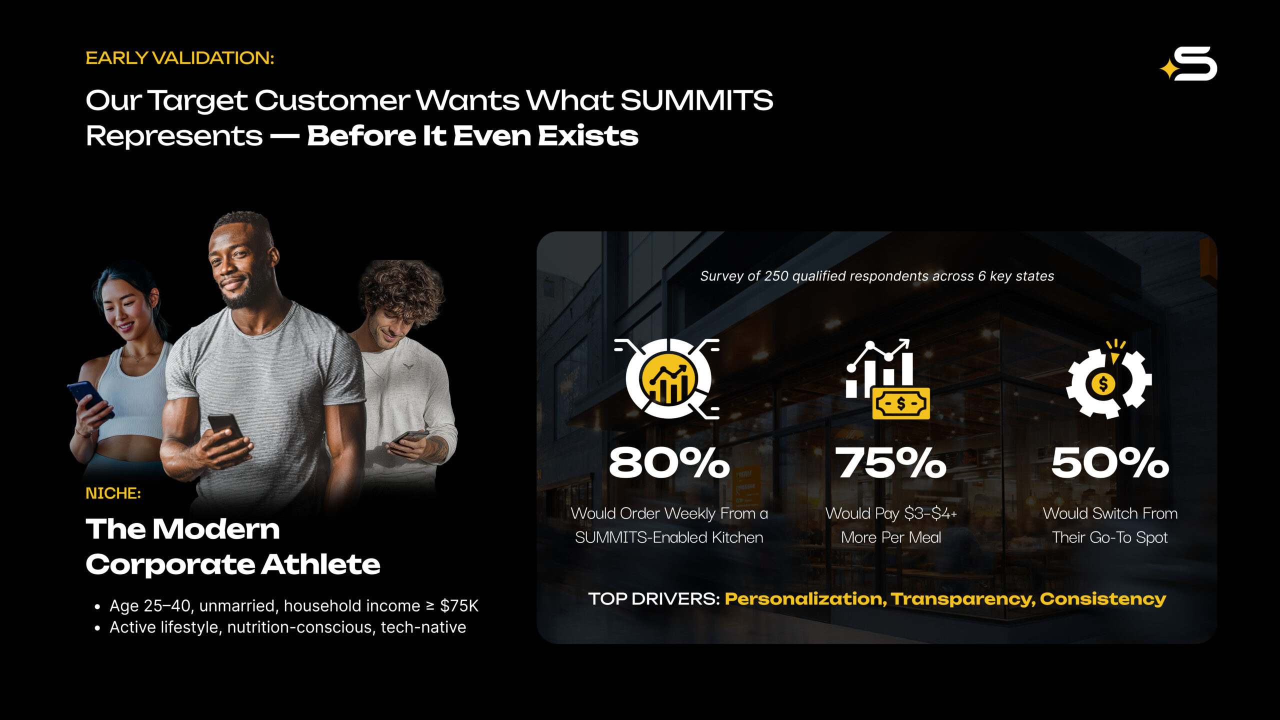
Before & After views of the “Early Validation” slide with new brand colors applied.

Key Decision

Let fresh colors inspire new Logo Ideas.

The Tension

The deck was built on the client’s existing palette, and revisiting color mid-project meant reopening work already approved — with no guarantee a new direction would land.

The Choice

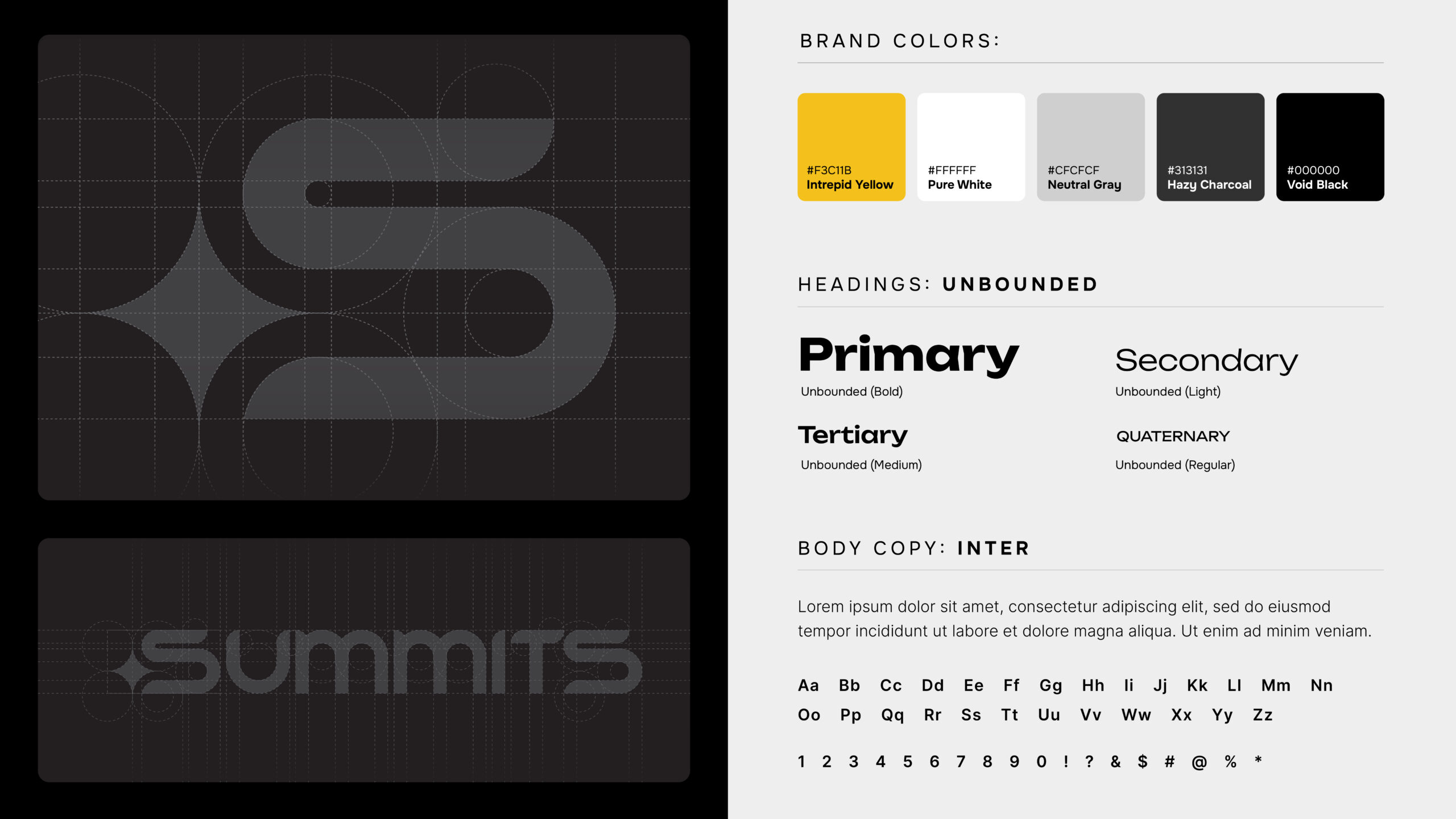
Having earned the room to explore beyond what the client had provided, built an entirely new system around Void Black, Hazy Charcoal, Neutral Gray, Pure White, and Intrepid Yellow — a high-contrast, dark-mode palette chosen to read as tech-forward and durable rather than trend-driven.

The Outcome

The client approved it immediately, and the palette built for one deck slide became the brand’s new foundation — the same colors that would go on to shape the final logo. A color decision made for a single deliverable ended up defining the company’s visual identity.

Act 3

AI as Creative Infrastructure

The deck required imagery that couldn’t be sourced, licensed, or photographed — conceptual visuals at the intersection of food, technology, and human potential. Midjourney was the right tool, but using it well required developing a methodology rather than just running prompts. That methodology evolved in real time. And as deep creative immersion in the brand’s visual language accumulated through weeks of imagery work, the provisional logo mark found its final form — resolved not by a scheduled design phase, but by sustained engagement with the brand itself.

Process Step 5

Testing What Midjourney Could Actually Do

With messaging locked and the new palette applied, focus shifted to visuals stock photography couldn’t deliver. Early Midjourney experiments tested the tool’s real constraints — simple concepts came together in a single pass.
Early Midjourney generation tests, iterative prompt refinements, and the selected output image to be used in the deck.

Key Decision

Knowing When to Stop Prompting.

The Tension

Simple visuals came together in a single Midjourney pass, but the more nuanced concepts didn’t — and there wasn’t time to chase a perfect prompt indefinitely.

The Choice

Instead of continuing to refine prompts against diminishing returns, identified the shift as a process problem and moved to a more hands-on, layered approach.

The Outcome

Telling “needs a better prompt” apart from “needs a different method” kept the harder visuals from consuming time budgeted for the rest of the deck.

Process Step 6

When One Image Wasn’t Enough

Complex scenes were beyond what Midjourney could produce in a single image, so the approach split: generate isolated assets independently, then composite the final image in Photoshop.
Rough composite presented to the client to validate the scene concept before committing to full layer production.

Key Decision

Proof of concept, then the real deal.

The Tension

The cover image was the most technically demanding asset in the deck and the one the client cared about most — exactly the wrong place to guess and find out later.

The Choice

Built isolated assets in Midjourney, composited a rough version in Photoshop, and got it in front of the client before investing in the final pass.

The Outcome

Approval on framing and composition happened early and cheaply. Final compositing moved forward with no structural surprises at the most expensive stage of the process.

Process Step 7

Answering the Question the Early Logos Asked

Months into the brand’s buildout, one piece remained unresolved: the logo. A sharper understanding of the company — built through hands-on work across the deck and imagery — finally answered the synthetic-versus-organic question the earliest concepts had only circled. New concepts drew on custom typographic references and cues from modern athletic branding, and led to the final form.
Rough composite presented to the client to validate the scene concept before committing to full layer production.

Key Decision

A star rises, chosen with purpose.

The Tension

The logo had stayed open since early in the project, and the final direction still needed to resolve a question raised at the very start — how synthetic the mark should feel against how organic — with no external deadline forcing the call.

The Choice

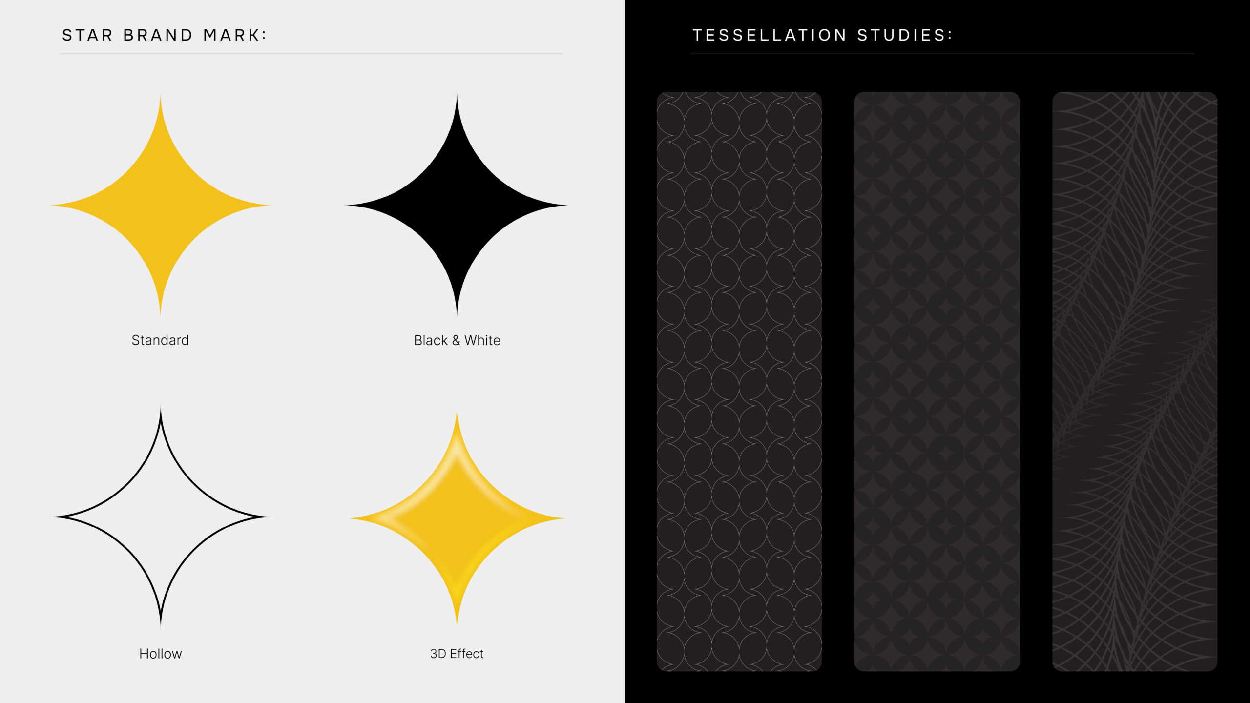
Waited until months of hands-on work across the deck and imagery built a sharper understanding of the brand, then resolved the mark around custom typography and cues from modern athletic branding — including a yellow star, chosen deliberately for its cultural association with AI, and built to extend cleanly into future brand assets like patterns, merchandise, and lockups.

The Outcome

The final mark closed out the identity phase and resolved the synthetic-versus-organic question the earliest concepts had only tested — landing on a symbol chosen for stated cultural relevance and long-term system flexibility, not style alone.

Showcase 1

The Finished Identity System

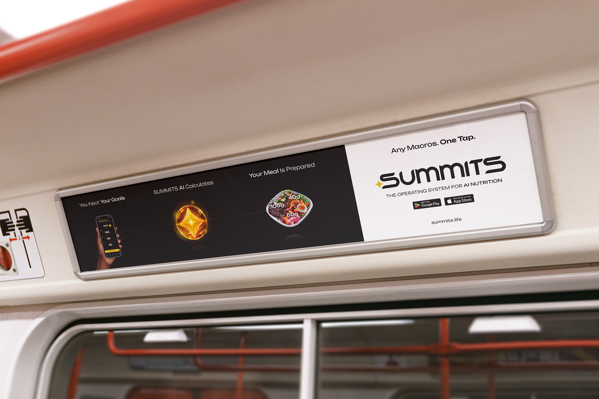
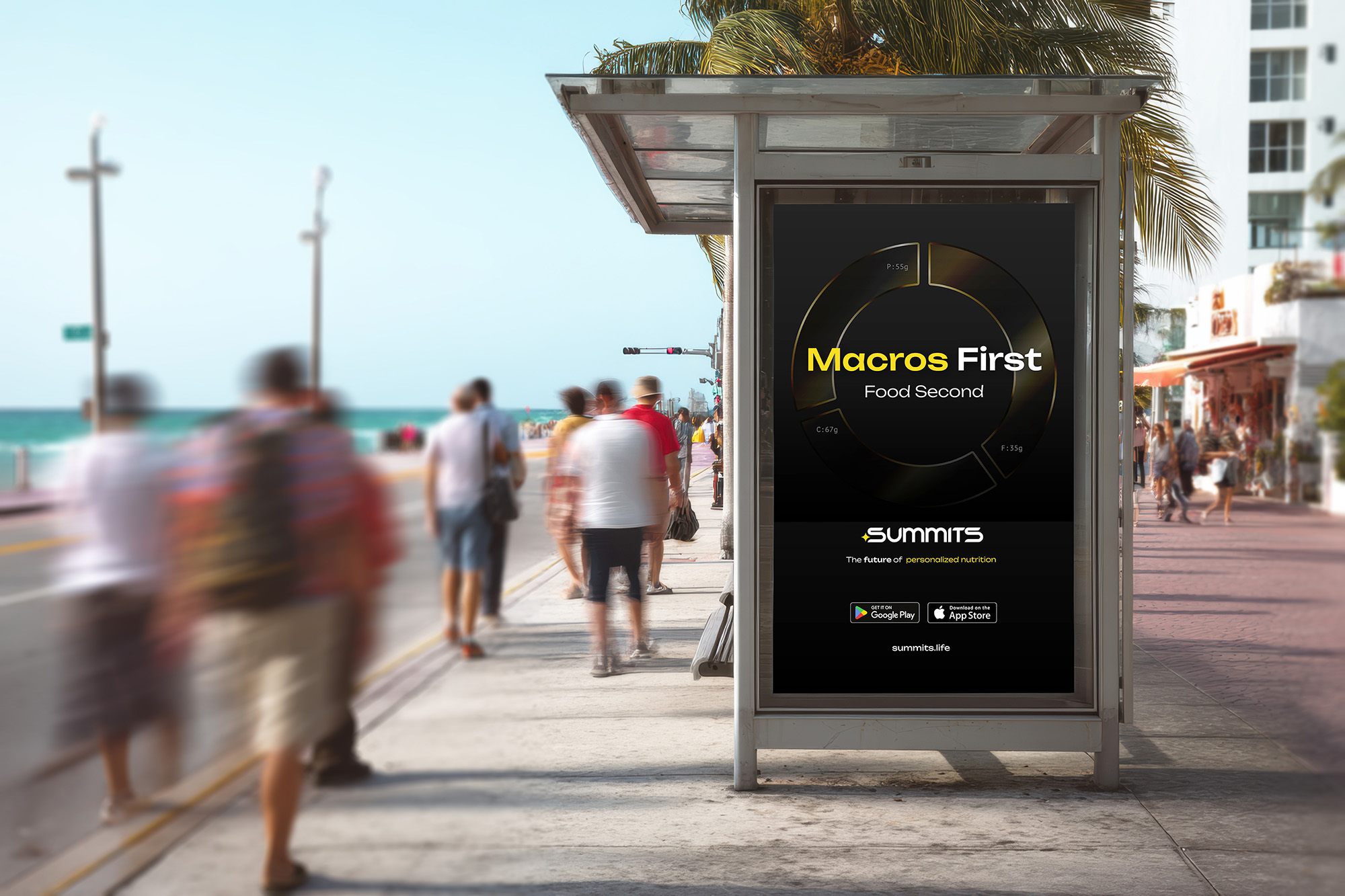
The final brand system pulls logo, color, and type into one cohesive language — built to carry SUMMITS from app launch through fundraising and beyond.
Final brand identity — color, typography, logo lockup.

Showcase 2

The Completed Deck

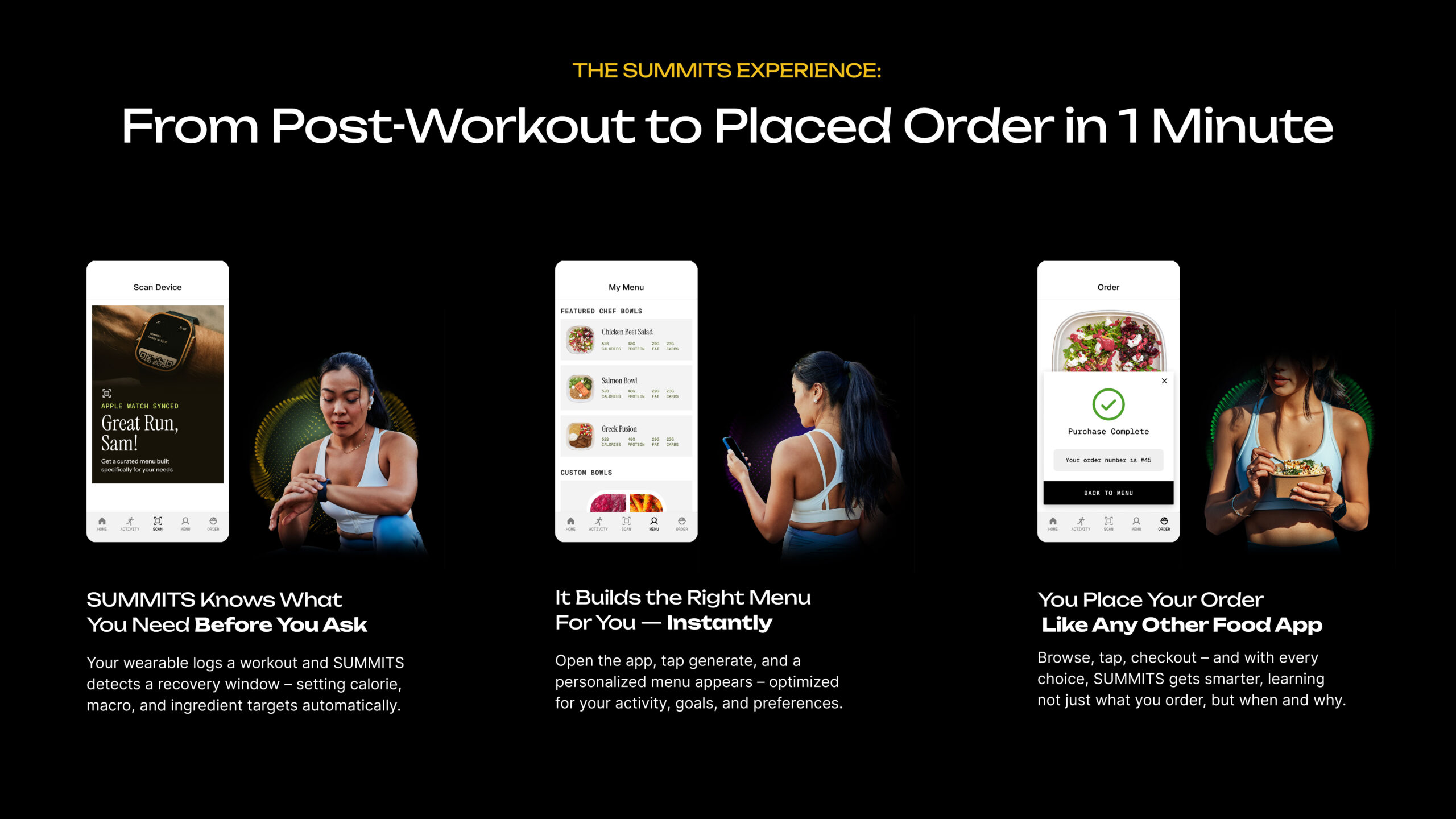
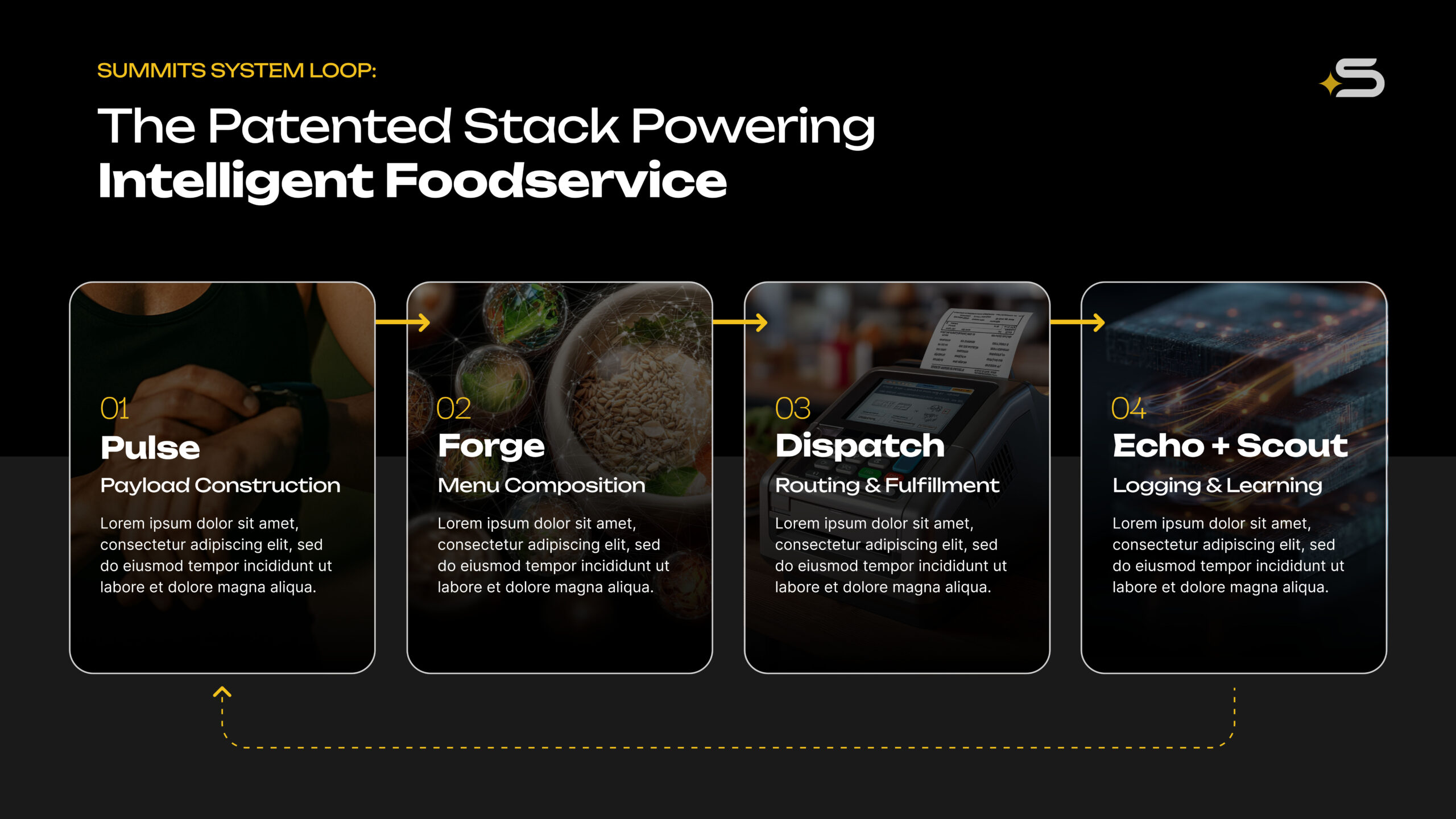
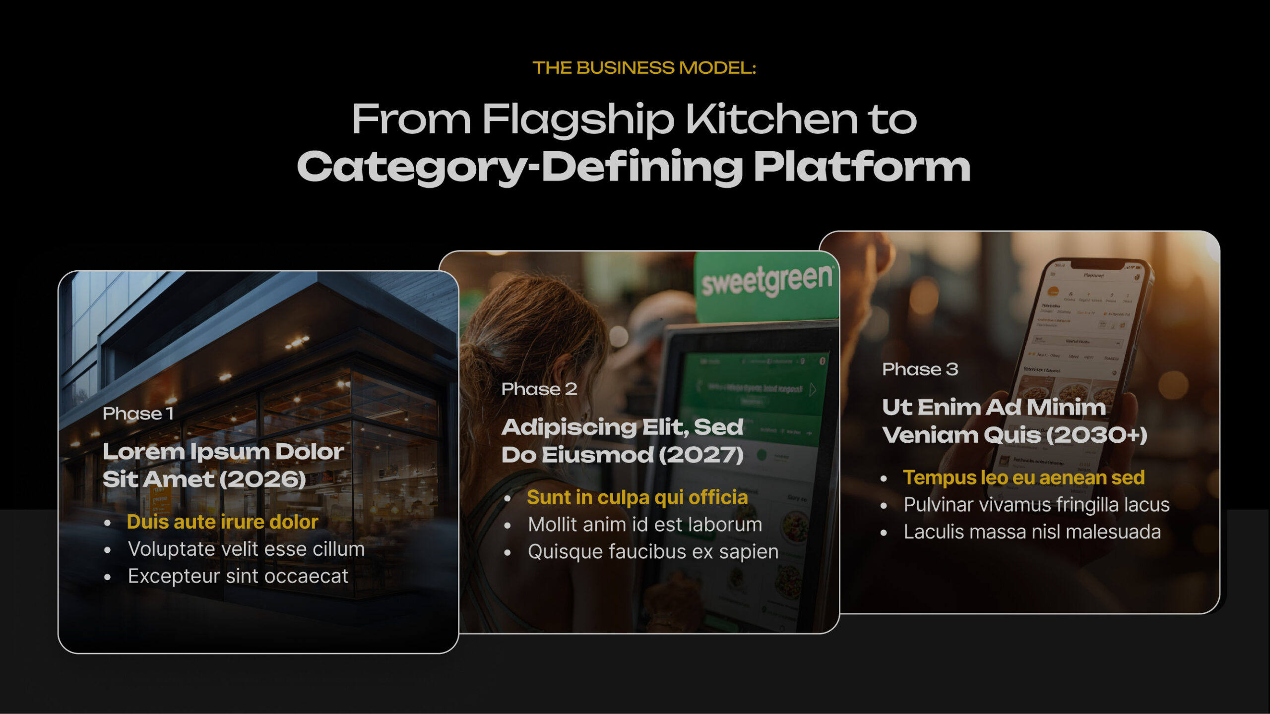
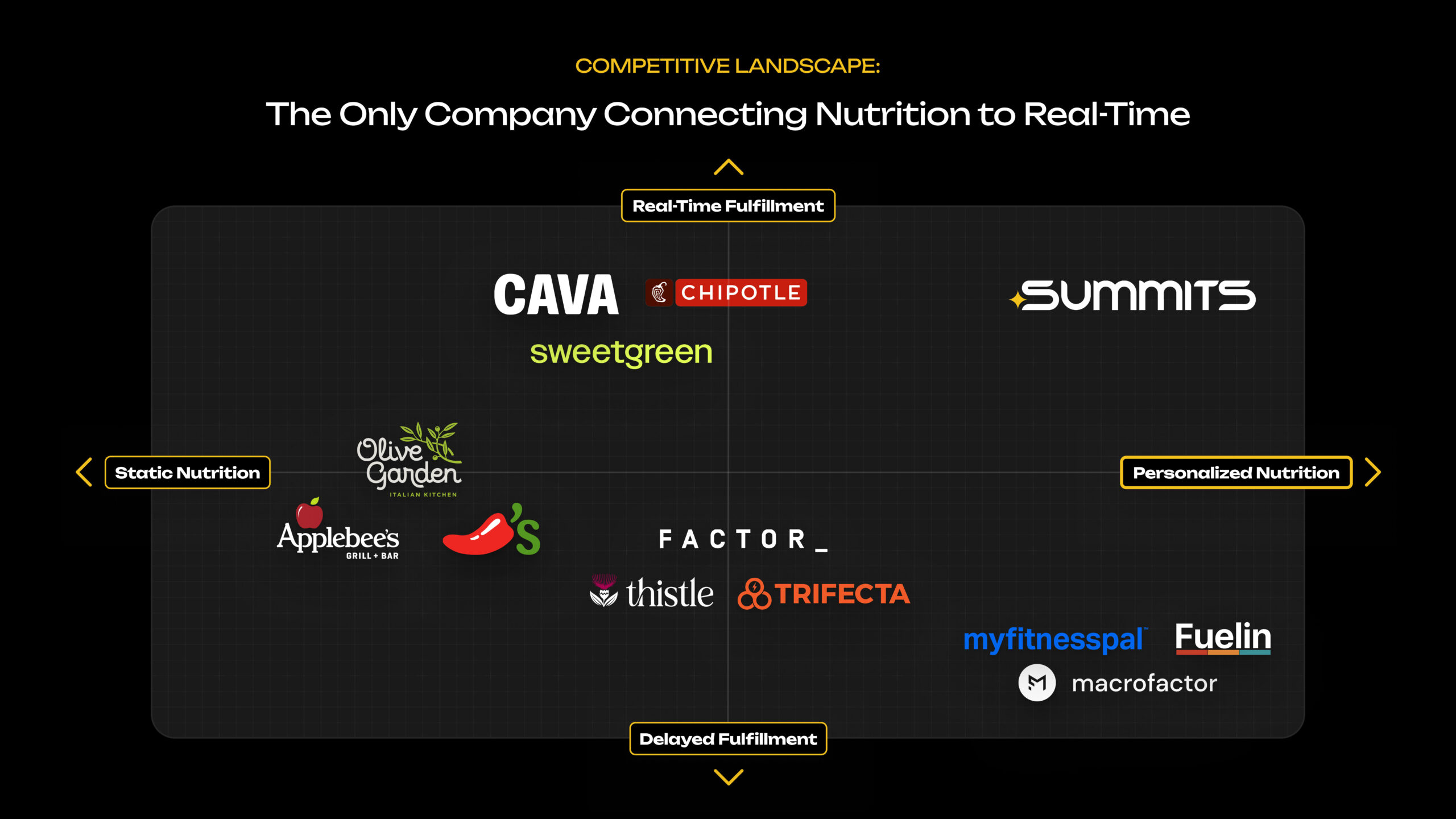
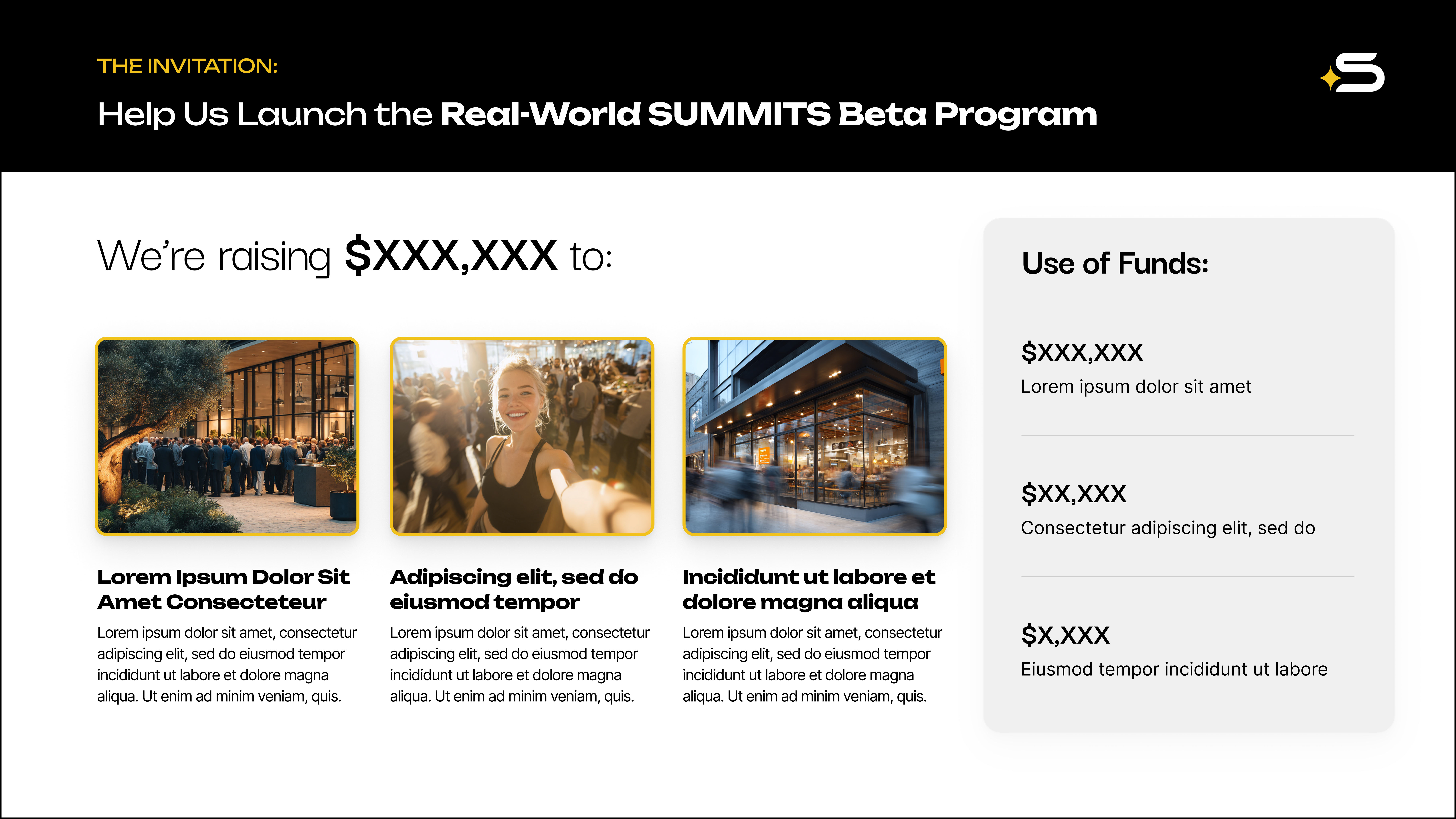
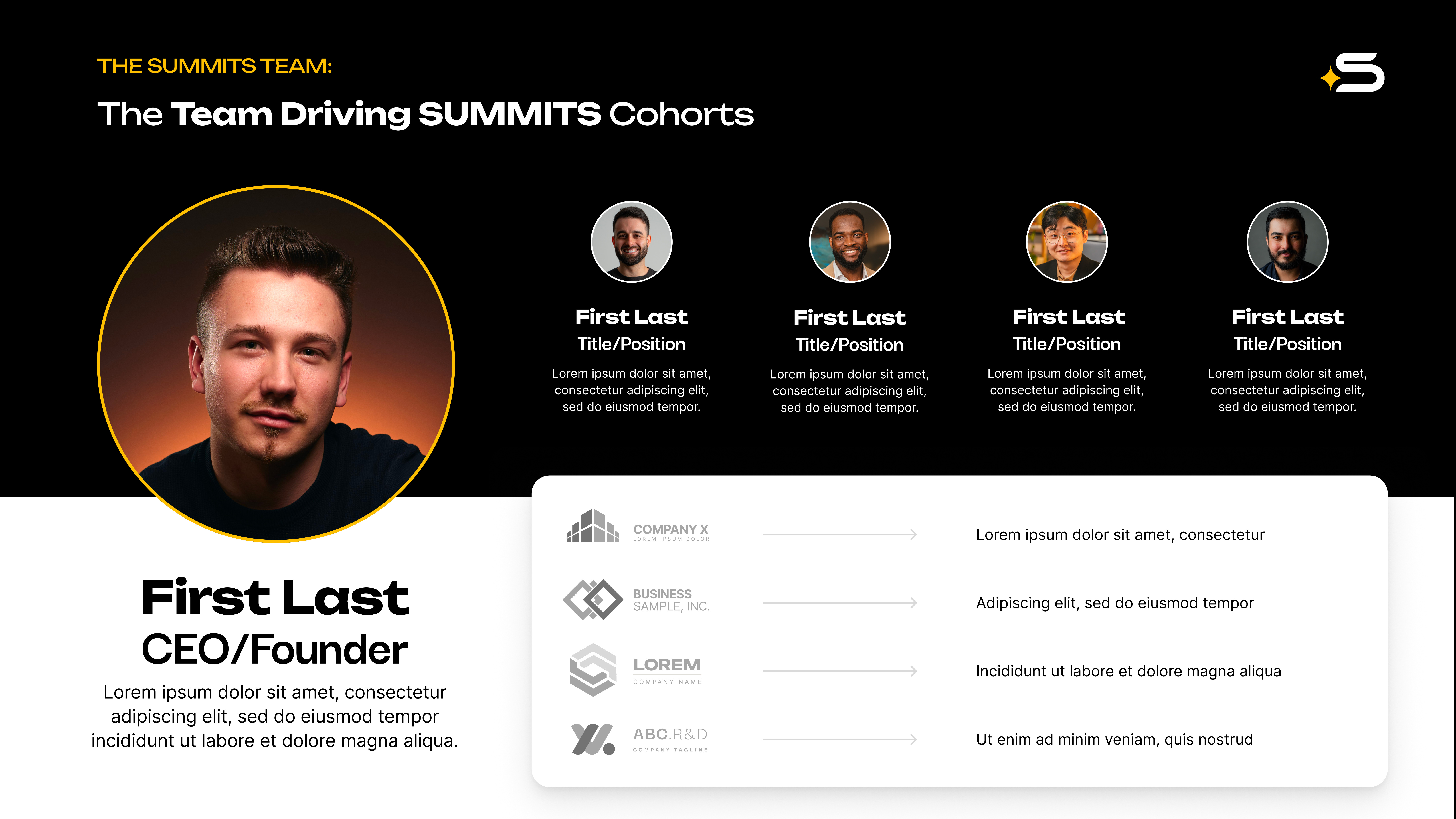
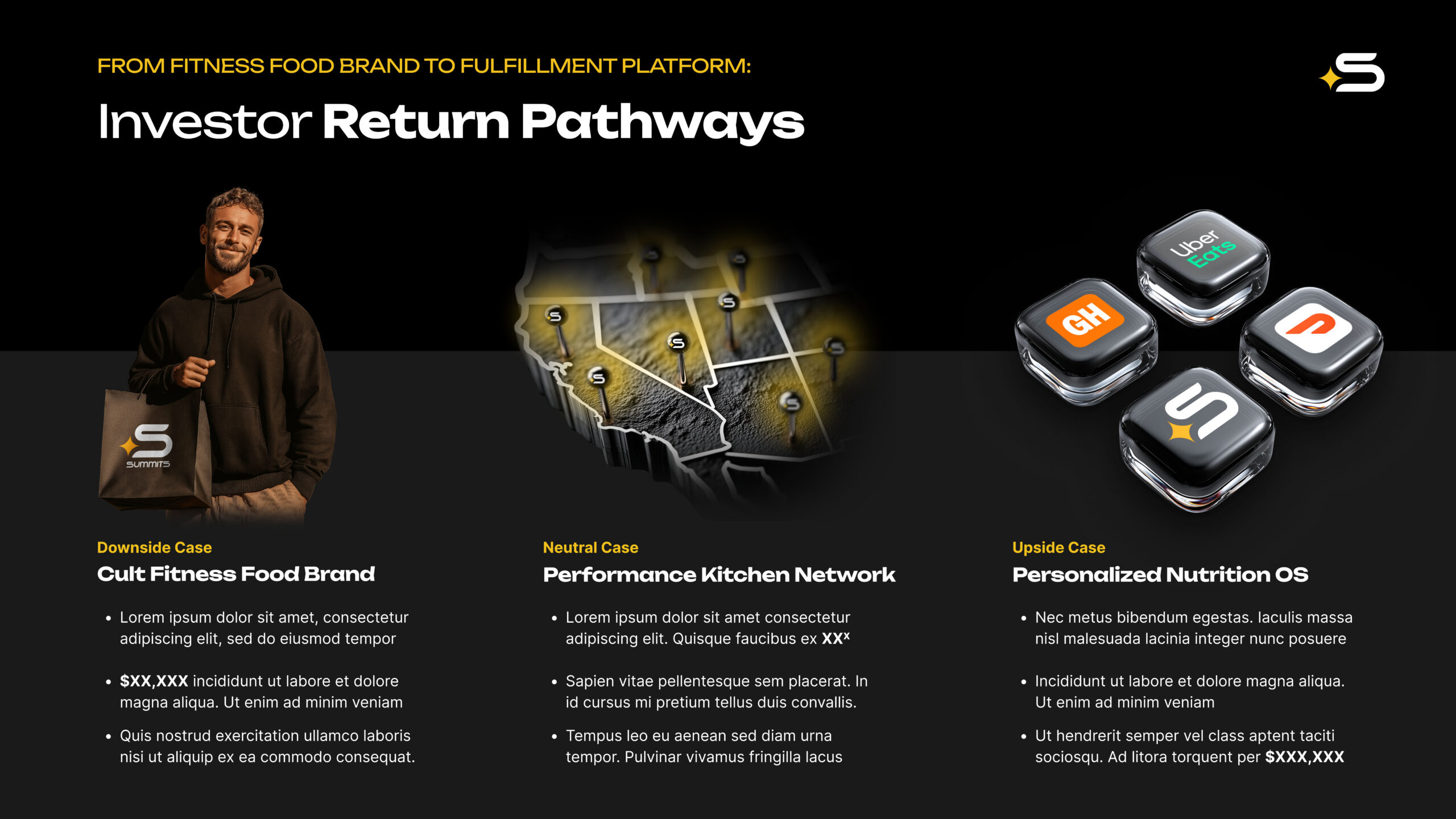
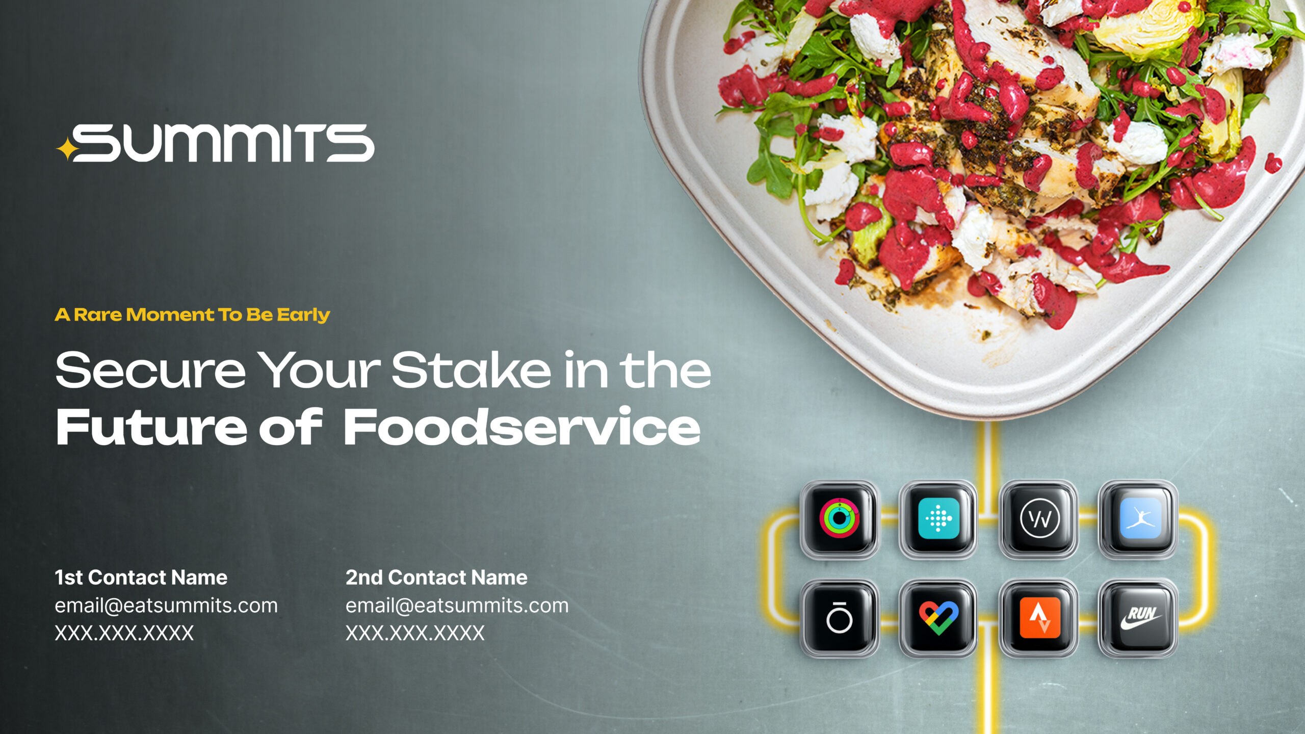
The finished deck translates a complex AI platform into a visual narrative built for investors — confident and precise, communicating the company’s positioning before a single data point is read.

Showcase 3

Generation Case Study — “One Menu. For Every Body”

The Problem slide needed to feel deliberately generic — a bifold menu frozen midair, uninspiring by design, to convey the absence of individuality. Each generation used the strongest previous result as a reference for the next, tightening lighting, perspective, and surface detail across several passes before the image earned its place in the deck.
Baseline
Refined
Selected
Final
“A basic bifold menu from a generic restaurant unfolds slightly to reveal numerous boring menu items. The menu, as if falling from above, sits frozen midair against a dark black background. The scene is uninspiring and conveys a lack of individuality.”

Showcase 4

Generation Case Study — “Menus Built From Scratch”

The Solution slide needed the opposite feeling — an amorphous network of glowing glass nodes connected by threads of light, cerebral and full of potential. Developed across four iterations, refining composition and material quality with each pass.
Baseline
Refined
Selected
Final
“An amorphous network of spherical nodes connected by thin threads, gradually tapering into a stream of light. Within each node, visuals of food groups and macronutrients glow faintly. The scene is cerebral and inspires a sense of organic potential.”

Showcase 5

Composite Case Study — The Cover

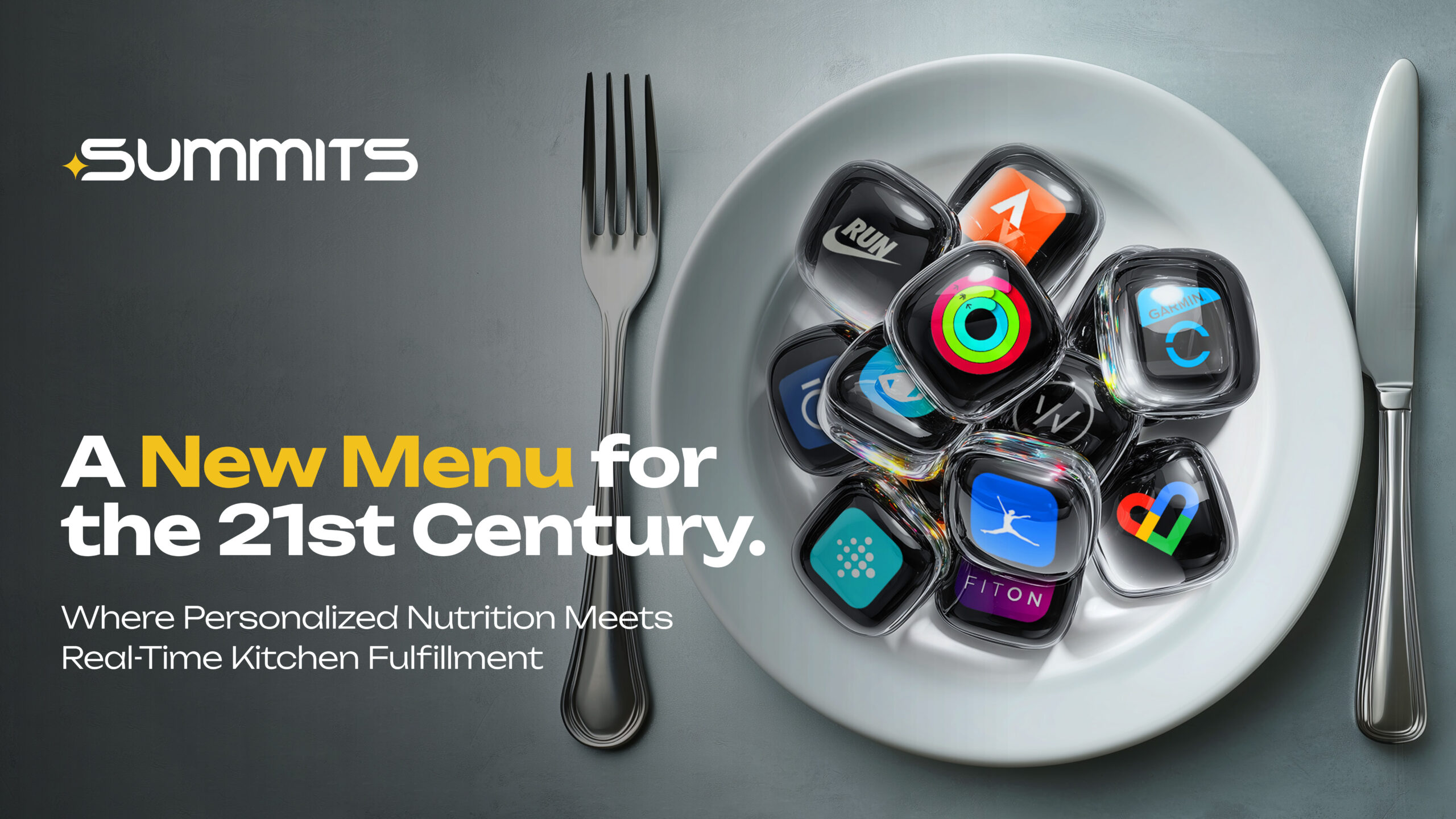
The most technically demanding image in the deck needed a different process entirely — assembled from independently generated layers in Photoshop, with full control over composition, surface, and light. What started as a workaround for Midjourney’s limits became the standard approach for every complex scene after it.
The final Intro Slide composite image followed by isolated image assets.

Key Metrics

Proven Value That Can Scale

Test 1

Lorem Ipsum Dolor Sit Amet

Test 2

Lorem Ipsum Dolor Sit Amet

Test 3

Lorem Ipsum Dolor Sit Amet

Outcomes

The brand identity and pitch materials supported SUMMITS through a significant product evolution and into market. A reputational concern that initially prompted the engagement was resolved through a full identity rebuild. The app launched on iOS and Android in October 2025. The company opened its first physical location in Venice Beach. A funding round is actively closing.