Vantage West Credit Union
Vantage West had built 60 years of trust with its members as a local, personable credit union — but its website didn’t carry that reputation online. The existing site was functional but redundant, with unclear navigation and critical member journeys buried several clicks deep. Every design and content decision also had to clear the credit union’s compliance and legal review, adding a layer of scrutiny most consumer redesigns don’t face. The mandate: modernize the experience and put member “user stories” at the center of the site, without sacrificing the familiarity members had come to rely on.

A full 70+ page rebuild followed the homepage phase by design — but it wasn’t automatic. The larger investment was contingent on the new direction proving itself first: the homepage existed to define and validate a repeatable design language before the client committed to extending it across the entire site. It held up, and the full build followed.

Client:

Vantage West Credit Union
Industry:
Financial Services
Timeline:
March 2025 – December 2025
Role:
Head of Creative — the primary design voice across a year-long, agency-wide effort significant enough that the agency’s own CEO stepped in as project manager. Directed a subcontractor team through a 70+ page system build and stepped in personally wherever the work outpaced existing inhouse expertise.
Tools:
Elementor, Adobe Photoshop, Adobe Illustrator, Canva

Act 1

Prove the Direction

Before committing to a 70-page rebuild, the direction itself had to be tested. Concept mockups gave Vantage West’s team something concrete to react to, and gave the project an early, low-risk read on how a legacy brand with decades of built-up trust would respond to a modernized visual language.

Process Step 1

Concept Exploration

Early flat mockups translated Vantage West’s existing brand identity into a modernized direction, testing whether a familiar, personable credit union brand could read as current without losing what long-time members recognized.
Early concept direction, established before any page-level design began.

Key Decision

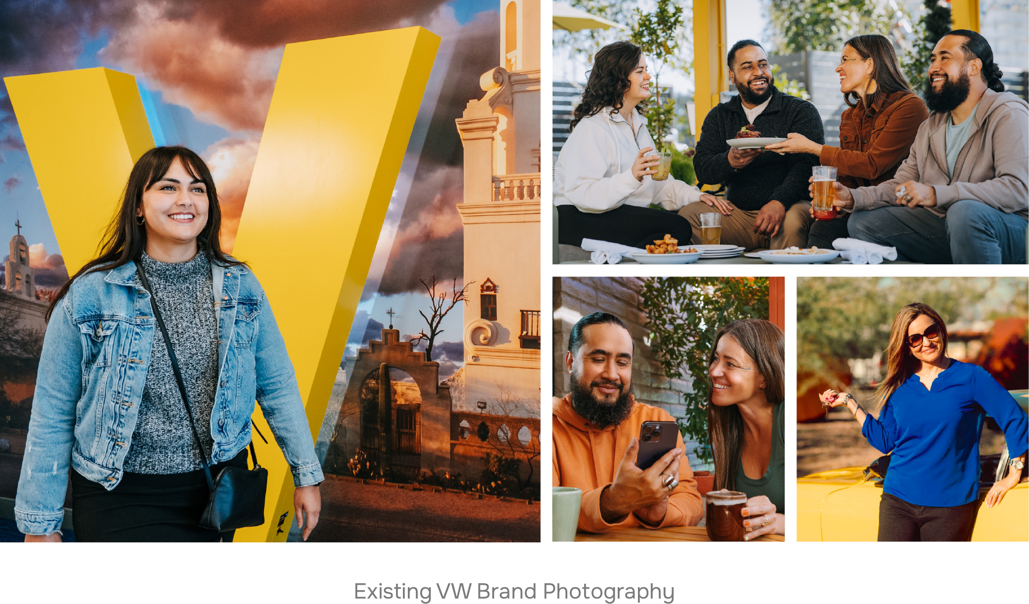
Sourcing a Brand's Voice, Not Just Its Photos

The Tension

Vantage West’s own photo library, while high-quality, couldn’t cover every page across a 70+ page site — and off-the-shelf stock imagery risked flattening a brand built specifically on feeling local and personable, not generic.

The Choice

Sourced supplemental photography against an internalized sense of Vantage West’s visual voice — proportion, warmth, tone — rather than defaulting to whatever stock options were most convenient, then made the case for each selection to the client. This happened dozens of times across the build, not once. A related color decision followed the same instinct: a copper accent included in the brand guidelines but rarely used was reintroduced deliberately in select moments to break up a palette otherwise dominated by blues, yellow, tan, and white.

The Outcome

Every page needed to feel like an extension of Vantage West’s existing brand, even on pages their own photo library couldn’t fully support. That meant treating photo selection as an ongoing brandfidelity judgment rather than a one-time asset pull — a discipline that had to hold up consistently across dozens of pages and many months of production.

Process Step 2

Action Bar Design

Part of the early concept development during the mockup phase was establishing a repeatable “action bar” design that could host important links, which would be determined on a per-page basis. Given the goal of consolidating redundant page content and cleaning up critical user-flows, establishing this component early in the design process made it easier to determine overall page hierarchy across the site.
Action bar explorations and the final polished design, ready for use across future pages.

Key Decision

The Action Bar

The Tension

Some parent pages — Personal Banking, Why Us, Mortgage, Rates — linked out to a wide range of possible next steps: services, sub-categories, related tools. Standard page content alone made it easy for a member to land on the right page and still not find what they actually needed. But this wasn’t true of every page. A global solution applied everywhere would have added clutter to simple pages that didn’t have the problem in the first place.

The Choice

Designed and built a reusable component — internally called the Action Bar — during parent-page development, ahead of any subpage work. Rather than rolling it out site-wide, it was applied selectively: only to pages with genuinely many potential destinations, and left out everywhere else.

The Outcome

Because it was built early, the Action Bar existed as a ready-made tool the moment a new page turned out to need it — including Mortgage, a subpage that still had enough of its own subdestinations to qualify. That’s a different kind of system-thinking than the archetype templates below: not “build once, repeat everywhere,” but “build once, apply only where the actual problem exists.”

Act 2

Build the System

With the new direction validated, the priority shifted from designing individual pages to designing a system that could scale. Repeatable page and section archetypes covering critical content were designed by me, validated by the client, and and extended across the site by a subcontractor team working from approved standards.

Process Step 3

Archetype Development

Each archetype was designed and approved as a parent template before any subpages were built, giving the subcontractor team a clear, reusable standard to work from rather than starting each page from scratch. The Locations section is the clearest example of this in practice: a single archive template pulls in every branch, and each individual location page — like the Tucson 22nd & Kolb branch — extends that same template with its own address, hours, and details, rather than being hand-built from scratch every time.
The clearest parent/child template relationship on the site: one archive, extended consistently across every branch.

Key Decision

Correcting Before The Client Sees It

The Tension

Subcontracted pages regularly landed close to the mark but not close enough to survive review from the client or the agency’s project manager — understandable given the number of pages and designers involved, but a real risk to consistency at this scale.

The Choice

Reviewed and corrected every subcontracted page before it reached the client or PM, providing detailed, specific feedback rather than surface-level notes, so the same gaps didn’t resurface in the next batch of pages.

The Outcome

This wasn’t about micromanaging the team — it was about protecting the system’s integrity without slowing delegation down. Catching and correcting issues before they reached the client meant the subcontractor team could keep moving fast without the client ever seeing inconsistency.

Process Step 4

Mega Menu

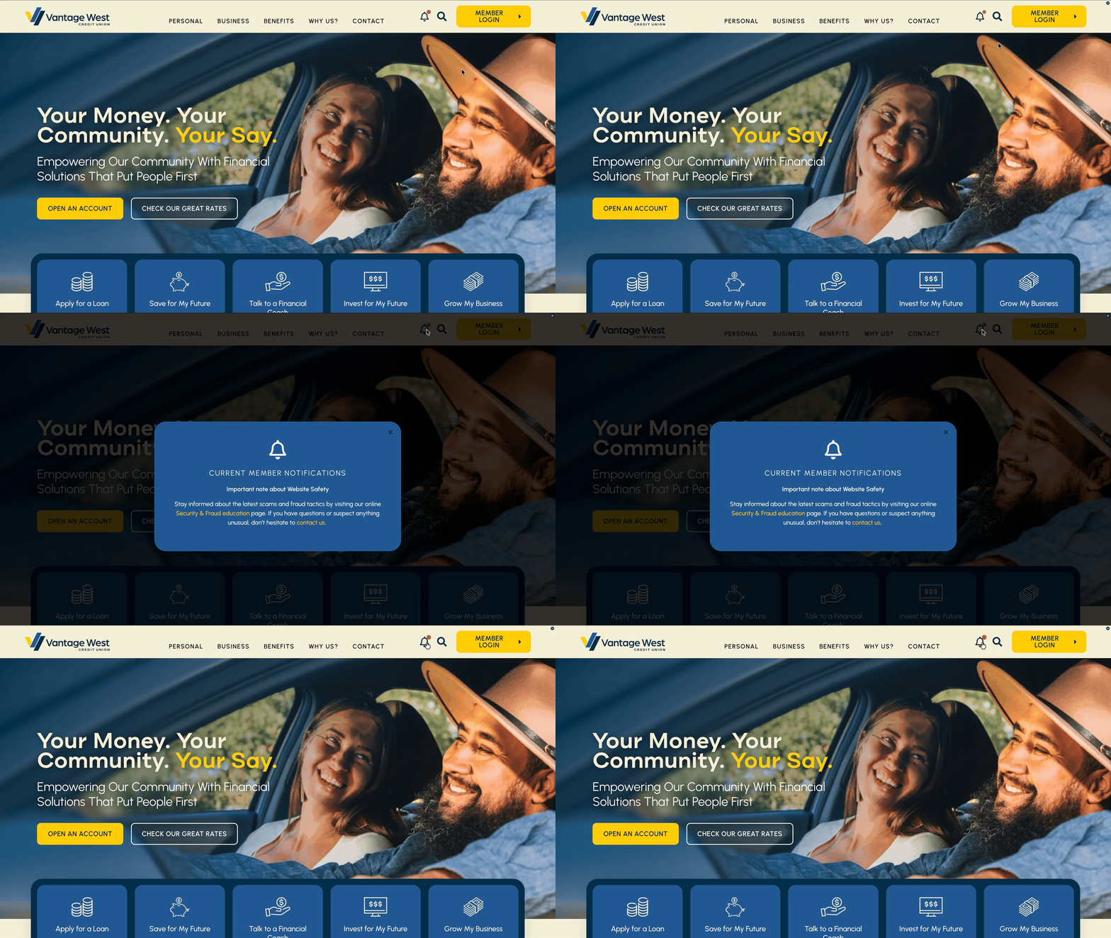
Vantage West wanted a mega menu that could organize a large and varied set of business offerings clearly — something their flat, basic menu couldn’t do. The final build included multiple dense submenus, a custom notification icon with its own pop-up behavior, custom search functionality, and full mobile optimization — designed, built, and troubleshot personally, including the front-end CSS work. This happened concurrently with the full-site build, while the redesigned homepage was already live and the legacy site was still serving the rest of the pages.
Full mobile optimization built alongside the desktop system.

Key Decision

Closing The Gap Myself

The Tension

By this point in the project, the agency’s Tech Support team was already heavily burdened with its own share of the build. The mega menu still needed genuine front-end problem-solving outside my usual scope — including figuring out how to build a perpetual notification animation using the brand’s own colors.

The Choice

Rather than pull an already-stretched Tech Support team deeper into a problem I could solve myself, I took the time to learn what was needed and built the solution directly.

The Outcome

It wasn’t a difficult task from the outside looking in, but it mattered — both because it delivered exactly what the client wanted to see, and because it meant not adding to another team’s load during an already high-pressure stretch of the project.

Act 3

Solve What the System Couldn't

The hardest problems on this project didn’t fit neatly into the archetype system — they needed direct, hands-on ownership, often outside my usual day-to-day scope, at a point in the project when every department was effectively all hands on deck.

Process Step 5

Knowledge Base Migration

Vantage West’s existing site held years of blog content the client wanted to preserve for their members. What looked like a straightforward migration turned into a discovery process: many of these posts had been set up as standalone pages with no clear way for users to find them. The solution was a custom Knowledge Base post type with global search across the entire collection, plus category-based sub-archives so related posts could surface together — solving the findability problem for users while also cleaning up how the content was organized on the backend.

Key Decision

Fixing The Real Problem, Not Just The Migration

The Tension

Legacy blog posts had been built as orphaned pages with no clear path in for users — a content architecture problem hiding inside what was scoped as a simple migration task.

The Choice

Designed a new Knowledge Base archive with global search and category-based sub-archives, rather than simply recreating the old structure in a new template.

The Outcome

Solved the user-facing findability problem and cleaned up years of accumulated backend content debt in the same move — the kind of fix that only surfaces when you’re willing to look past the task as scoped.

Comparing Original & Improved Homepage Designs

Original Homepage

Redesigned Homepage

Showcase 1

Designed At Scale

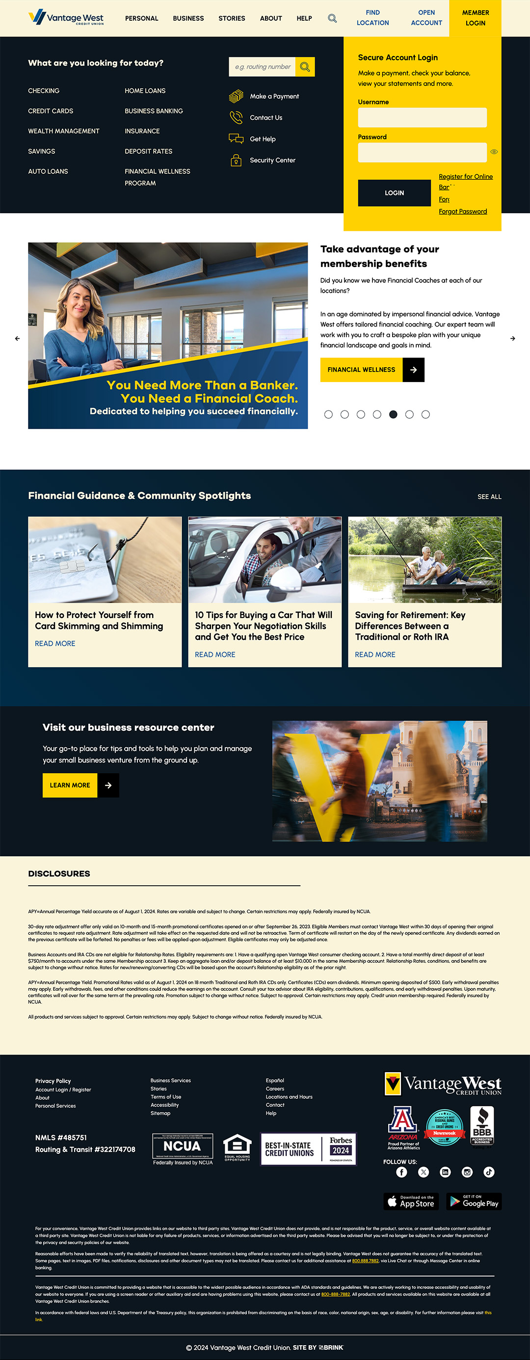
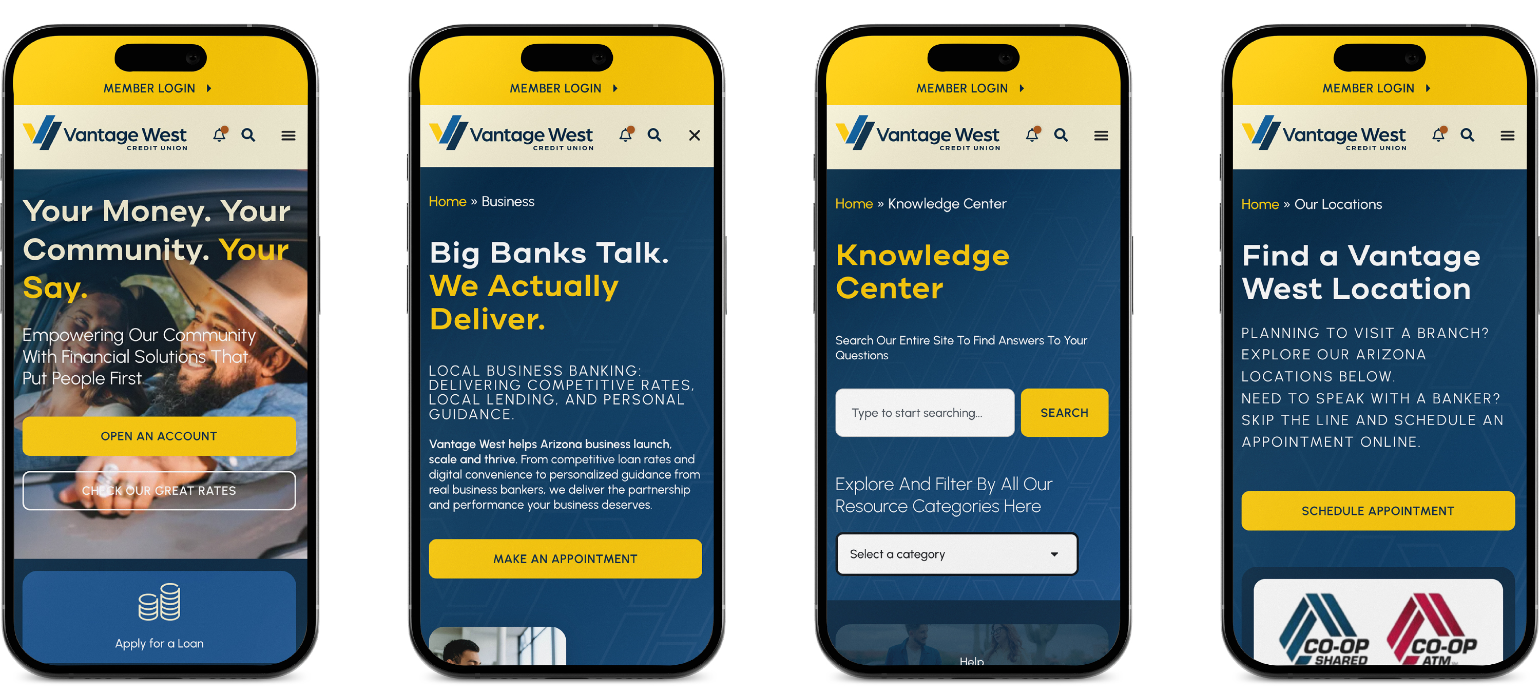
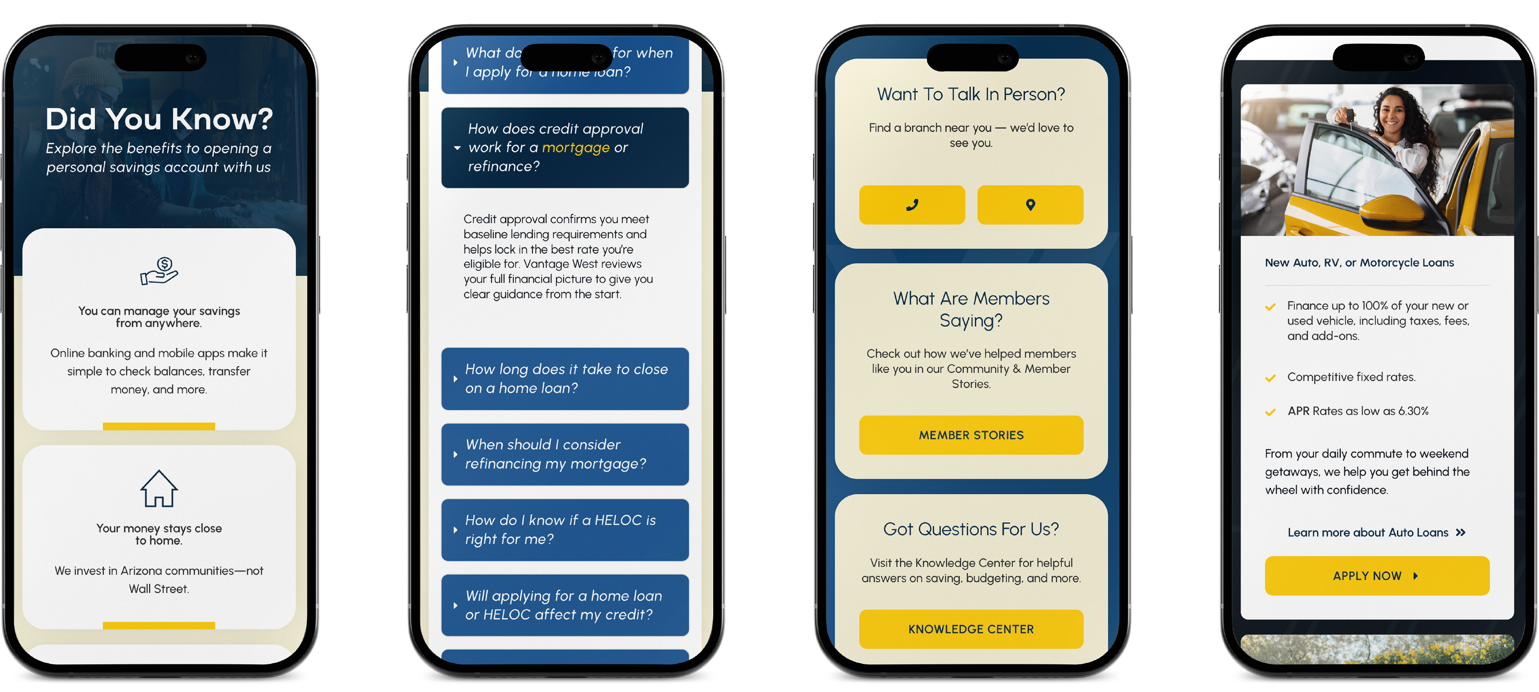
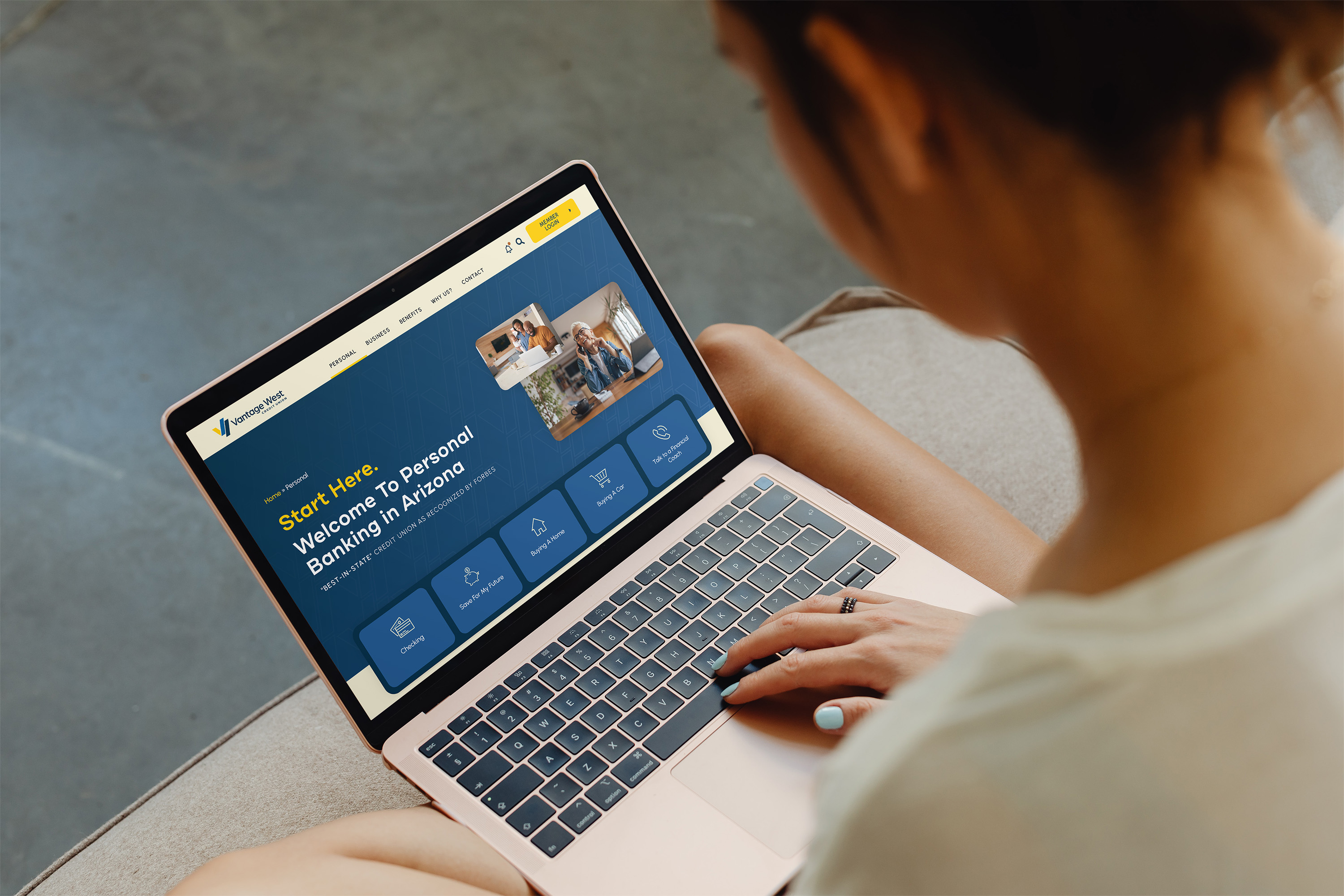
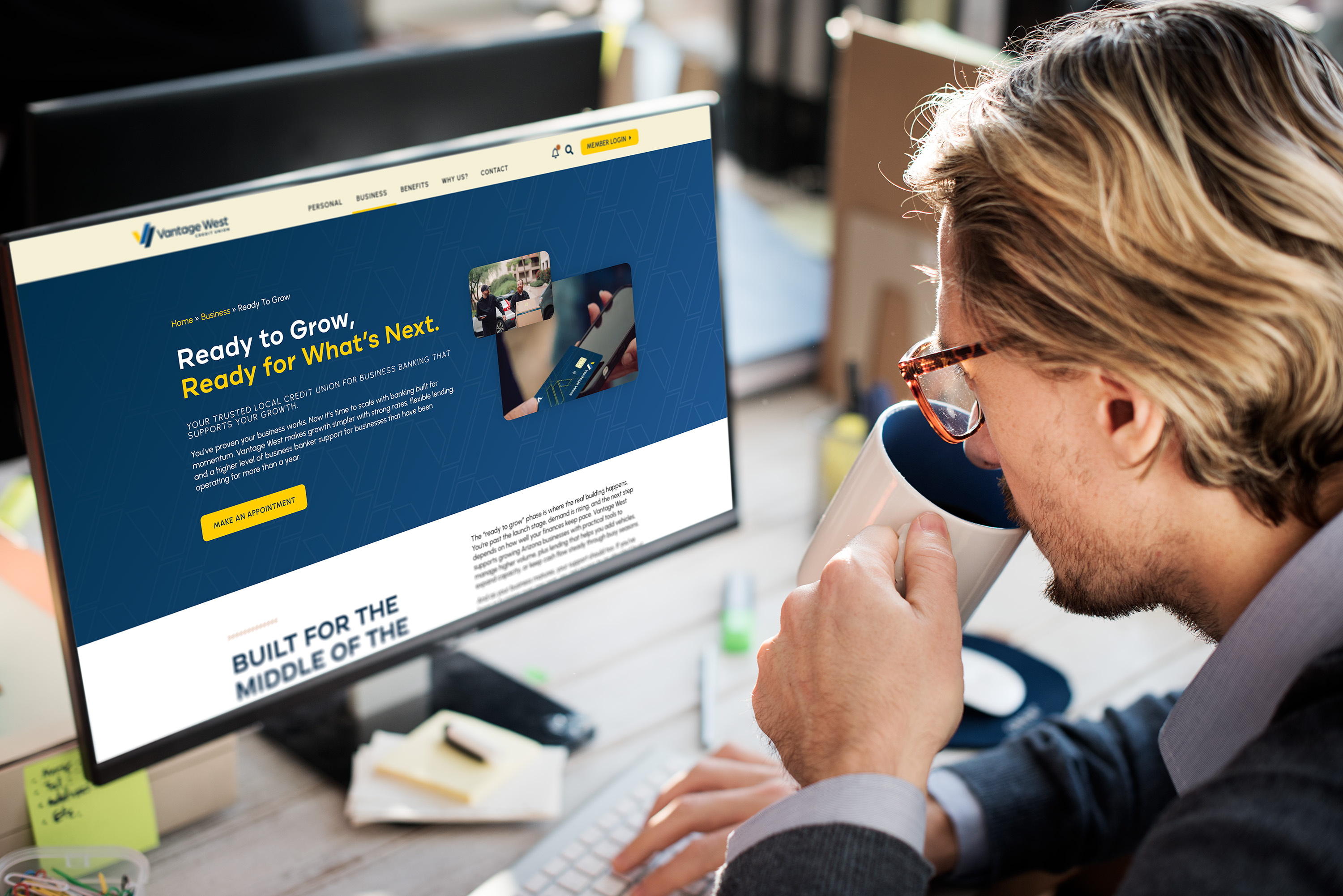
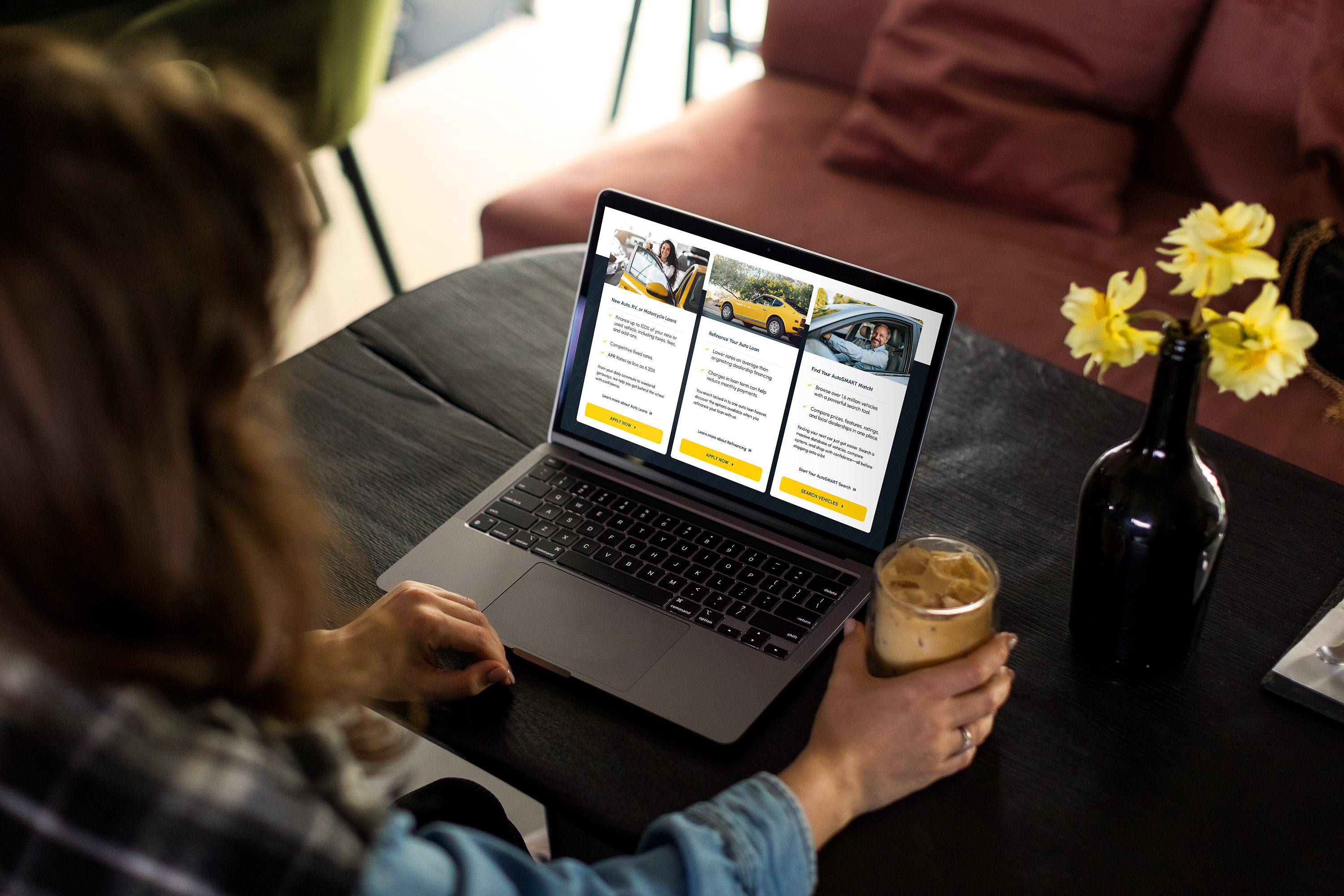
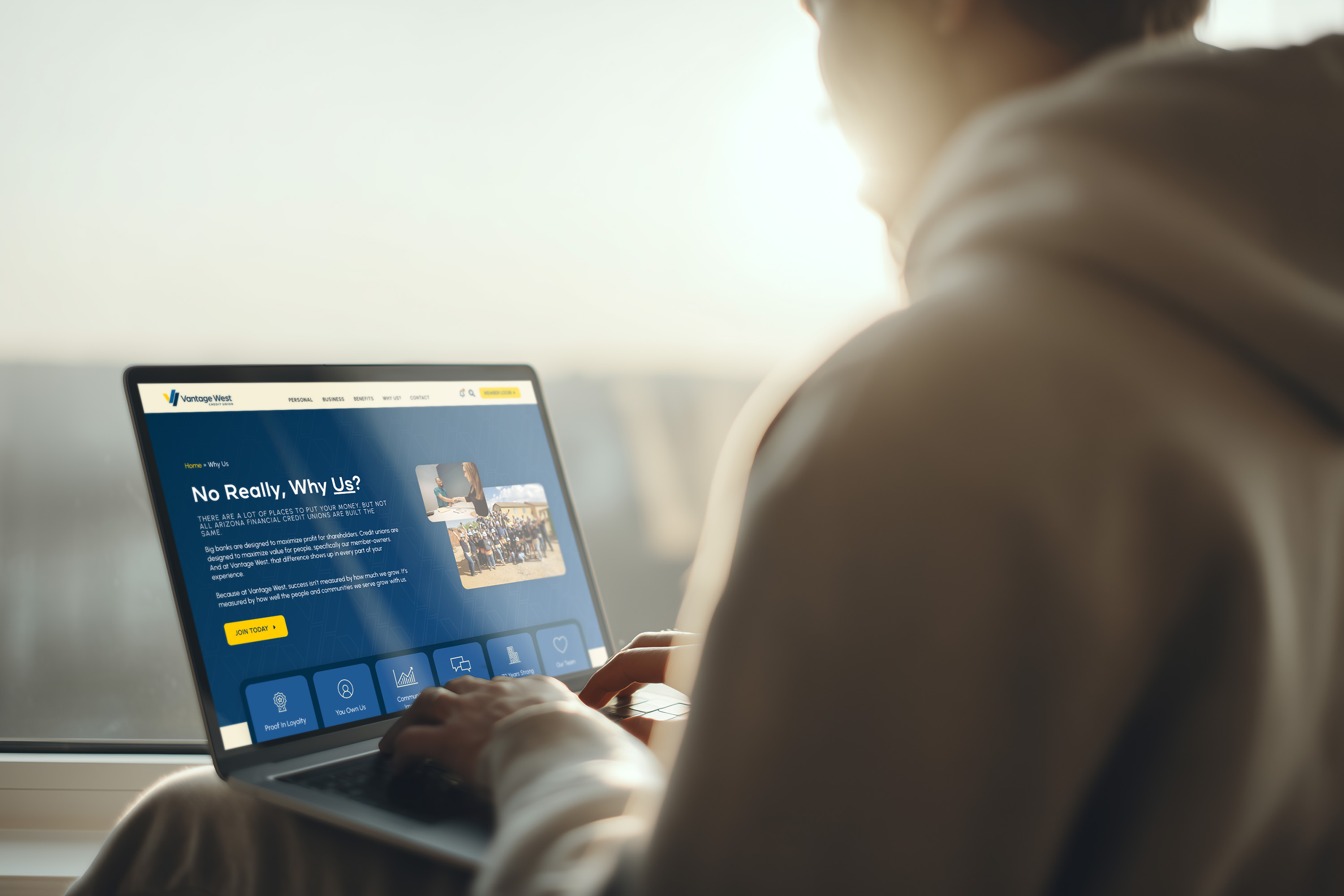
A look at the final page designs across the site — Personal Banking, Business Banking, Knowledge Center, Locations, and more — each carrying the same system with room to flex for different content and offerings.

Showcase 2

Built For Every Screen

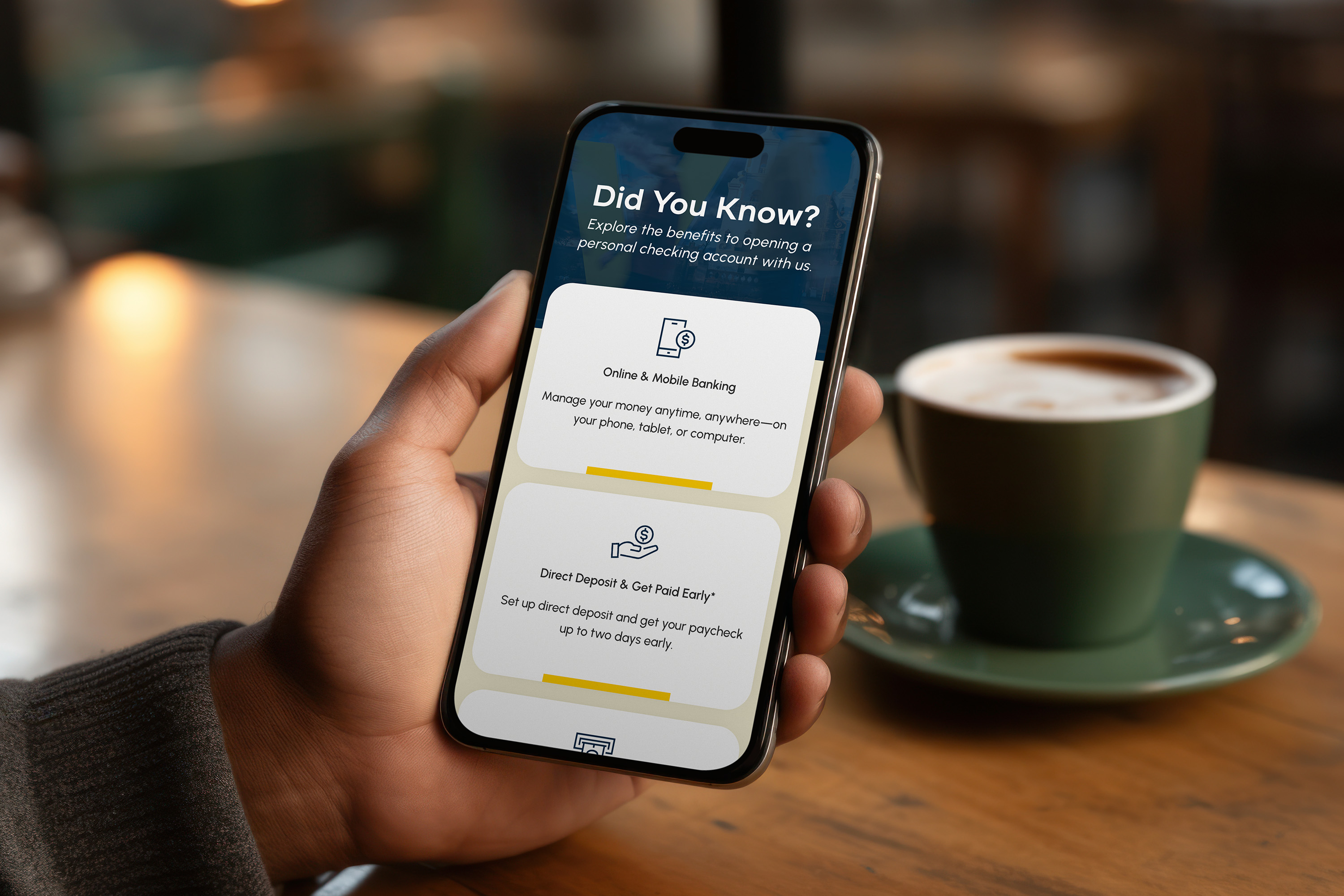
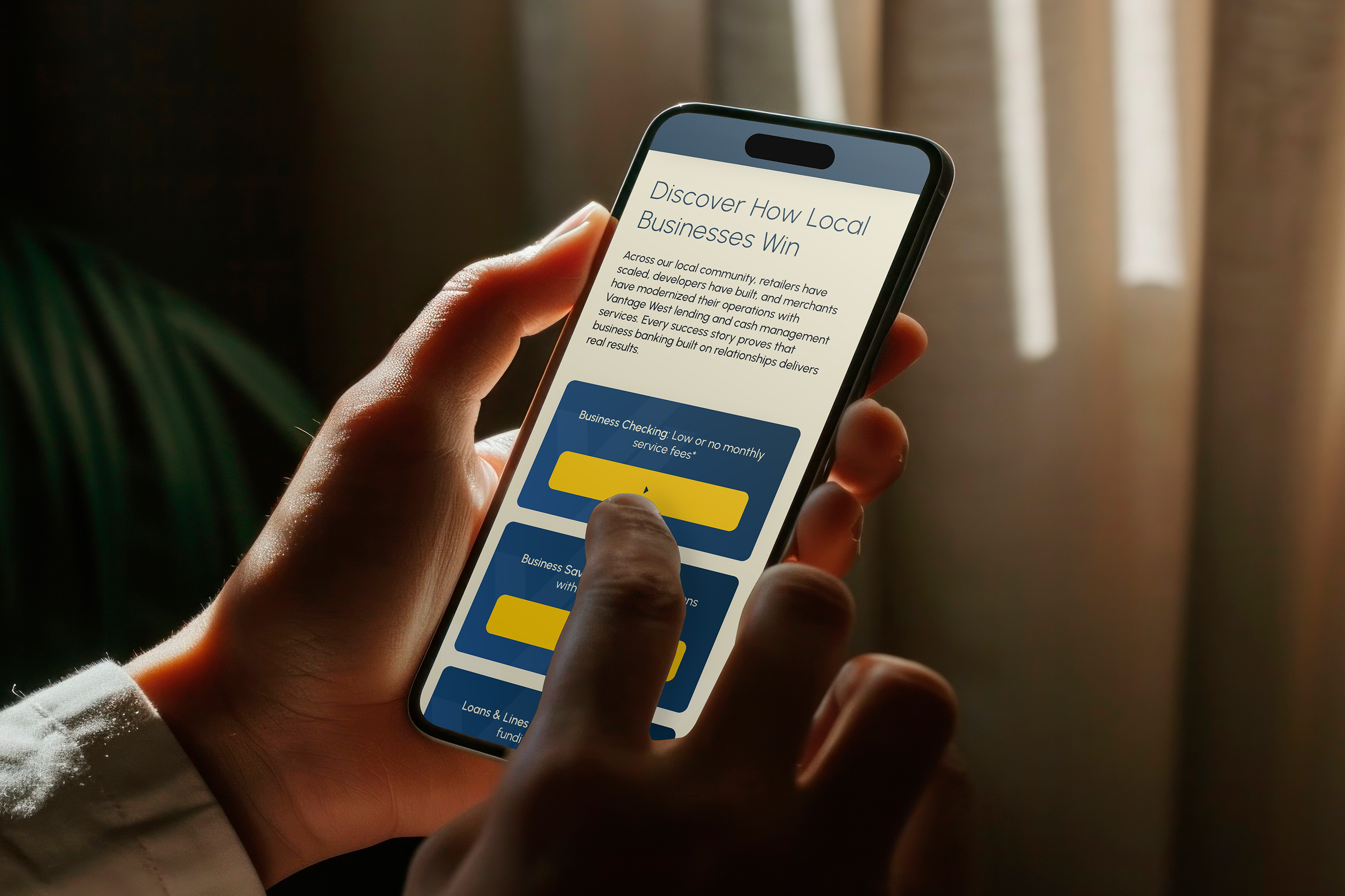
The mega menu, and the site overall, optimized for mobile from the ground up — not adapted after the fact.

Key Metrics

Project Metrics

Pages redesigned

70+

Core Web Vitals — Good / Poor (Feb 2026)

275/0

Organic engagement time (YoY)

+58.6%

Organic key events (YoY)

+161%

Outcomes

The redesign shipped on time despite its scale, with a dedicated support window immediately after launch to troubleshoot and test the new site in production. The agency’s relationship with Vantage West has continued since, through ongoing marketing and technical support work, a meaningful signal of trust for an engagement this large and this close to the client’s core brand. A year out, the site’s information architecture is showing in the numbers: organic visitors spend significantly more time on the site and convert at a much higher rate than before the rebuild. In a recent eight-week window, the site drove over 25,000 lead-generation events and nearly 5,700 appointment bookings, real member actions the previous structure was actively burying.