Halcyon Resort & Spa — Self-Directed Identity Project · Davenport, CA (fictional)
Halcyon Resort & Spa is a self-directed identity project built to solve a different kind of problem than the rest of this book. It meant entering a category with zero prior professional exposure and proving out a full brand from a blank page: naming, mark, system, applied collateral, as if it were a real client engagement, with no existing equity to react to and no client input to lean on. The concept committed to one thread from the start. A literal image resolving into abstraction, mirroring the myth the name comes from: Alcyone and Ceyx, chaos calming into stillness. That thread had to survive translation intact, from a hand-drawn kingfisher through a two-part mark system into a full guest amenity line and a digital touchpoint, without breaking or getting lost along the way.

Client:

Halcyon Resort & Spa — Self-Directed Identity Project · Davenport, CA (fictional)
Industry:
Timeline:
Summer 2021 (approx. 10 weeks, self-directed)

Role:

Sole designer — full scope: research, naming rationale, logo development, color and type systems, applied collateral across stationery, amenities, and digital
Tools:
Hand Sketching, Photoshop, Illustrator

Process Step 1

Naming & Brand Territory

The name predates the project and carries its own rationale: Alcyone and Ceyx, the Greek myth of a storm calming into stillness, mapped directly onto a resort built around recovery and self-care positioning. Kept intentionally brief. There is no real development narrative to build out here, and manufacturing process collateral for a name that arrived fully formed would read as padding.
Early naming rationale and category positioning.

Process Step 2

Concept Exploration: Literal Bird To Abstraction

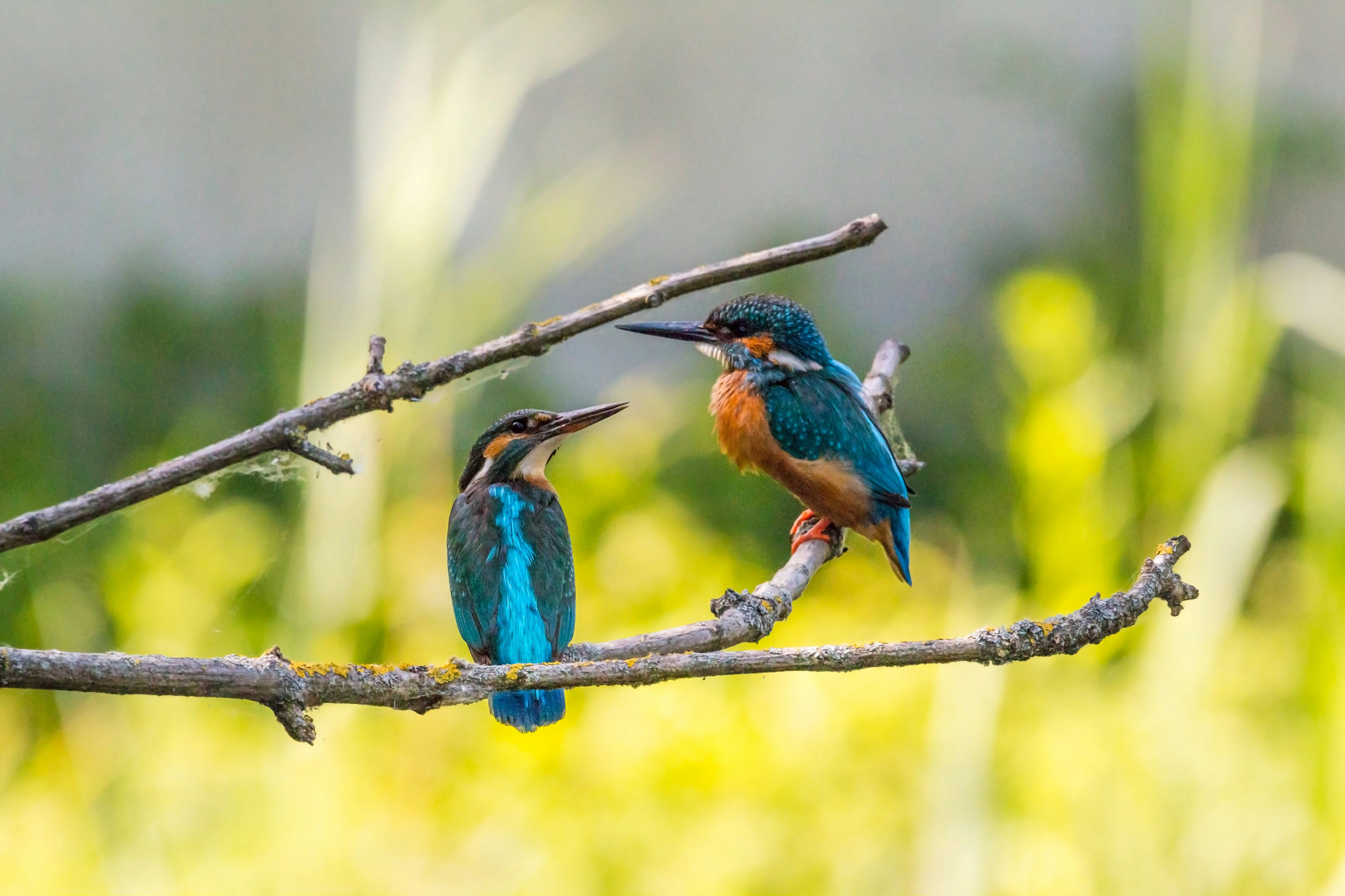
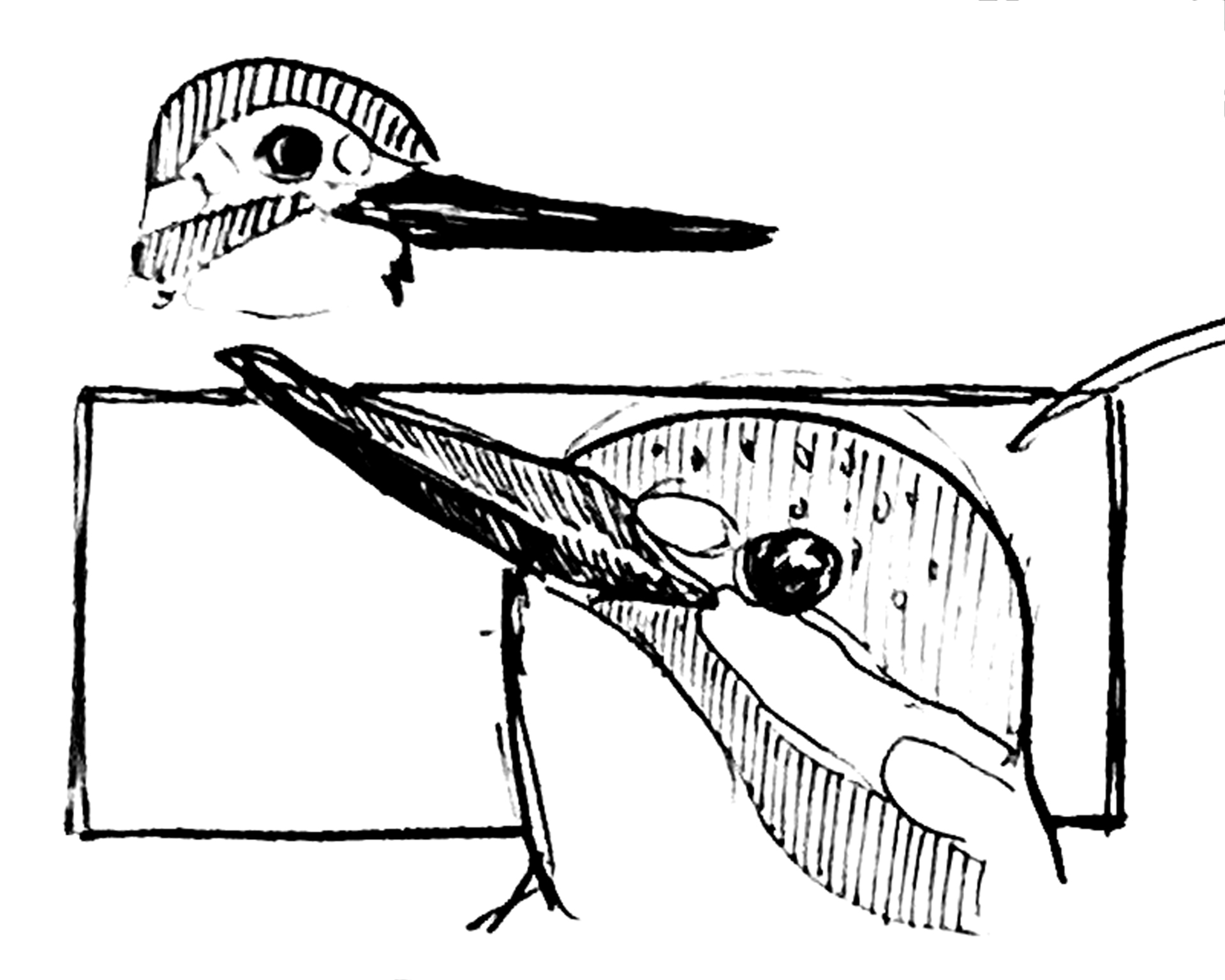
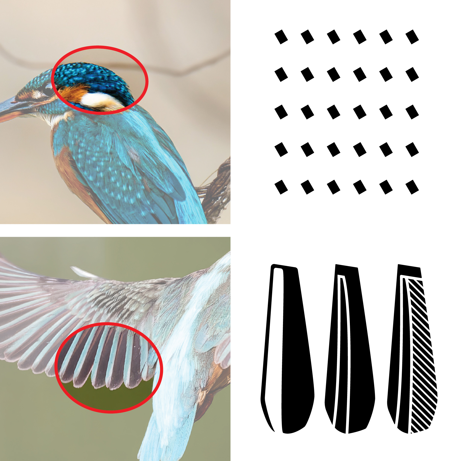
Early sketches worked directly from kingfisher reference photography, isolating specific features (crest, wing structure, plumage texture) as raw material for a mark. Successive passes pushed the same source image through increasing stages of reduction, testing how far the form could travel from its literal source before the concept’s own logic demanded it.
Sketchbook exploration and kingfisher reference studies. Feature isolation studies used to extract the wing shape and plumage pattern as raw material for the mark.

Process Step 3

Mark System Development

With the resolved wing form established, exploration shifted to building a working mark system: full lockup variations, standalone treatments of the wing shape, and pattern studies using the dotted plumage motif extracted from the same reference material.
Lockup variations and standalone mark studies. Pattern development from the dotted plumage motif

Process Step 4

Color & Typography Foundation

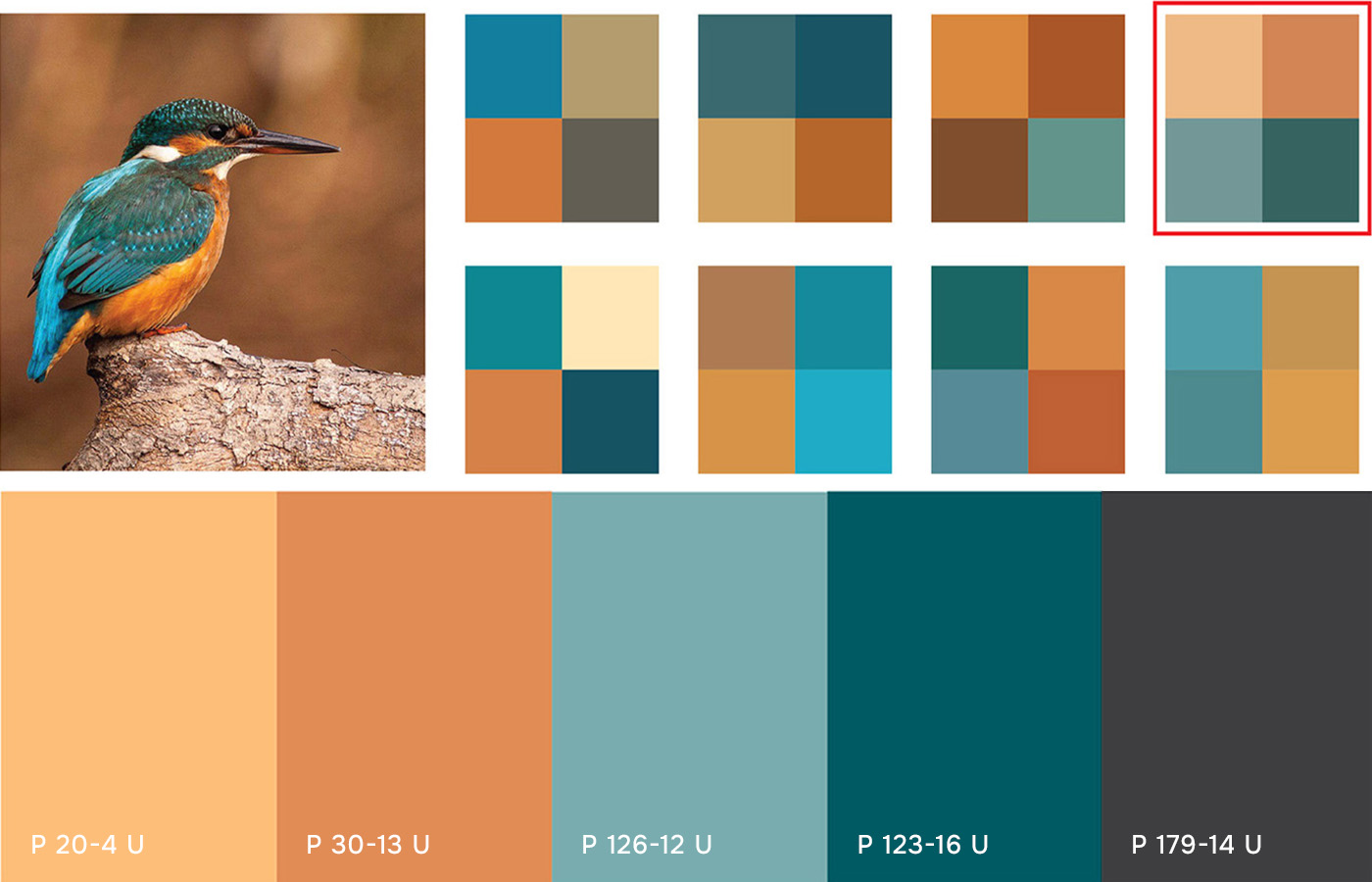
Color development pulled directly from the kingfisher’s own palette, cross-referenced against Pantone equivalents to land on a workable four-color system. Typography exploration ran in parallel, testing candidates against the finished mark before committing to a hierarchy.
Kingfisher-derived color studies and Pantone equivalency testing. Serif and sans-serif typography tests against the resolved mark.

Process Step 5

Proving The System on Paper

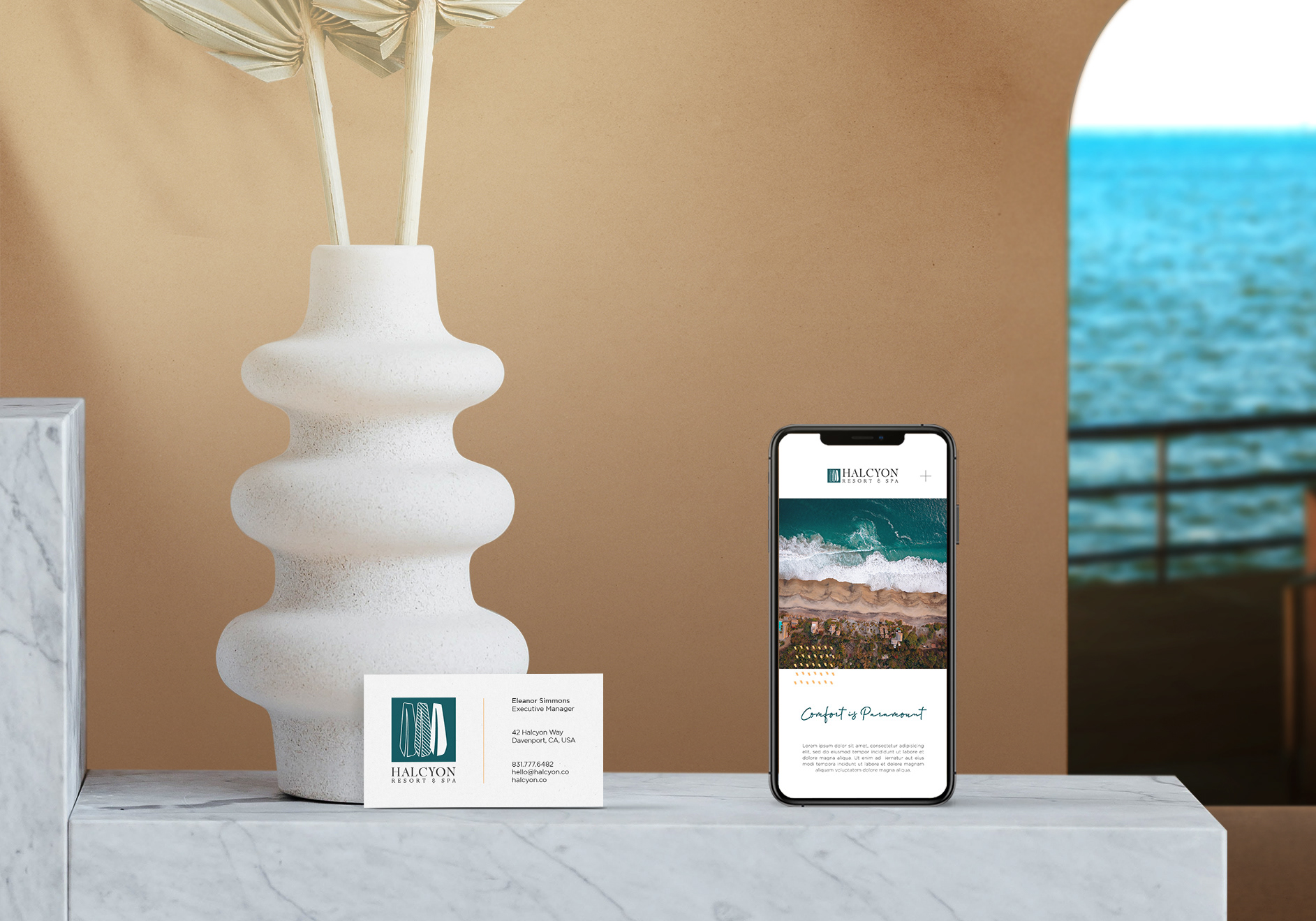
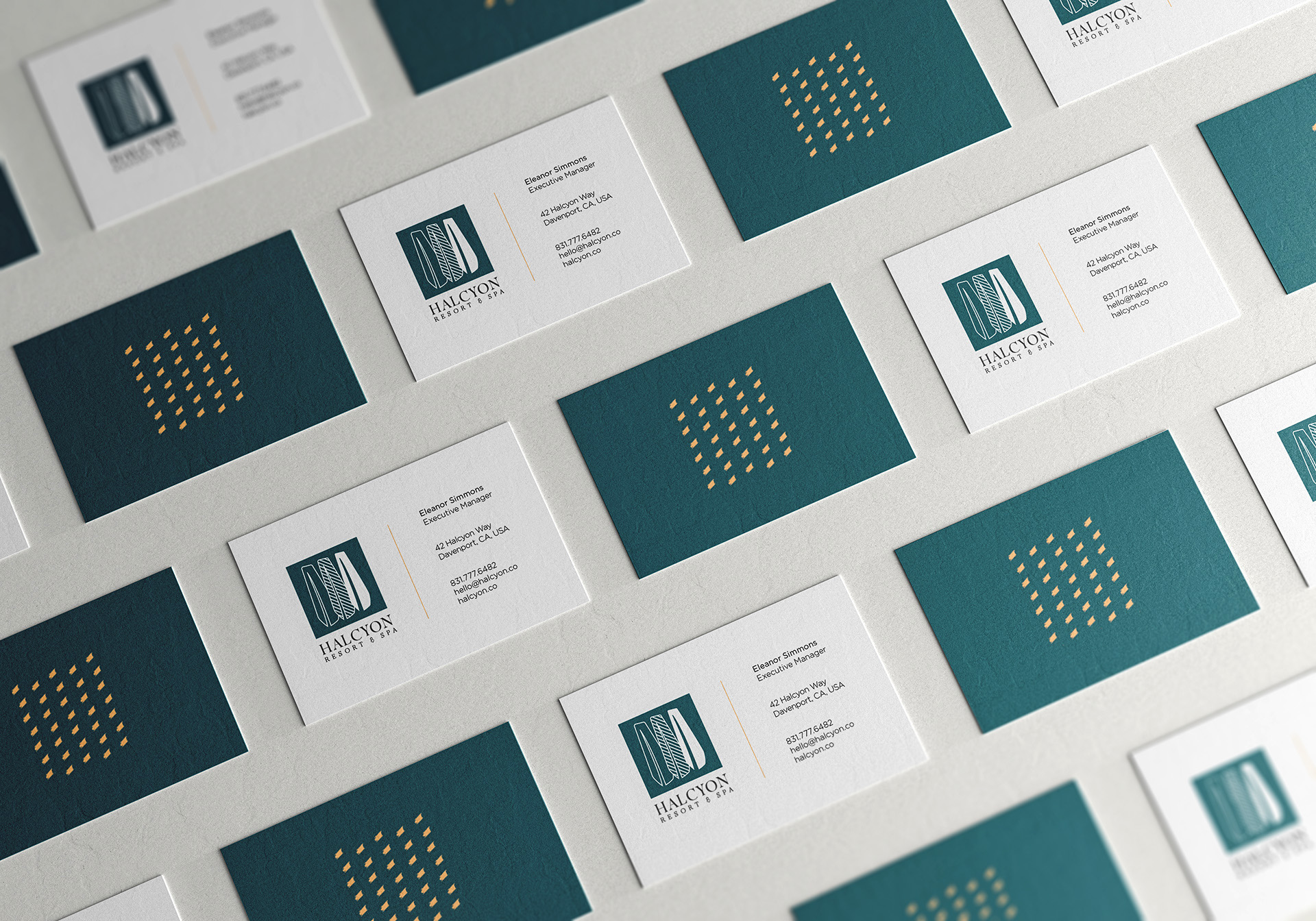
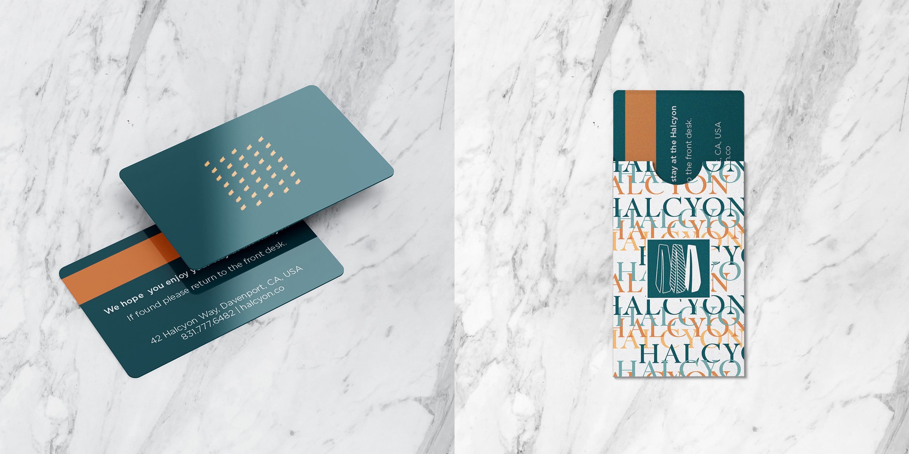
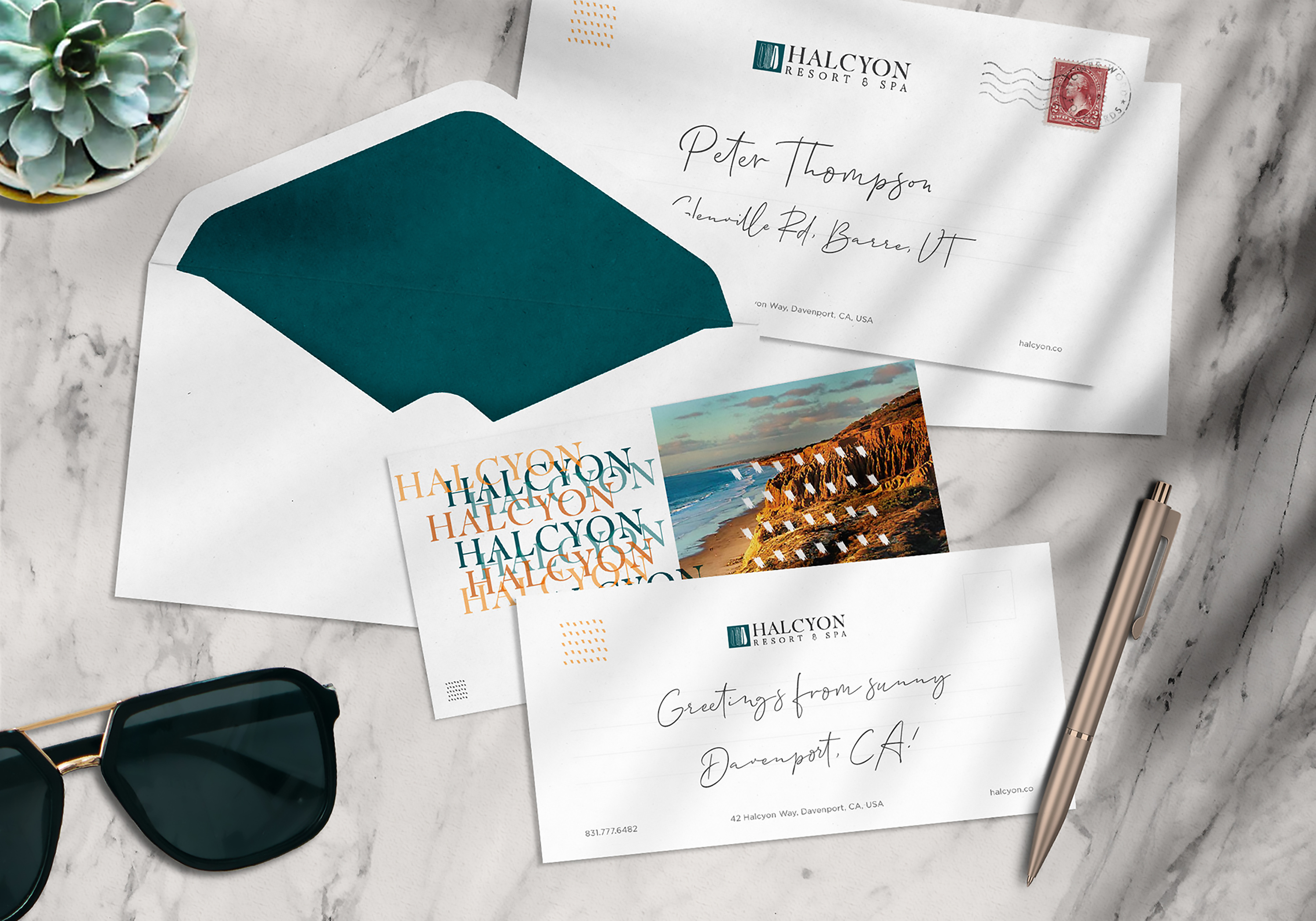
With the mark, pattern, and type hierarchy resolved, the next test was whether the primary and secondary marks could hold up across the print materials a real guest would actually handle: business cards, key cards, correspondence.
Business card suite, key card and sleeve, correspondence and greeting card set.

Process Step 6

Proving The System in The Room

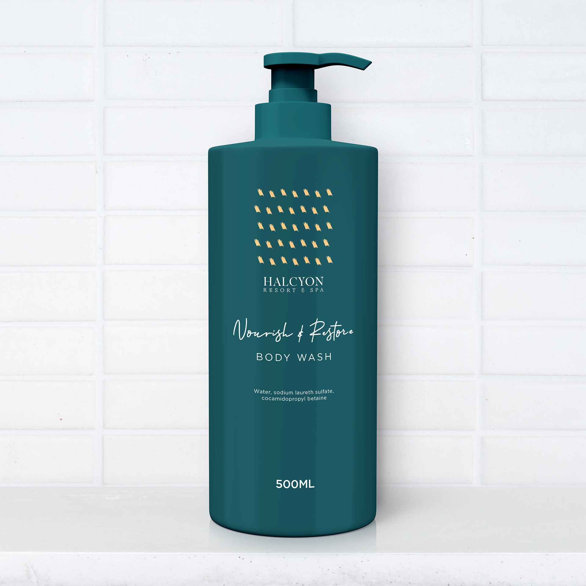
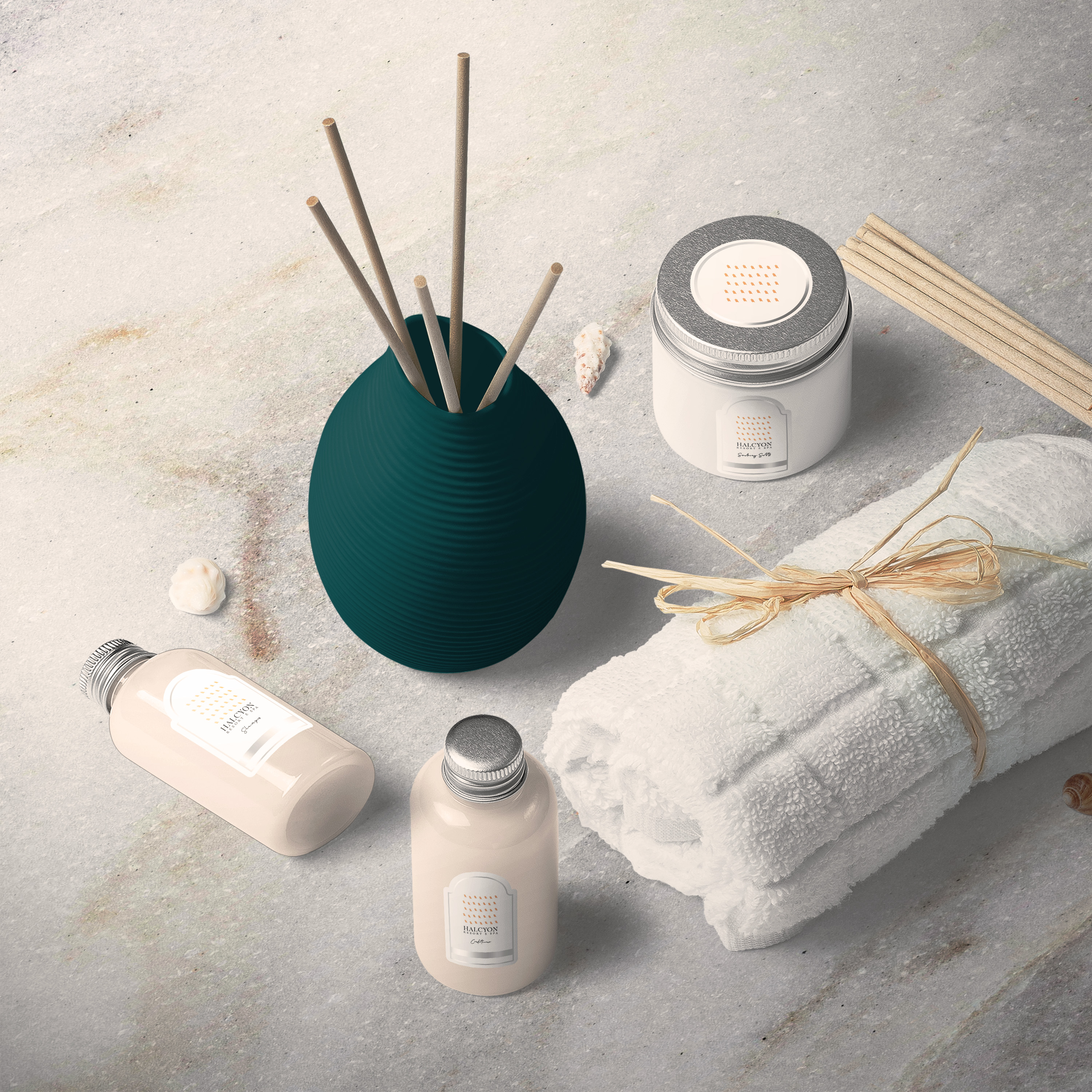
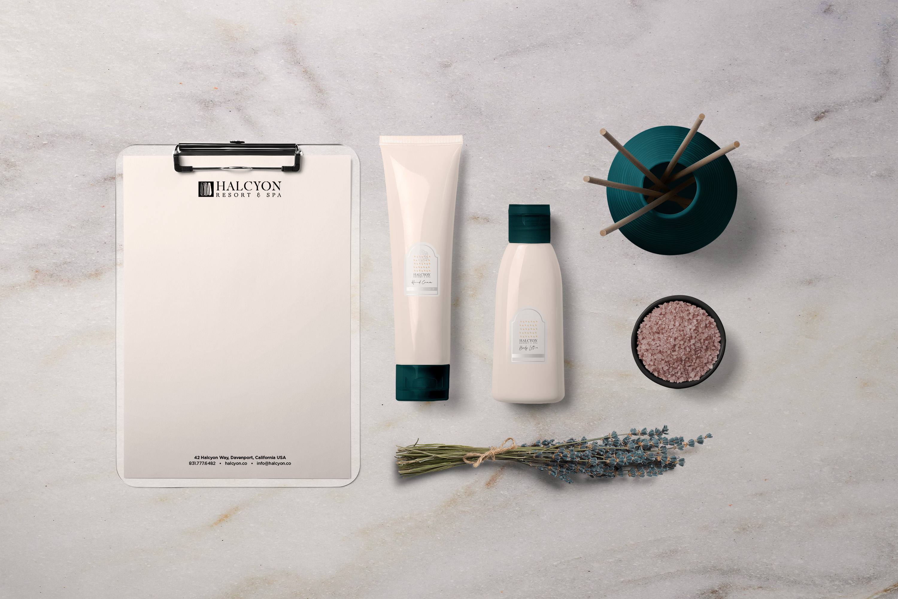
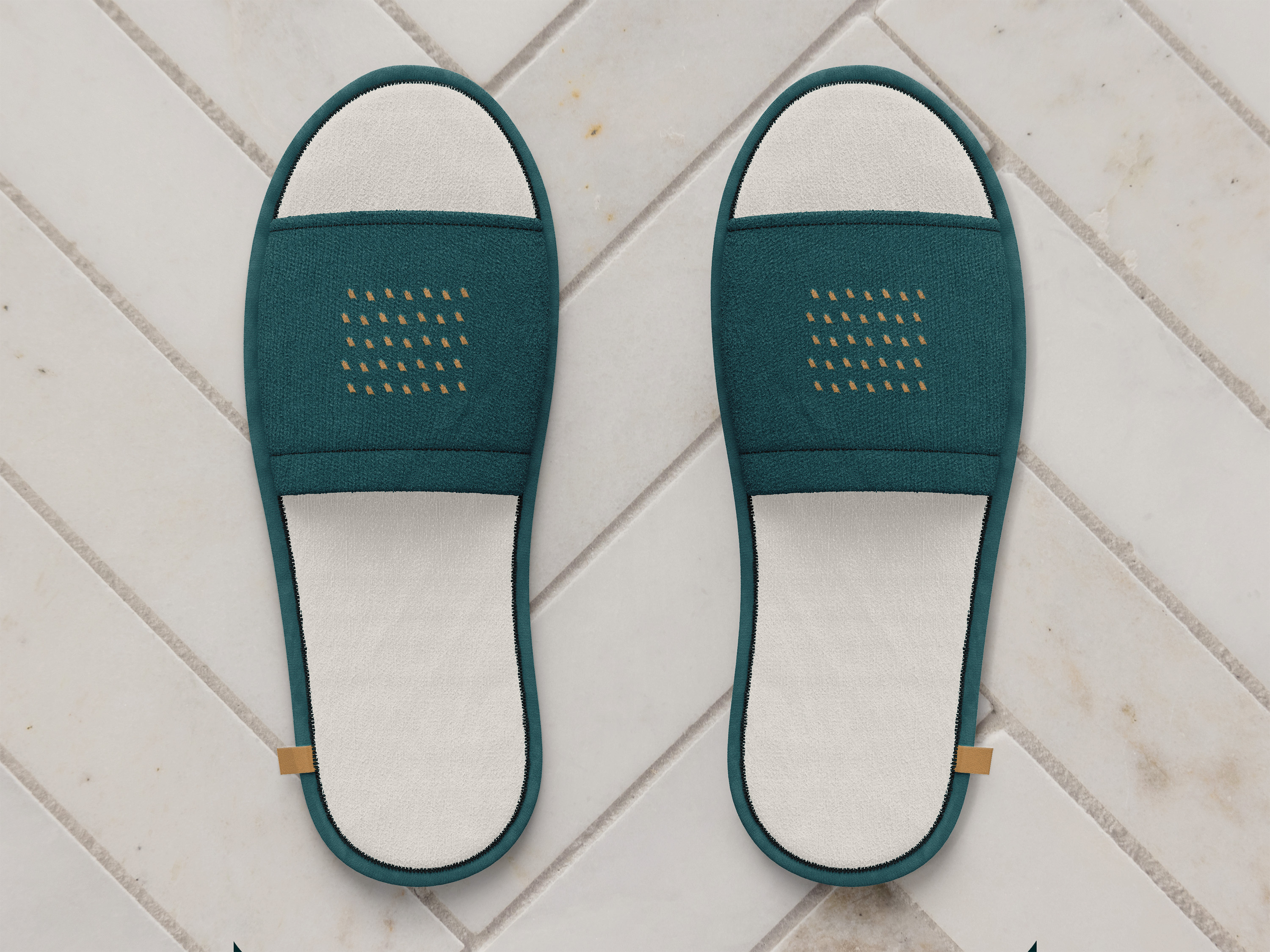
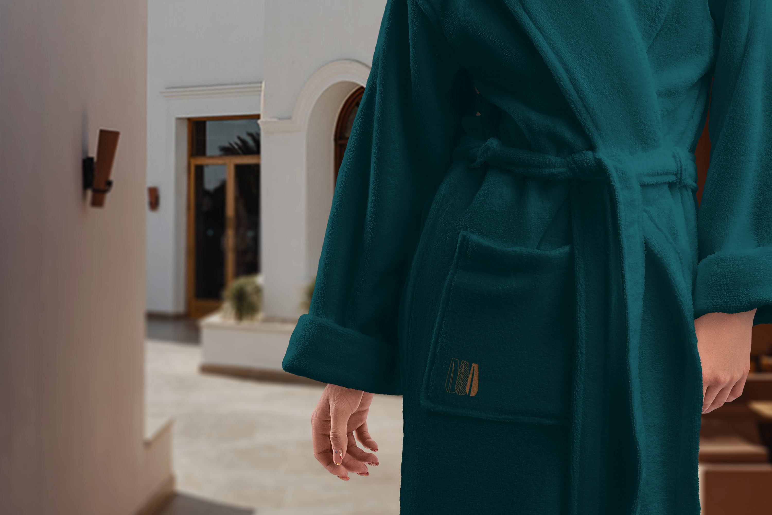
The harder test was product packaging and in-room amenities, where the brand has to read at a glance and hold up next to the resort’s own materiality: bath products, robe embroidery, diffuser.

Before & After

Key Metrics

Project Metrics

Outcomes