Vantage West Credit Union
Vantage West had built 60 years of trust with its members as a local, personable credit union, but its website didn’t carry that reputation online. The site was functional but redundant, with unclear navigation and key member journeys buried several clicks deep. Every decision also had to clear the credit union’s compliance and legal review, a layer of scrutiny most consumer redesigns don’t face. The mandate: modernize the experience and put member stories at the center of the site, without losing the familiarity members had come to rely on

Client:

Vantage West Credit Union
Industry:
Financial Services
Timeline:
March 2025 – December 2025
Role:
Head of Creative — the primary design voice across a year-long, agency-wide effort significant enough that the agency’s own CEO stepped in as project manager. Directed a subcontractor team through a 70+ page system build and stepped in personally wherever the work outpaced existing inhouse expertise.
Tools:
Elementor, Adobe Photoshop, Adobe Illustrator, Canva

Act 1

Prove the Direction

The 70+ page rebuild was planned as Phase 2 from the start, staggered so a new visual language could be proven on the homepage first. Concept mockups gave Vantage West’s team something concrete to react to: an early read on how a legacy brand with decades of built-up trust would respond to a modernized direction.

Key Decision

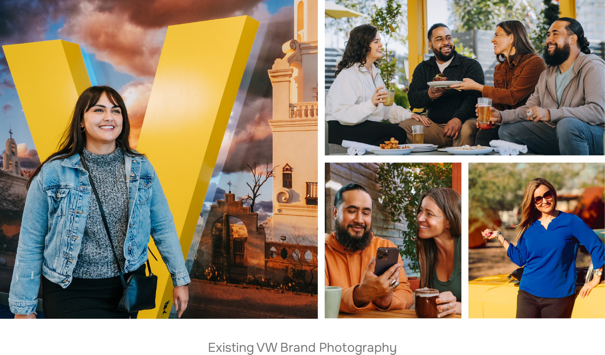
Sourcing a Brand's Voice

The Tension

Vantage West’s photo library was strong, but it couldn’t cover 70+ pages. Stock imagery was the obvious backfill, but generic photography risked flattening a brand built on feeling local and personable.

The Choice

Sourced supplemental photography against an internalized sense of Vantage West’s voice: proportion, warmth, tone, then made the case for each selection to the client. This happened dozens of times over the build, not once.

The Outcome

Every page needed to feel like it belonged to the members who’d trust it with their money, not just to the brand guidelines. Photo selection carried that weight on every page Vantage West’s own library couldn’t reach.

Key Decision

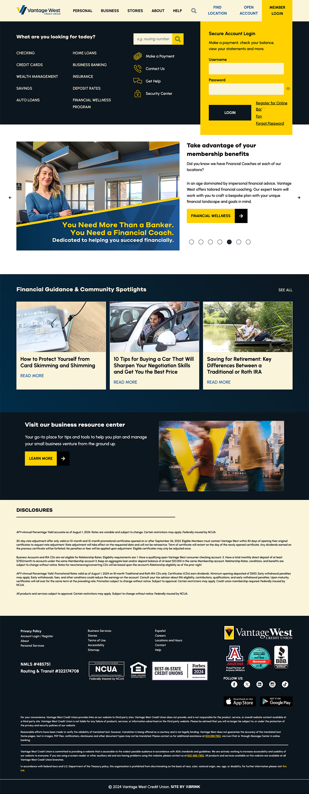
The Action Bar

The Tension

Personal Banking, Why Us, Mortgage, and Rates each linked to a wide field of services and tools, and a member could land on the right page and still not find what actually brought them there. Most pages didn’t have this problem, and a global fix would have cluttered the ones that didn’t need it.

The Choice

Built the Action Bar once, during parent-page design, and applied it only where a page’s next steps genuinely fragmented, leaving it off everywhere else. It shipped early enough that when Mortgage later turned out to need it too, the component was already there.

The Outcome

It’s the piece of the site closest to the brief’s real mandate. A member’s reason for visiting Personal Banking often has nothing to do with another member’s reason for being there, and the site needed to answer both without either one hunting for it.

Key Decision

Creating a dynamic, content-driven template

The Tension

Scaling to 70+ pages meant handing volume to a subcontractor team — but that only works if every location page can be built the same way. A generic template invites the kind of inconsistency that breaks a system at scale, and any friction in the base build would repeat across every page a contractor touched.

The Choice

Built a single dynamic post type that could take on any location’s content, and personally handled all the underlying troubleshooting before handoff — so the subcontractor team was extending something that already worked, not debugging it as they went.

The Outcome

It moved quality control from “catch mistakes after they happen” to “make the mistake impossible in the first place.” Contractors could move fast without inconsistency creeping in page by page, and it kept the archetype system’s integrity intact while delegation ran at full speed.

Key Decision

Closing A Knowledge Gap Myself

The Tension

Tech Support was already carrying its share of the build. The mega menu still needed real front-end problem-solving outside my usual scope, including a perpetual notification animation built entirely in the brand’s own colors.

The Choice

Researched and planned for what the animation needed instead of pulling an already-stretched team deeper into a solvable problem. I built the solution based on my findings and tested it thoroughly before showing the client.

The Outcome

The solution was simple, but finding it myself is what mattered for multiple stakeholders; it quickly delivered exactly what the client wanted to see, and it kept the load off a team that didn’t have the bandwidth.

Key Decision

Fixing the Real Problem

The Tension

Legacy posts were built as orphaned pages with no clear way in, a content architecture problem sitting inside what was scoped as a straightforward migration.

The Choice

Designed a new Knowledge Base archive with global search and category sub-archives instead of recreating the old structure inside a new template.

The Outcome

It solved the findability problem members were actually hitting, and cleared years of backend content debt in the same move.

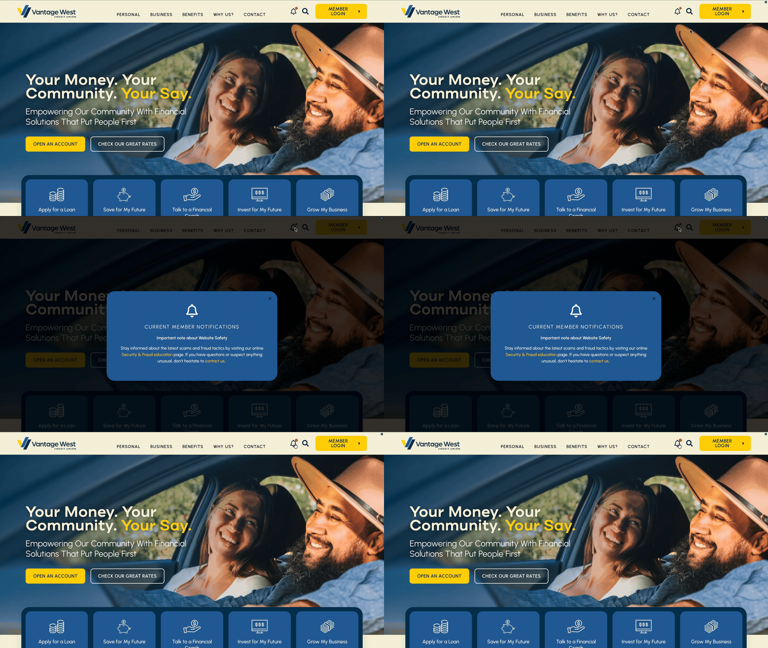
Comparing Original & Improved Homepage Designs

Original Homepage

Redesigned Homepage

Single image pair, homepage only, the clearest before/after proof on the site.

Showcase 1

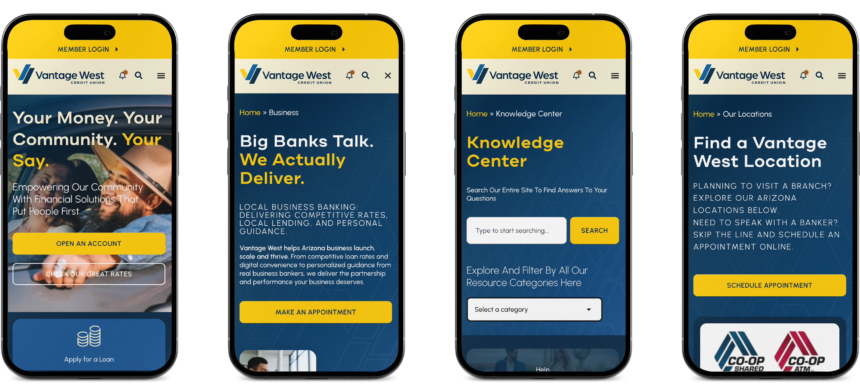
Built for Every Screen

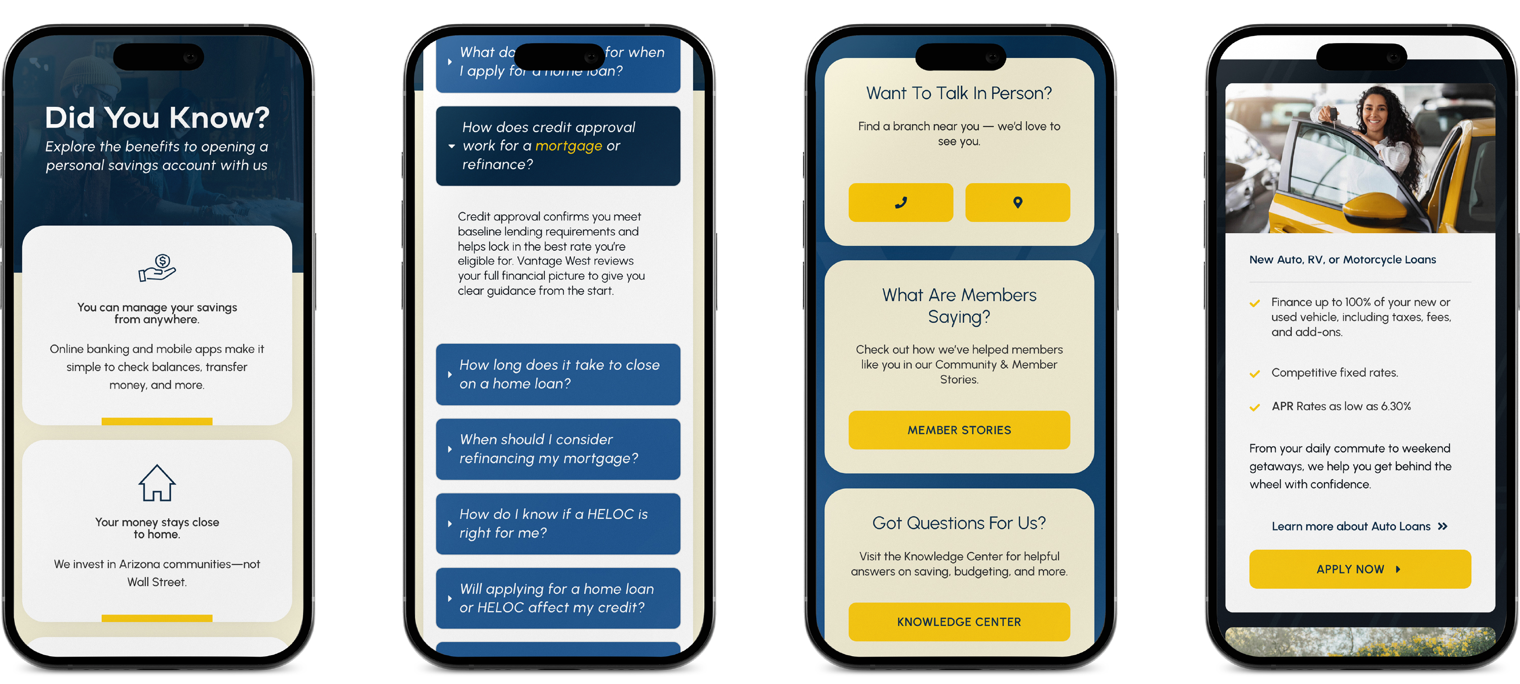
The design language held steady across every key page on mobile, the same attention to detail in the smaller moments as in the big ones, not a stripped-down version of the desktop experience.
Mobile versions of main parent pages as seen earlier. Select user interaction moments down page.

Showcase 2

Built Around Real Member Stories

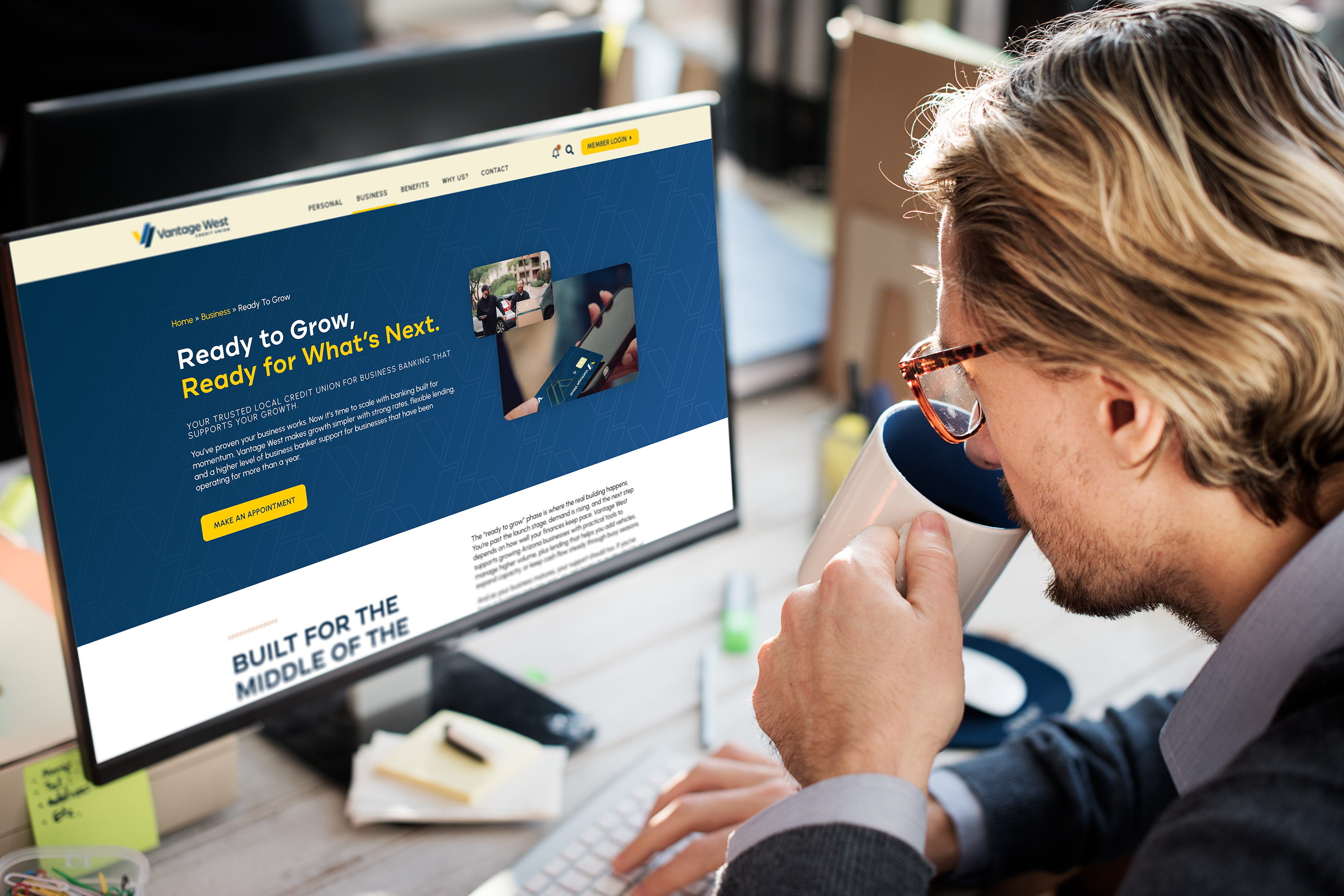
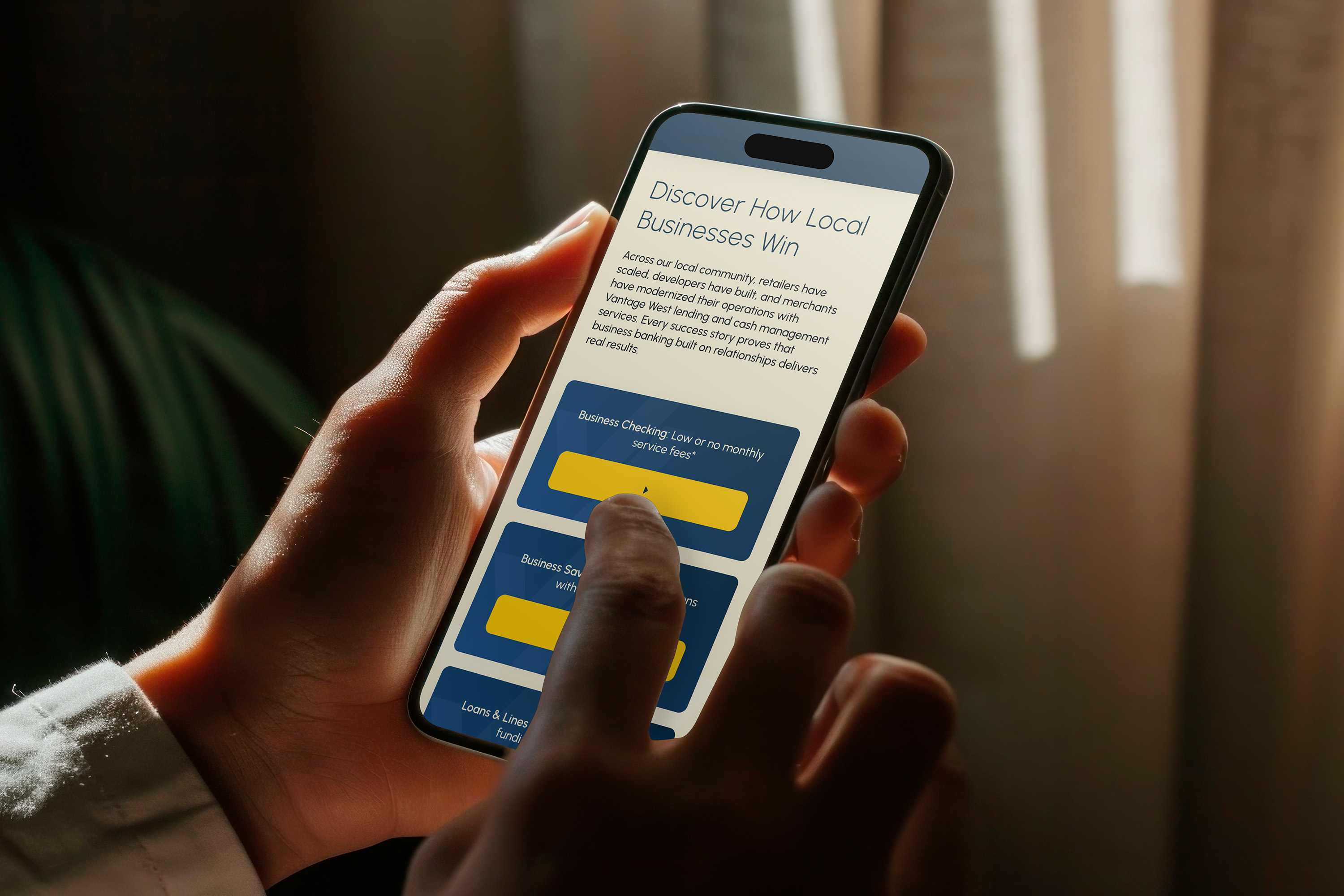
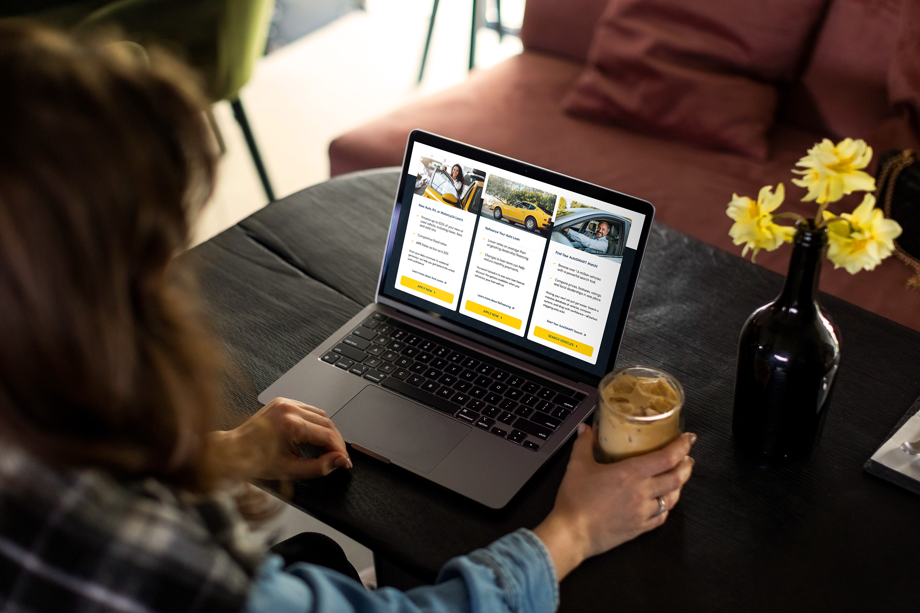
Every archetype above was tested against a specific reason someone was on the page: a member checking an account before dinner, a small business owner comparing rates between customers, someone looking up a form on a break. The system had to hold up in those moments, not just in a browser tab.
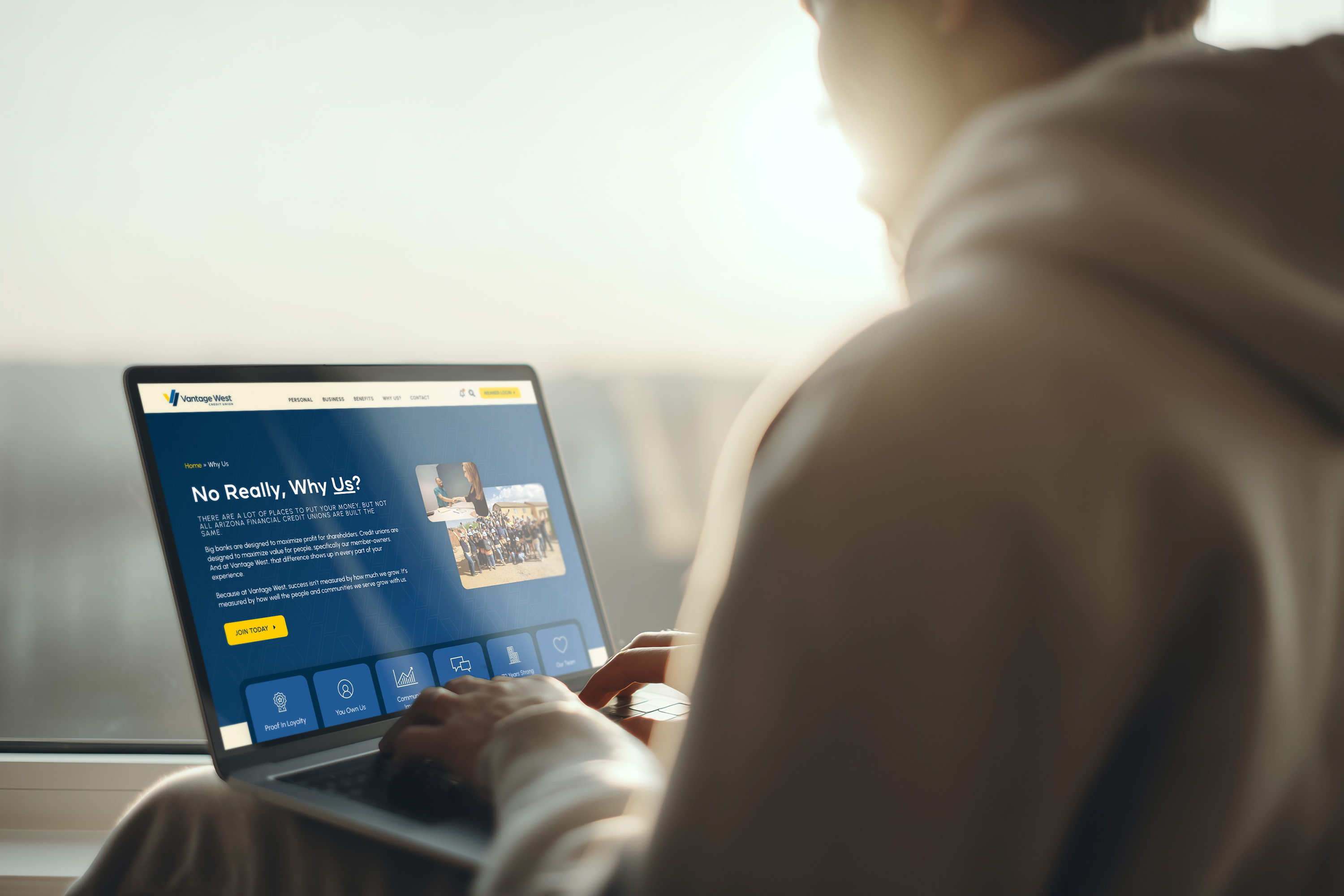
The full site build in the wild, captured from the perspective of real members in their normal environments.

Key Metrics

Post-Launch Project Details

70+

Pages redesigned

+58.6%

Core Web Vitals (2026)

+161%

Organic key events (YoY)

Organic figures compare Dec 10, 2025 – Feb 4, 2026 to the same window one year earlier. Isolated to Organic Search specifically since Paid Social/Display spend changed materially year-over-year and would confound a site-wide traffic claim.

Outcomes

The redesign shipped on time despite its scale, with a dedicated support window right after launch to test the new site in production. The agency’s relationship with Vantage West has continued since through ongoing marketing and technical work, real trust for an engagement this large and this close to the client’s core brand. A year out, the numbers back up the original mandate: organic visitors spend significantly more time on the site and convert at a much higher rate than before the rebuild. In a recent eight-week window, the site drove over 25,000 lead-generation events and nearly 5,700 appointment bookings, member actions the old structure was actively burying.