Draper Laboratory
Draper had just won a NASA contract to develop Positioning, Navigation, and Timing technology for the OSIRIS-REx asteroid sample return mission—real, mission-critical engineering. But Draper’s brand had seldomly existed as anything other than words on a page or pixels on a screen. For EP18, an internal expo meant to showcase Draper’s R&D work to the public, that was a problem: the company needed a way to make cutting-edge, highly technical work legible and credible to a general audience, and to do it through an object, not a slide deck.
What started as a request for an accurate scale model of the spacecraft concept became something closer to a branding exercise: could Draper’s visual identity, sharp, angular, defined by its carat mark, be translated into physical form rather than just applied to a surface?
Client:

Draper Laboratory
Industry
Aerospace R&D — internal engineering expo (EP18: Engineering Possibilities 2018)
Timeline:
Role:
Visual Designer — contributed ID sketch exploration, CAD development, and brand-to-form translation, collaborating with Draper’s Industrial Design team (Robert de Saint Phalle, Head of ID; Jeff Burrell, Lead Industrial Designer)
Tools:
Sketching, CAD, physical model fabrication

Process Step 1

Sketch & Brand Exploration

Working alongside Draper’s ID team, I contributed rounds of sketch exploration grounded in real spacecraft constraints, like sample arm placement, solar panel geometry, and sensor housings, while also pushing on how Draper’s brand language could live in the object itself. We tried a range of approaches for pulling Draper’s visual identity into the details. Some directions were stronger than others, and critique sessions helped narrow the field before moving into CAD.
Sketch exploration combined technical plausibility with early studies in translating Draper’s brand language into physical detail.

Key Decision

Letting the Brand Live in the Form, Not on It

The Tension

A technically accurate model risked reading as a generic engineering mockup with no brand identity; a heavily stylized one risked undermining the credibility of the real mission hardware it represented. Draper’s brand guidelines had no precedent for physical application to begin with.

The Choice

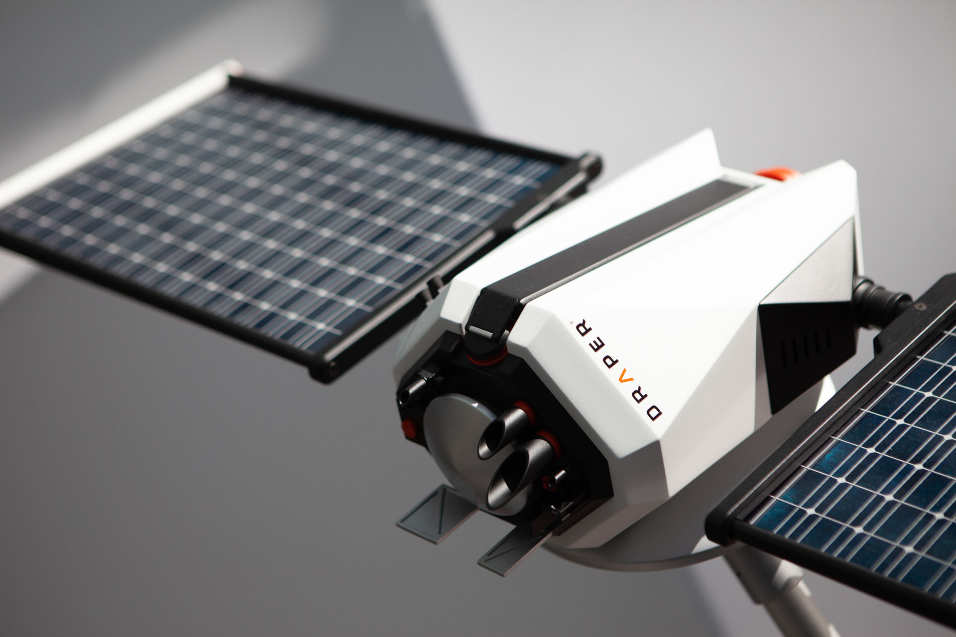
We grounded the primary form in plausible real-world spacecraft constraints, then expressed Draper’s angular, high-contrast brand language through faceted surfacing rather than applied graphics or a logo treatment. Material choices reinforced this: copper accents nodded to Draper’s red/orange mark while drawing on copper’s real precedent in aerospace hardware.

The Outcome

The model needed to do two jobs at once: prove Draper’s engineering was real, and make Draper’s brand feel physically inevitable rather than stuck on top of the object. Faceting and material language let both happen in the same form instead of competing for attention.

Process Step 2

CAD & Fabrication

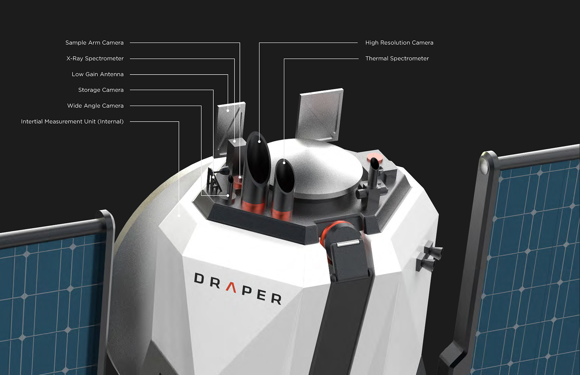
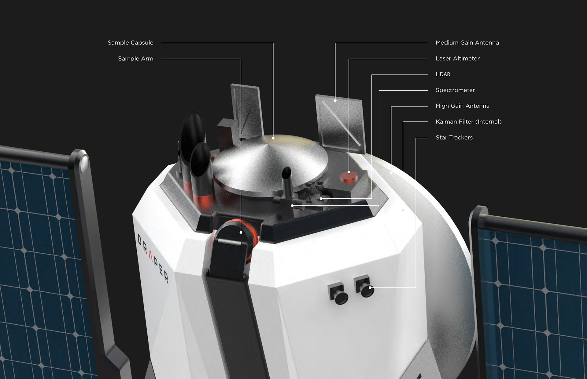
Selected directions moved into CAD, where sketch-stage ideas were resolved into buildable geometry, including detailing I carried through from early studies into final surfacing. The physical model was then fabricated and finished to match approved CMF specifications.
CAD development and physical fabrication, including component layout and finish work matching the approved material palette.

Showcase 1

The Finished Object

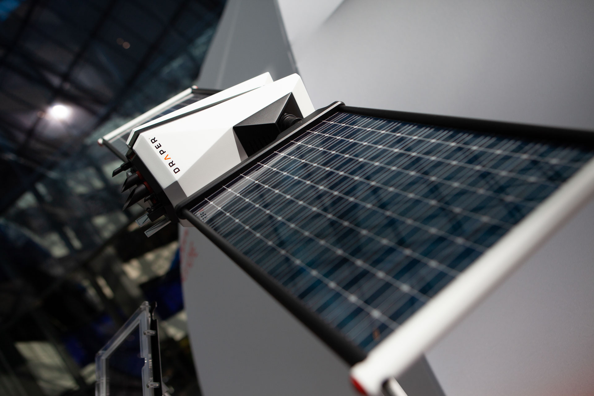
Studio photography of the completed model, detailing the faceted form language and material palette carried through from concept to build.

Showcase 2

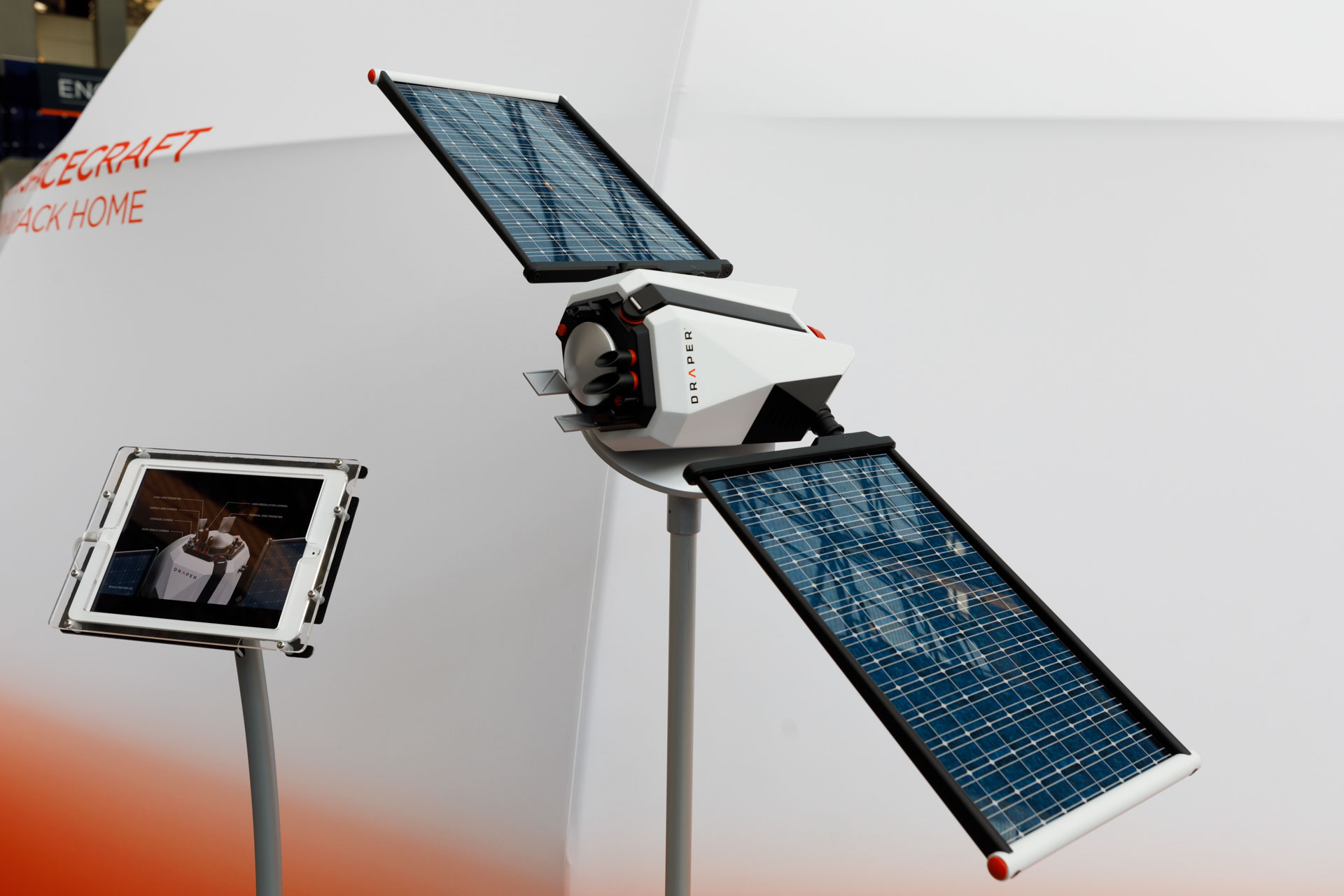
On Display at EP18

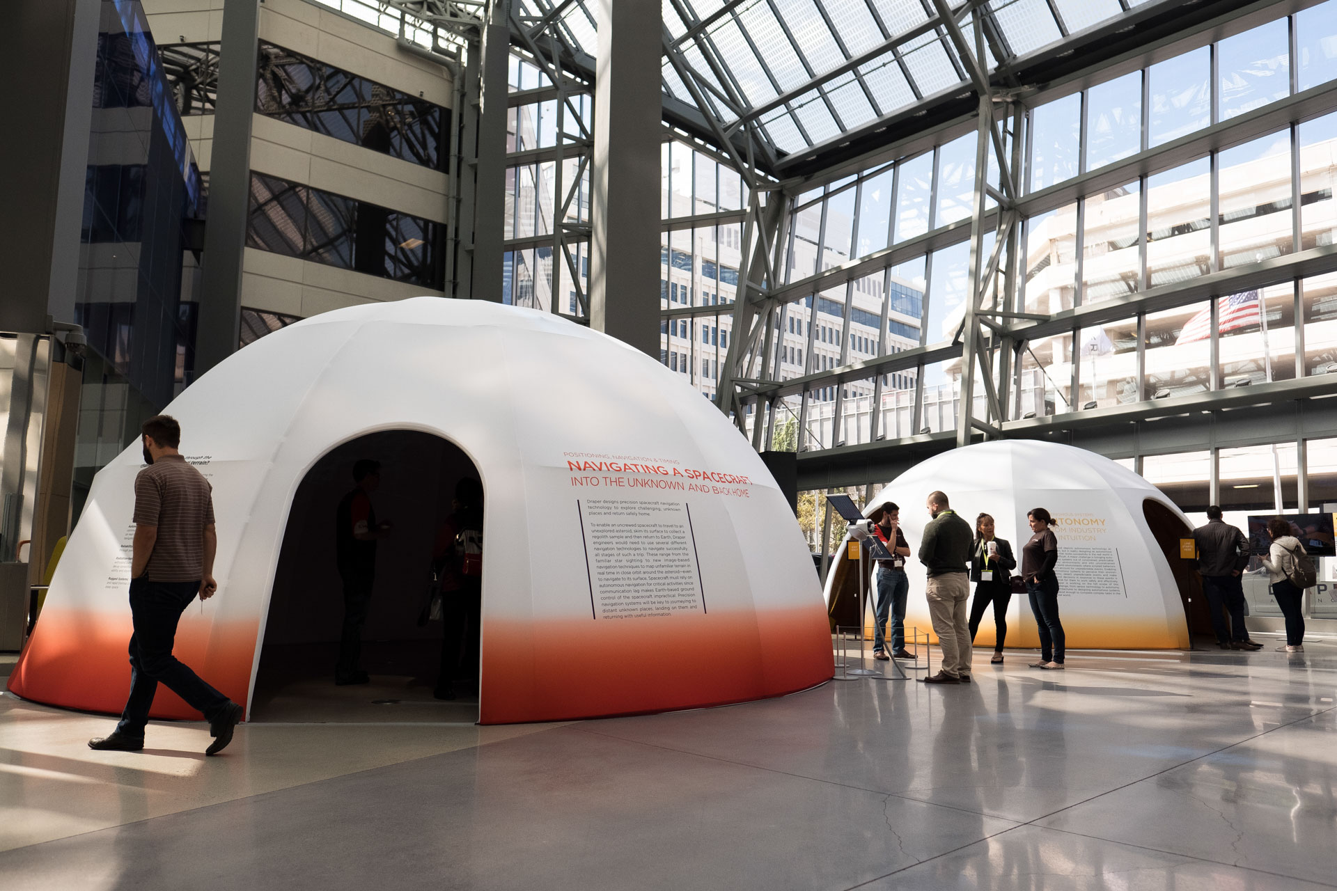
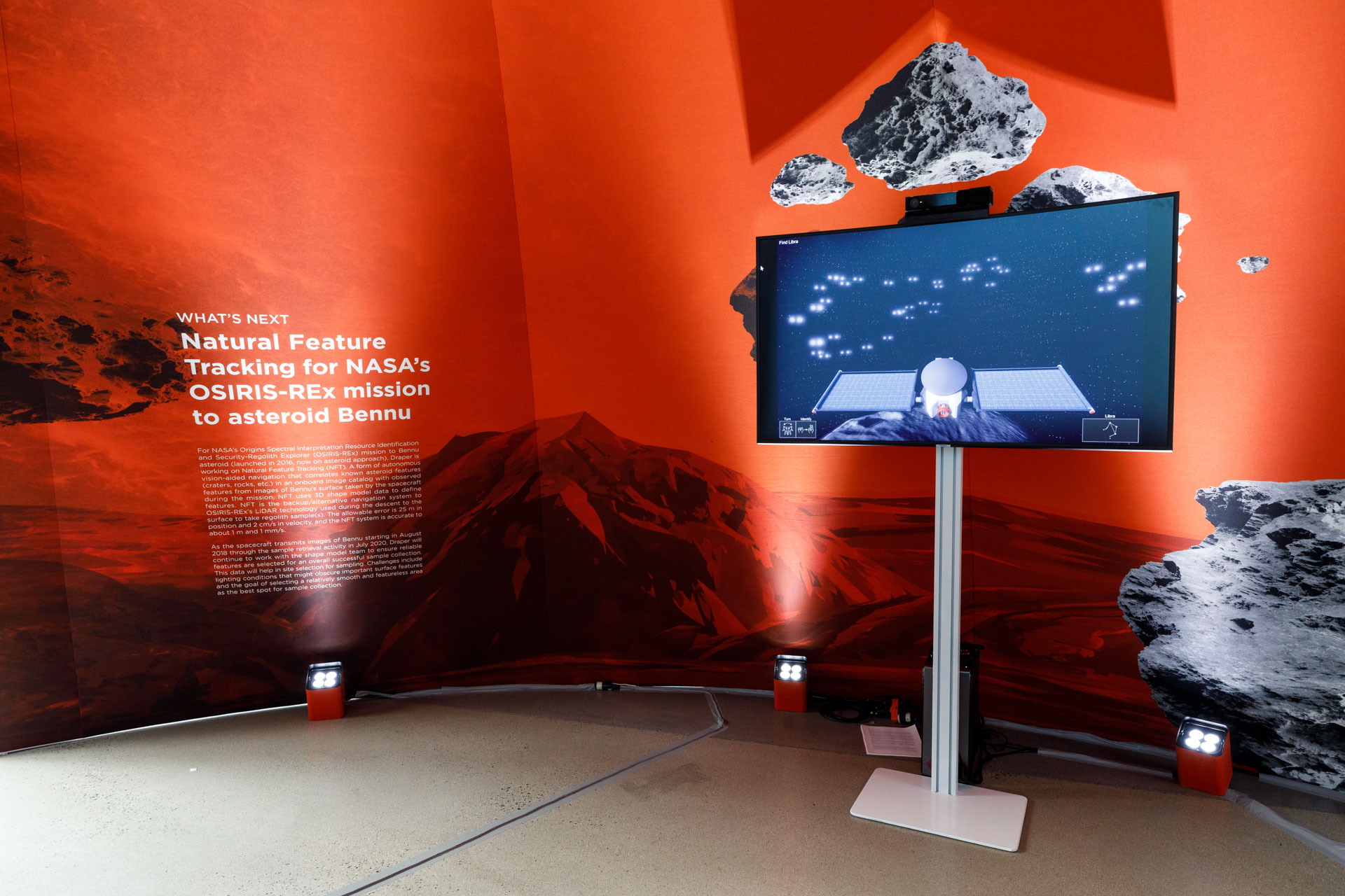
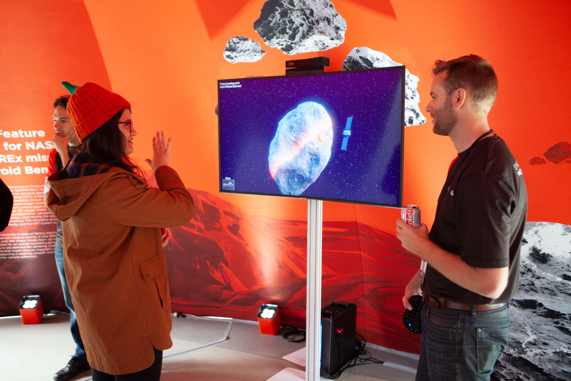
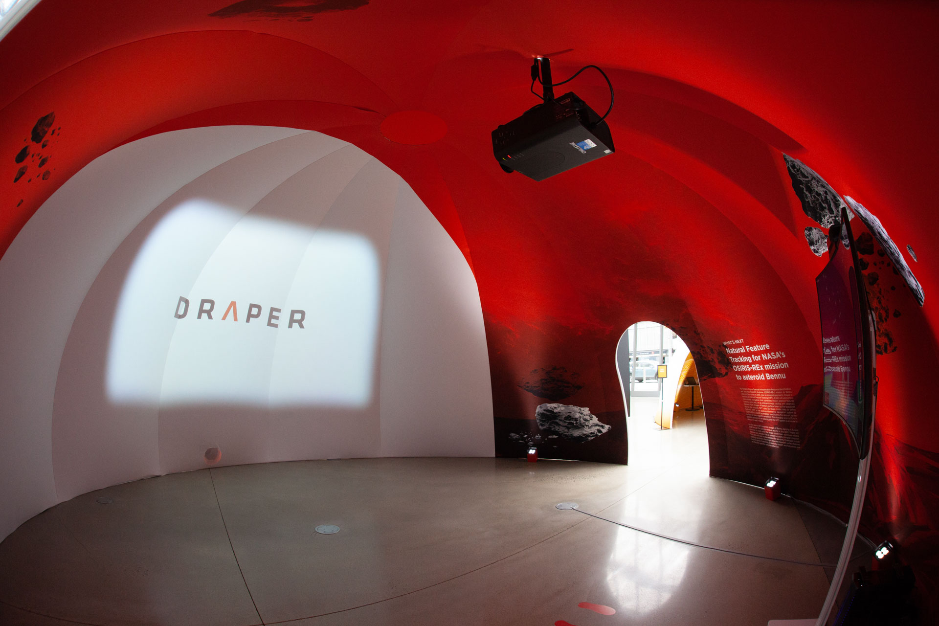
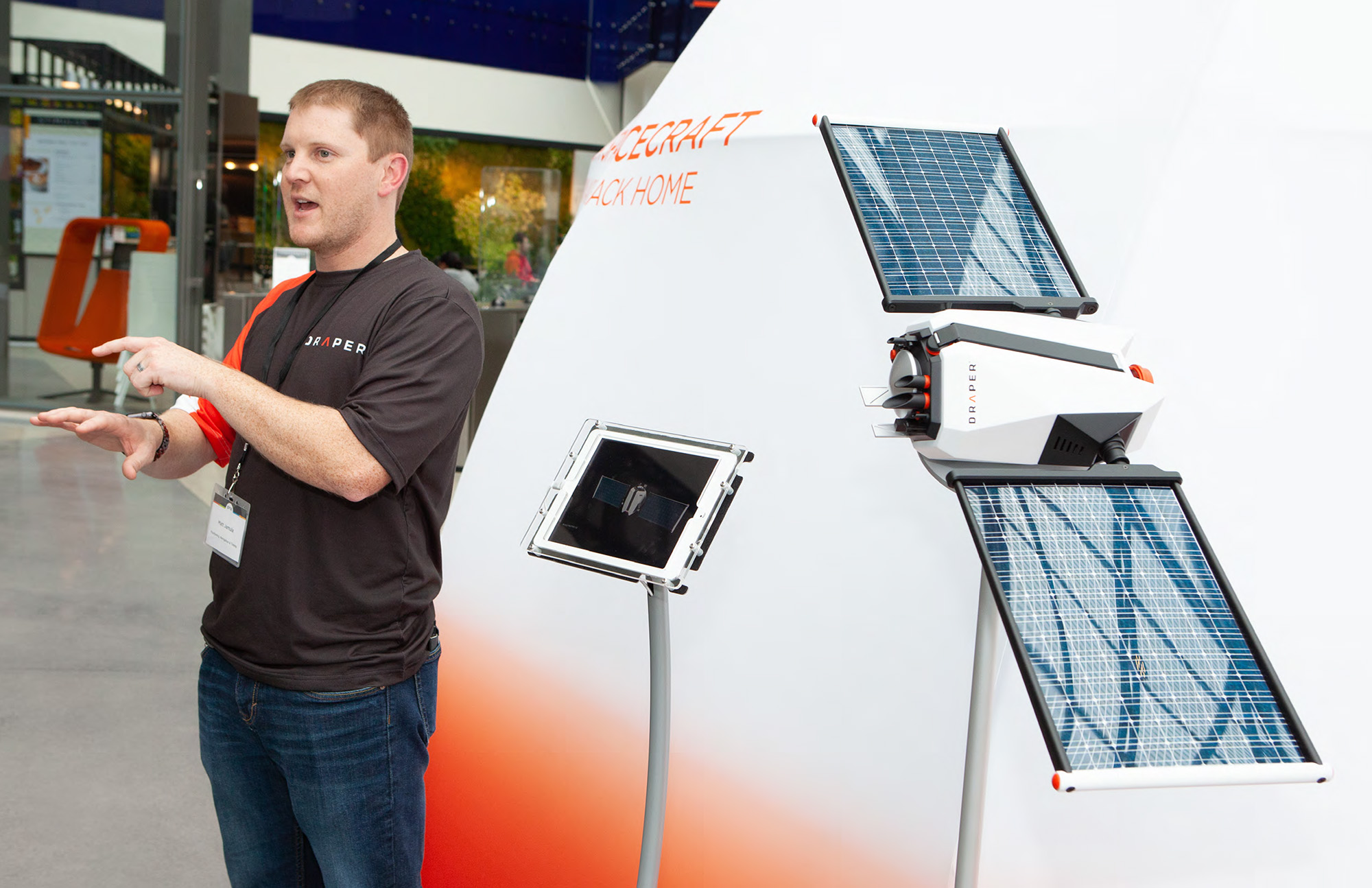
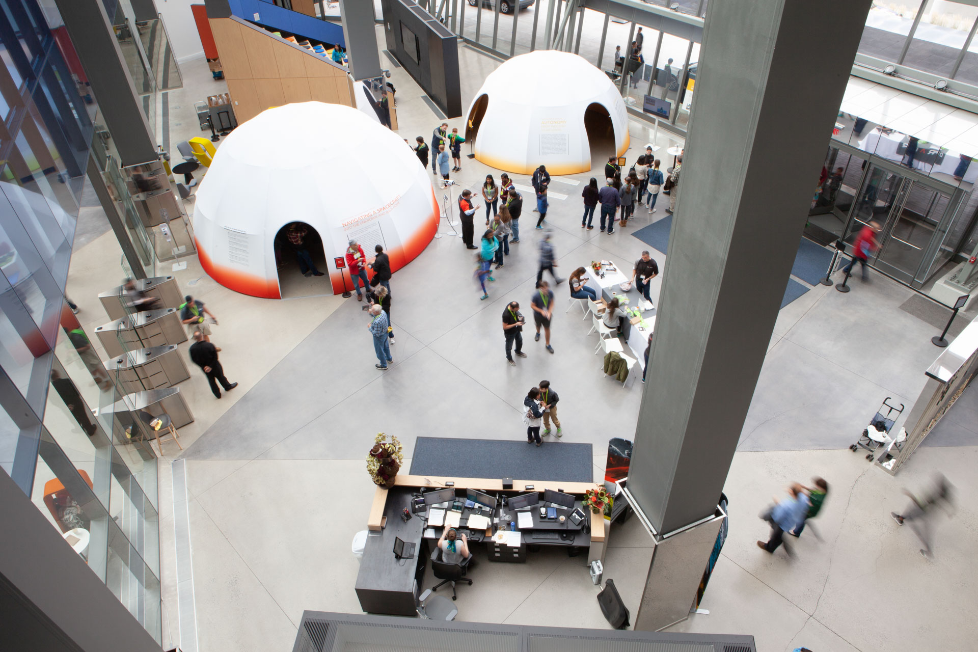
The model on display in Draper’s PNT experience dome, alongside the accompanying AR/technical presentation.

Key Metrics

Project Metrics

Outcomes

The model was well received by the public at EP18, and in the years since, following OSIRIS-REx’s successful mission, the technical details we worked to get right have held up. It remains one of the clearest examples in my portfolio of translating a brand’s visual identity into physical form rather than treating brand as a surface-level application.