SUMMITS, Inc.
SUMMITS was building a new category, AI-powered nutrition fulfillment, on top of a logo mark with unintended associations and no visual playbook to follow. As the sole designer, I was brought in to resolve the mark and stayed to build what it needed to live inside: a system that could earn credibility with investors and customers at the same time, and hold up once the SUMMITS team was running it without me.
What began as brand triage on a single logo grew into a full identity system and its rollout across the business, from color, type, and pattern to photography, packaging, and out-of-home concepts.
Client:
SUMMITS, Inc.
Industry:
A Venice Beach, CA startup building an AI-powered nutrition fulfillment platform for both consumers and businesses.
Timeline:
Fall 2024 to Summer 2026
Role:
Sole designer. Brand strategy, logo, color and type system, pattern and texture development, photo direction, guidelines, and rollout support.
Tools:
Figma, Adobe Illustrator, Adobe Photoshop, Midjourney
Live URL:
Act 1
Project Context & Brand Intake Process
Early brand work centered on placing the raw, existing SUMMITS brand in the spotlight and examining the foundation I was building off of. This process revealed pain points and framed my approach to defining the logo mark, as well as broader brand positioning opportunities for a burgeoning startup in the AI and Nutrition space.

Brand Positioning
Finding Scalable Strengths in an Inherited Mark
The existing mark I was handed had strong characteristics despite its potential association: minimalism, movement, and proportion. Rather than ignore these traits, I used them to fuel research into other major brands that embodied them. These insights were then channeled into brand archetypes I could build a modern, disruptive brand around.
Key Decision
Setting Firm Constraints to Claim Disruptor Whitespace
The Tension
SUMMITS was entering uncharted waters with a product that didn’t fit neatly into an existing category. With no established competitors to measure against, there was no visual playbook to follow.
The Choice
I set firm constraints from the start: minimal, simple forms that balanced the synthetic and the organic. Every concept that followed had to work within those guardrails.
The Outcome
The most successful disruptor brands give themselves room to breathe. Keeping the system restrained left space for users to see themselves in it, which mattered for a product meant to fit into their everyday lives.
Logo Exploration
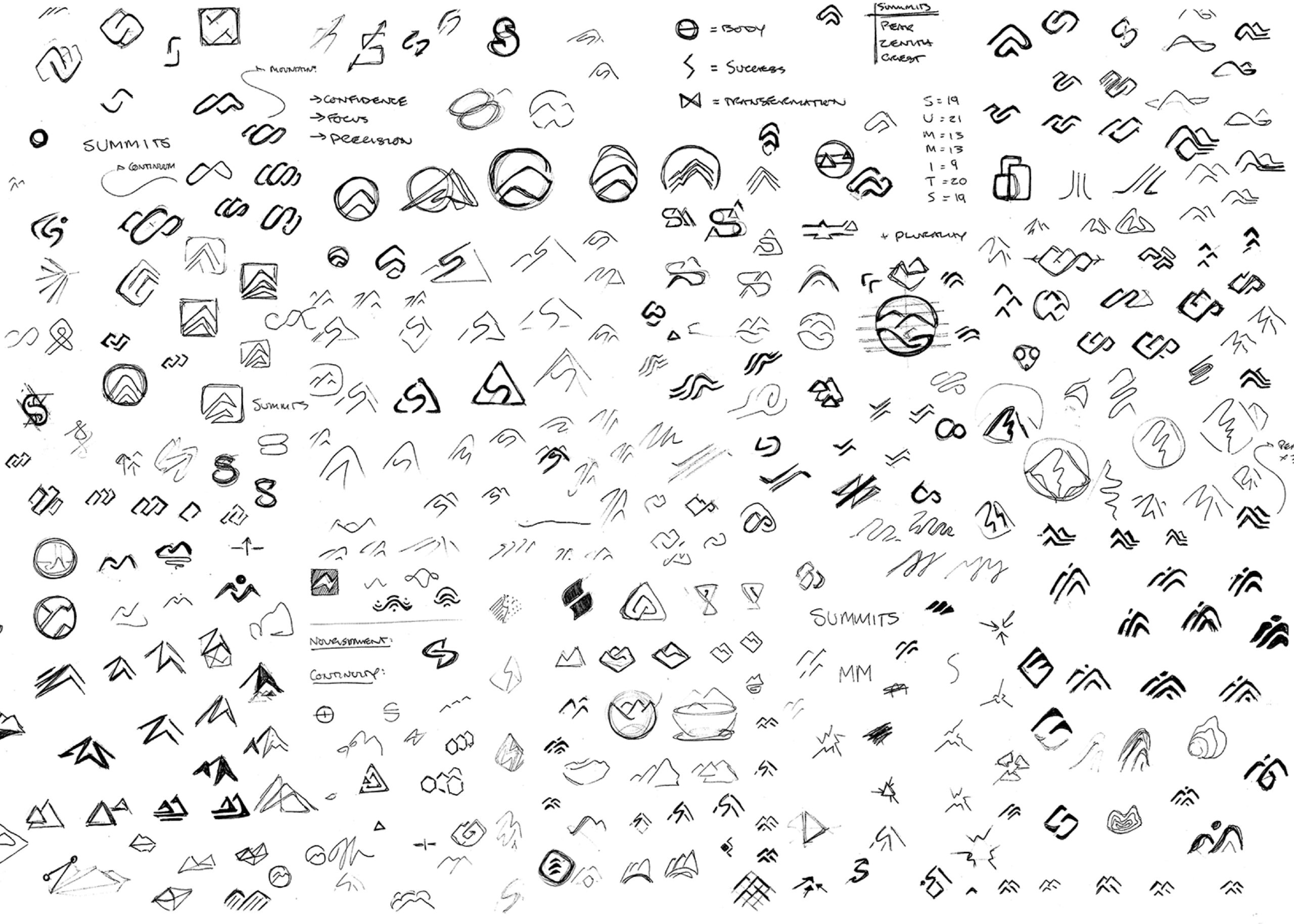
Sketching Toward a Synthetic and Organic Balance
With a rough but concise outline in mind, I put pen to paper working through early ideas in sketch form. Form studies in this stage centered on finding the perfect balance of synthetic and organic; a reflection of the brand’s own real-world positioning. Ultimately, while these explorations did not yield a finished mark, they did signal a need to push the explorations into new territory.

Logo Refinement
Returning to the Sketchbook to Find the Final Form
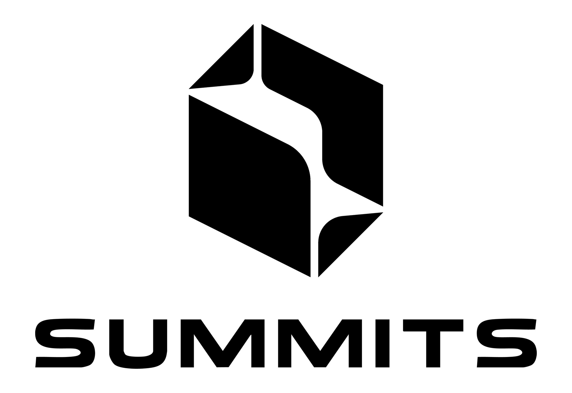
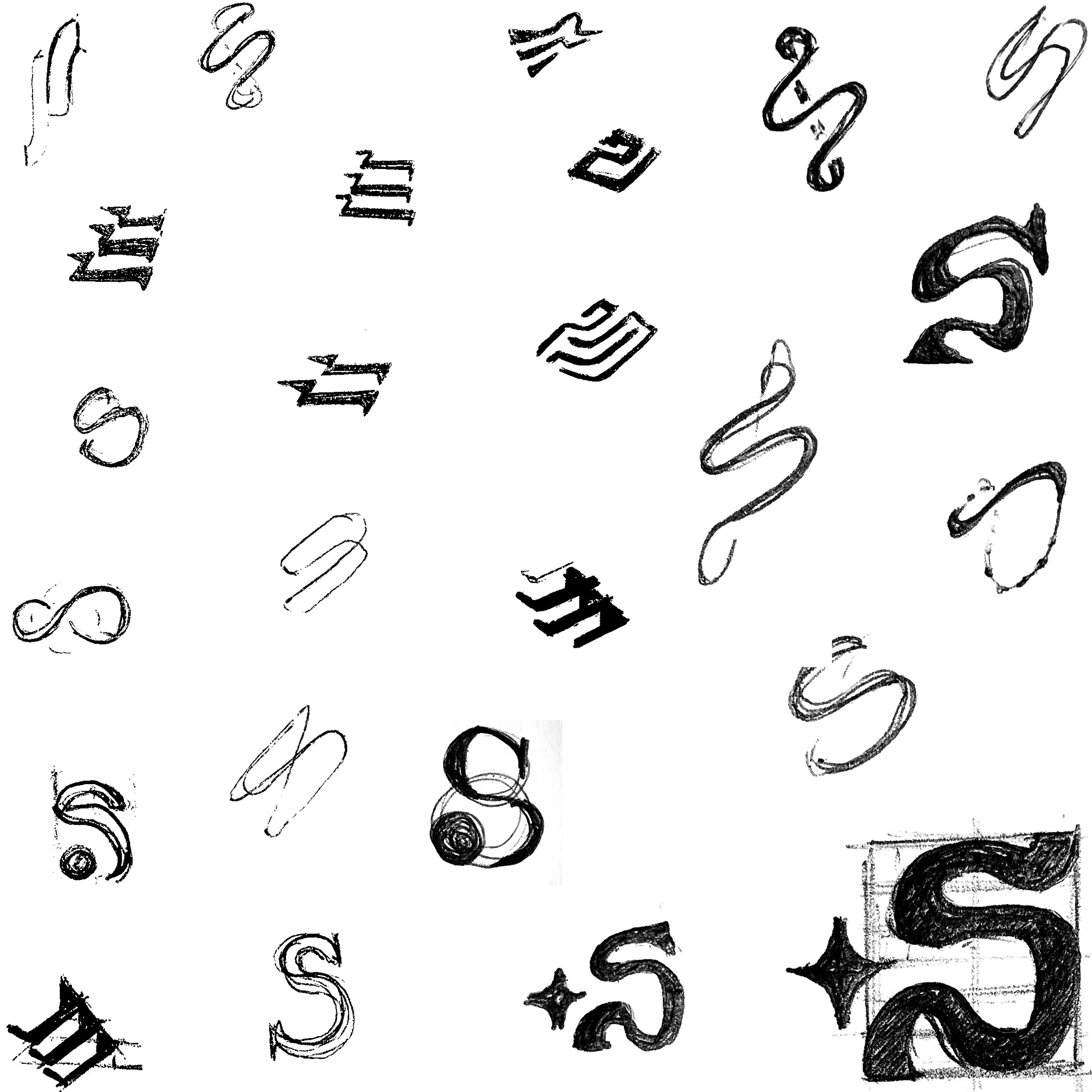
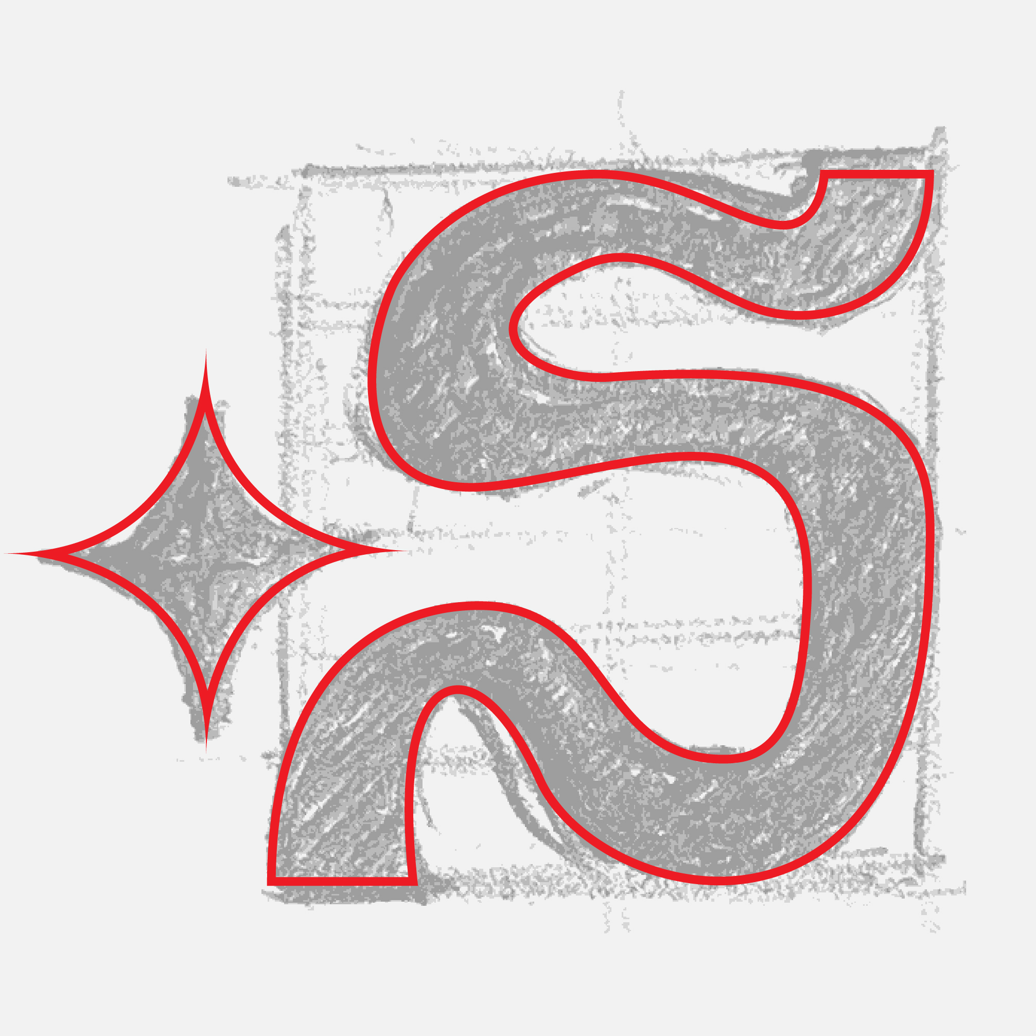
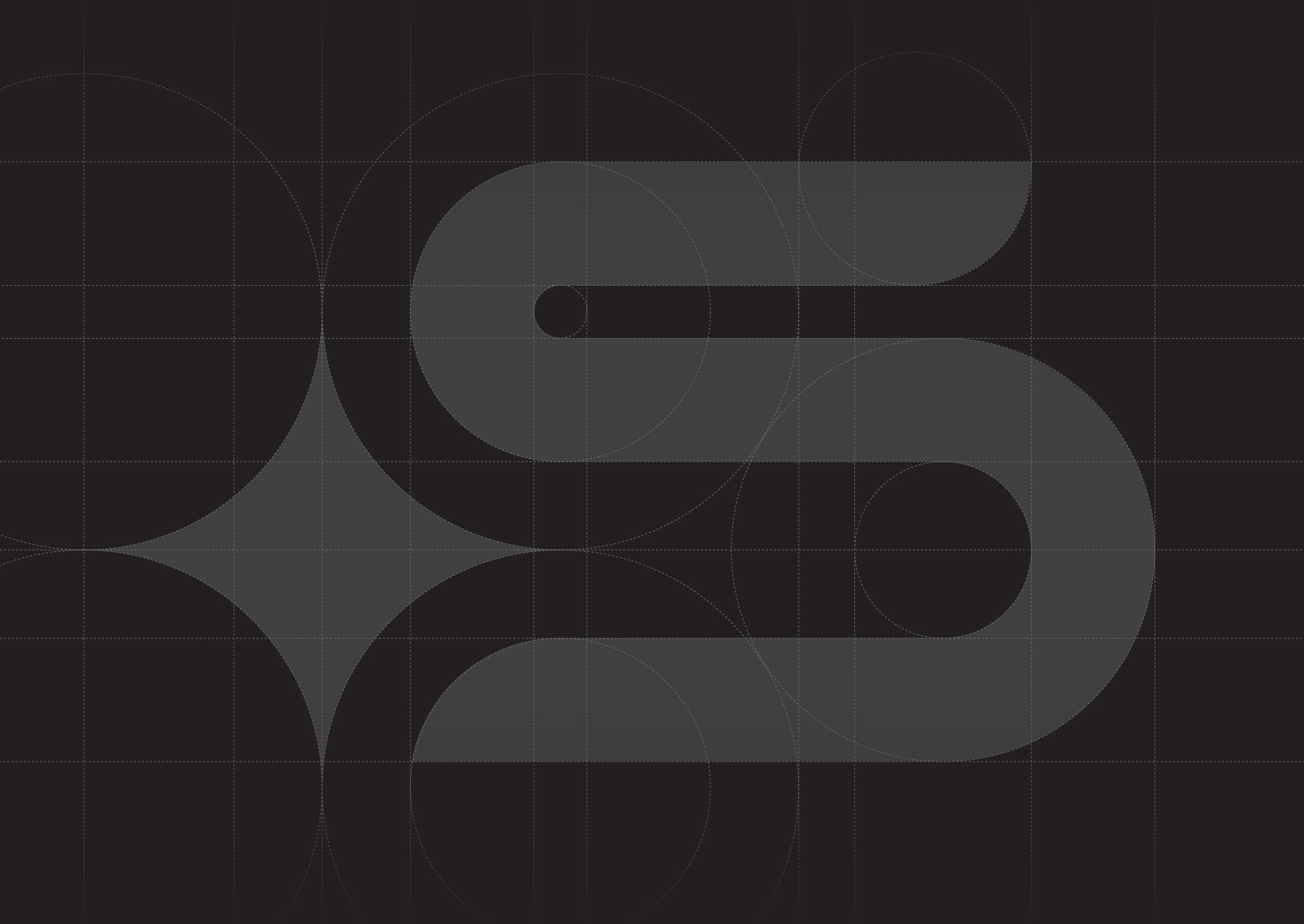
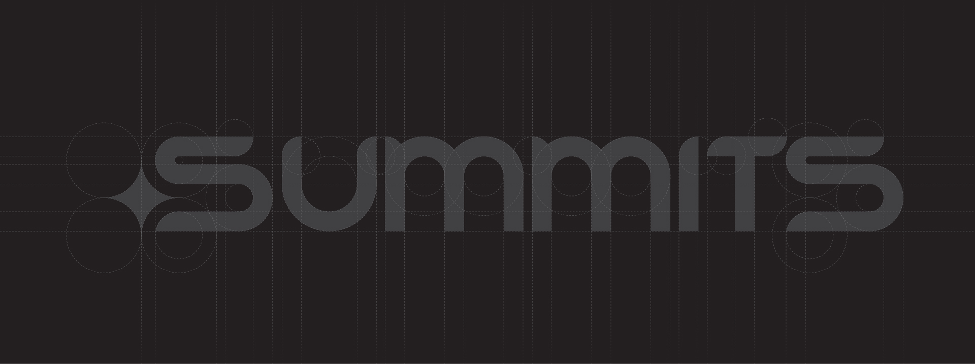
Holding the brand in mind without seeing it felt like an itch I could not scratch. This itch, however, led me back to my sketch book where, inspired by “human-leaning” brand marks, I arrived at a unique form that felt like it spoke to the SUMMITS brand: a distinct “S” shape with a small four-pointed star. Continued iteration resulted in the final, isolated mark along with a custom, full-type lockup.

Key Decision
Using the Four-Pointed Star to Signal AI at First Glance
The Tension
SUMMITS sat in a burgeoning industry where AI was quickly becoming the headline. The brand needed to capitalize on that proximity and signal it immediately.
The Choice
I built the mark around a cultural archetype viewers already associate with AI: the four-pointed star. Pairing it with the “S” form tied that familiar shorthand directly to the SUMMITS name.
The Outcome
Even without context for the brand, viewers could infer an AI connection at first glance. The mark did the explaining before a single word of copy was read.
Act 2
Expanding The Fundamentals
Landing on the final mark was a turning point in the process that unlocked new ideas for how to push the core SUMMITS ethos forward. Color, typography, and visual systems developed in this process were focused on bringing the brand to life—both to differentiate, but also to allow users to see themselves reflected.
Color & Type Systems
Trading a Crowded Palette for a Single Flagship Yellow
During the early logo process, I experimented with colors provided during intake. Yet as the brand shifted, it became apparent that a new color system was necessary to match positioning. The refreshed palette swapped numerous primary colors for a single flagship yellow and added a selection of neutral accents, allowing photo content to provide additional color. Typography selections mirrored this minimalism with high-contrast, modern typefaces.
Pattern Development
Extending the Star Into a Signature Pattern
As I explored tactile concepts, I became fascinated by luxury fashion brands that had evolved their iconic marks into equally iconic patterns. Inspired by this, I explored varying tessellations of the SUMMITS star, each pushing the boundary of recognition. While subtle, these abstractions offered a method of expanding brand recognition beyond the mark alone and reinforcing its presence in the real world.
Key Decision
Hiding Easter Eggs to Grow a Movement
The Tension
As a disruptor, SUMMITS had real potential to become a household name. Getting there would take more than putting a logo on a product.
The Choice
I positioned the brand as a movement first and a product second, using subtle touchpoints like the star pattern to carry its presence into everyday moments.
The Outcome
SUMMITS is defined by collective moments. Giving users Easter eggs to find makes recognition feel personal, and every discovery deepens their connection to the community around the brand.
Act 3
Brand Beyond The Mark
The silhouette of the brand had come into focus, but elevating what I had built beyond the fundamentals was what pushed it to new heights. As a B2C and B2B platform, first impressions were a critical consideration for SUMMITS, both for investors and users alike. Defining how the brand looked and felt beyond the mark was what brought the entire experience full circle.
Photos & Brand Imagery
Building Photo Criteria Around Real-World Moments
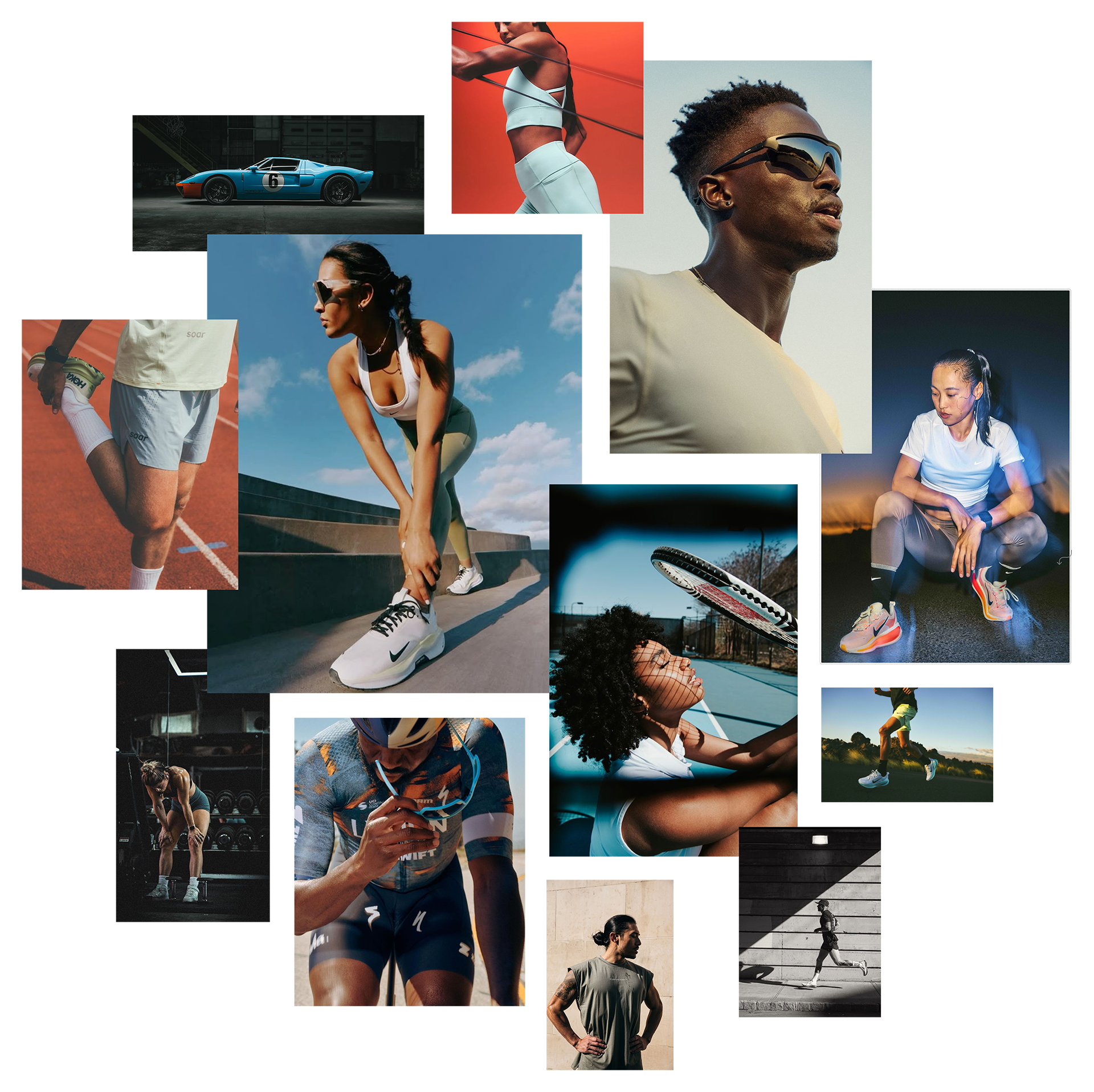
The SUMMITS experience existed in real-world moments that needed to be reflected in any photos or imagery tied to the brand. I established specific photo criteria to reinforce a connection to the target audience: high-contrast, candid, narrative-forward compositions. AI and Photoshop were leveraged to create visual metaphors that explained systems that didn’t exist yet.
Texture & Material
Following the Shift Toward Tactile Brand Treatments
Over my time working on the core assets, I had noticed a growing trend of major brands using “tactile” visual treatments for greater visual impact. Glassmorphism, Liquid Chrome, and 3D Design were all aesthetic styles that lent themselves to the cutting-edge nature of the SUMMITS platform. Inspired by the sense of realness these treatments imparted, I explored varying methods of expressing the brand through these real-world material mediums.
Key Decision
Earning Instant Credibility Through Modern Texture
The Tension
First impressions mattered for a platform speaking to investors and users at the same time. The brand needed to connect with a modern audience the moment it appeared.
The Choice
I expressed the brand through textures and imagery that read as “of the moment,” using glass, chrome, and 3D treatments to give the mark a sense of physical presence.
The Outcome
Placed next to competitors, SUMMITS read instantly as a cutting-edge brand. That credibility gave a young startup the polish of a far more established company.
Catering Touch Points
A Proving Ground for the System
Catering put SUMMITS directly in front of customers, making it a natural proving ground for the system. Posters, order forms, and packaging stickers each carry the flagship yellow and star motif, while universal and meal-specific sticker options let the system flex across orders without losing consistency.
Brand Adoption & Governance
Holding Up Without Me in the Room
Once the guidelines and assets were in the hands of the SUMMITS team, the brand had to hold up without me in the room. The site, social content, and LinkedIn posts show the system in day-to-day use, while photos from the storefront and events bring earlier renders into the real world. Employees in swag, customers carrying orders, and details as small as the POS screen and order slip show just how far the system reaches.
Out-of-Home Ad Concepts
Envisioning The SUMMITS Brand at Scale
These conceptual ad mockups explore how SUMMITS could show up at out-of-home scale. Every scene draws from urban, Los Angeles-inspired settings to keep the brand’s world consistent from one placement to the next. Across billboards, street walls, and transit shelters, the candid photography and metallic textures developed earlier in the process hold their impact at a glance, which is exactly where out-of-home advertising has to work.
Outcomes
The unintended associations that started the engagement were resolved through a full identity rebuild, and the system that replaced them carried SUMMITS from launch into the real world. The app launched on iOS and Android in October 2025, followed by a first physical location in Venice Beach where the brand now lives on storefront signage, catering, and point-of-sale screens. Ten months after launch, SUMMITS secured an automated-kitchen partnership with Hyphen, earned a spot on FITT Insider’s 2026 Top 50 Wellness Startups list, and landed trade press features across two outlets. A funding round is actively closing. Investors, customers, and a team running the brand without me all met the same system.