Halcyon Resort & Spa — Self-Directed Identity Project · Davenport, CA (fictional)
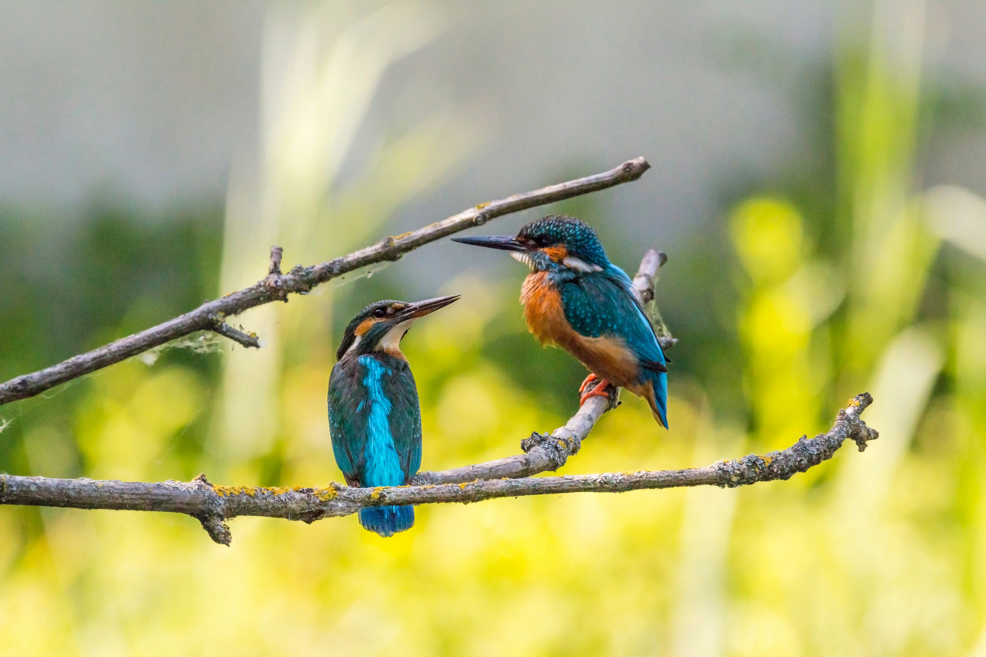
Halcyon Resort & Spa is a self-directed identity project built to push into a category with zero prior professional exposure: hospitality. It was treated like a real client engagement from day one, a full brand built from a blank page, naming, mark, system, and applied collateral, with no existing equity and no client feedback to react to. The name comes from Alcyone and Ceyx, a myth about transformation, and that became the concept for the whole project: carry a literal image, a kingfisher, through to an abstracted mark and a complete guest amenity system without losing the thread.
Client:

Halcyon Resort & Spa — Self-Directed Identity Project · Davenport, CA (fictional)
Industry:
Hospitality & Wellness
Timeline:
Summer 2021 (approx. 10 weeks, self-directed)
Role:
Sole designer — full scope: research, naming rationale, logo development, color and type systems, applied collateral across stationery, amenities, and digital
Tools:
Hand Sketching, Photoshop, Illustrator

Process Step 1

Naming & Brand Territory

The name predates the project and carries its own rationale: Alcyone and Ceyx, the Greek myth of a storm calming into stillness, mapped directly onto a resort built around recovery and self-care positioning.
Early naming rationale and category positioning.

Process Step 2

Concept Exploration: Literal Bird To Abstraction

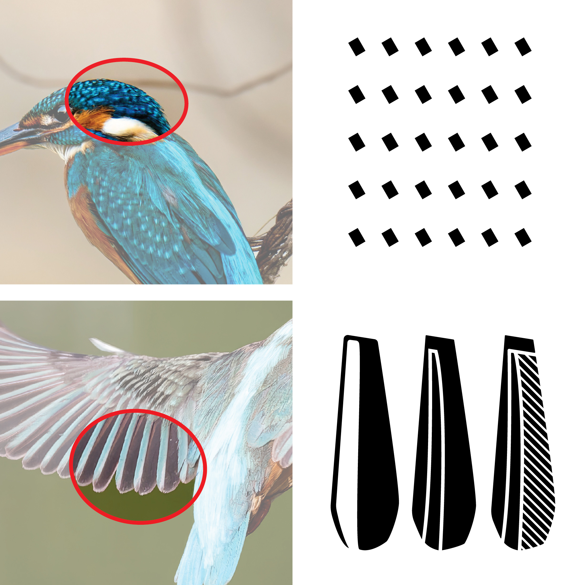
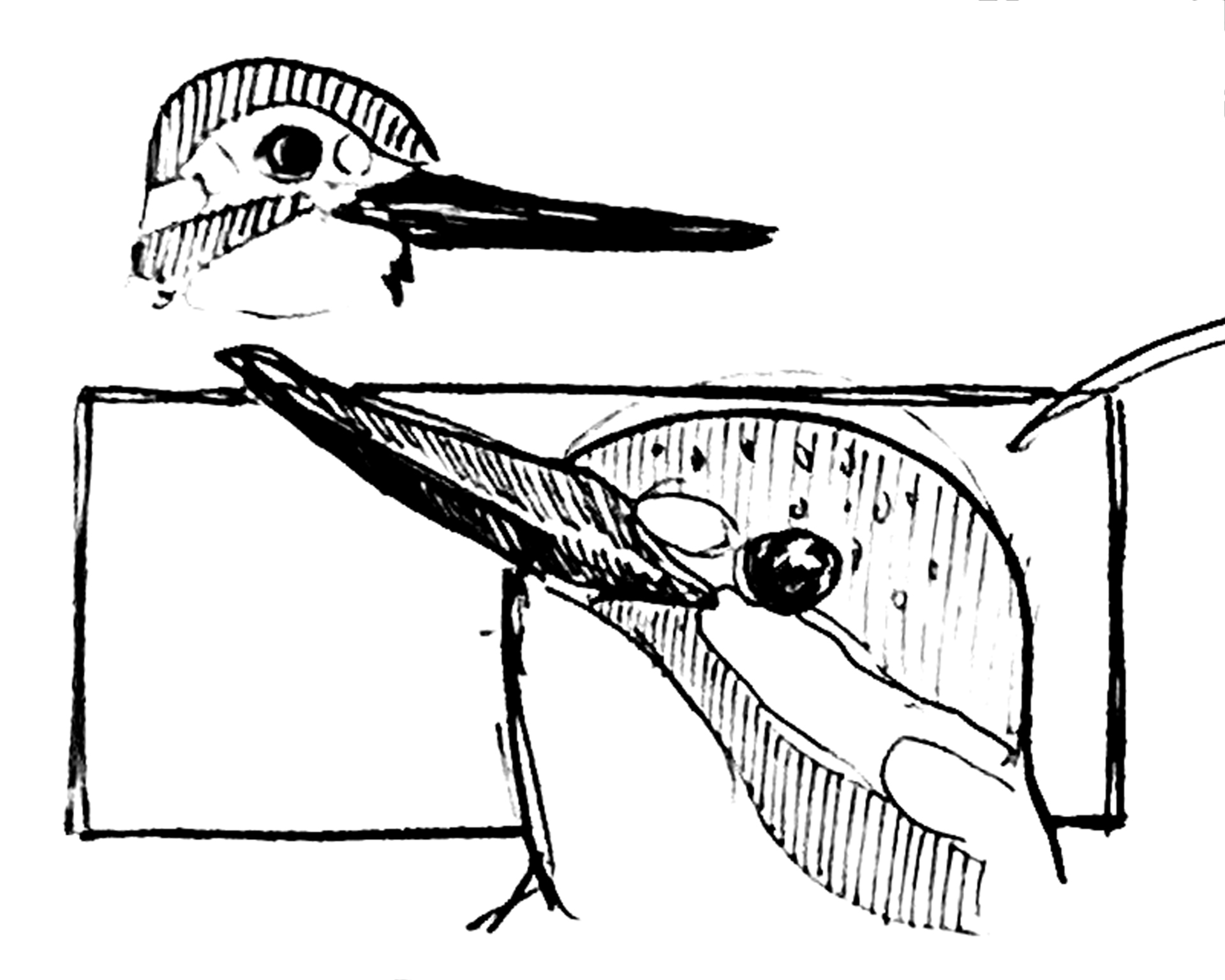
Early sketches worked directly from kingfisher reference photography, isolating specific features (crest, wing structure, plumage texture) as raw material for a mark. Successive passes pushed the same source image through increasing stages of reduction, testing how far the form could travel from its literal source before the concept’s own logic demanded it.
Sketchbook exploration and kingfisher reference studies. Feature isolation studies used to extract the wing shape and plumage pattern as raw material for the mark.

Key Decision

From Literal Kingfisher to Resolved Form

The Tension

The concept only worked if the mark’s transformation mirrored the myth. A literal kingfisher illustration was accurate to the source, but static: it looked like a bird from the first sketch to the last, with no evidence of the transformation idea the name was built on.

The Choice

Carried the bird through successive stages of reduction, pulling a wing shape and a dot-pattern plumage motif out of the source image, until the form resolved into abstracted panels that no longer read as a literal bird on their own.

The Outcome

The abstraction is the concept executed, not a style preference. Letting the final form lose its literal read was the proof the thread held: the identity went through the same reduction the myth describes.

Process Step 3

Mark System Development

With the resolved wing form established, exploration shifted to building a working mark system: full lockup variations, standalone treatments of the wing shape, and pattern studies using the dotted plumage motif extracted from the same reference material.
Lockup variations and standalone mark studies. Pattern development from the dotted plumage motif

Key Decision

A Primary Mark & A Supporting Secondary

The Tension

A single locked logo would have proven the abstraction thread but stalled the system fast. Hospitality collateral needs a way to show up on surfaces a full lockup can’t sit on gracefully: a robe cuff, a bath salts label, a single tile in a printed pattern.

The Choice

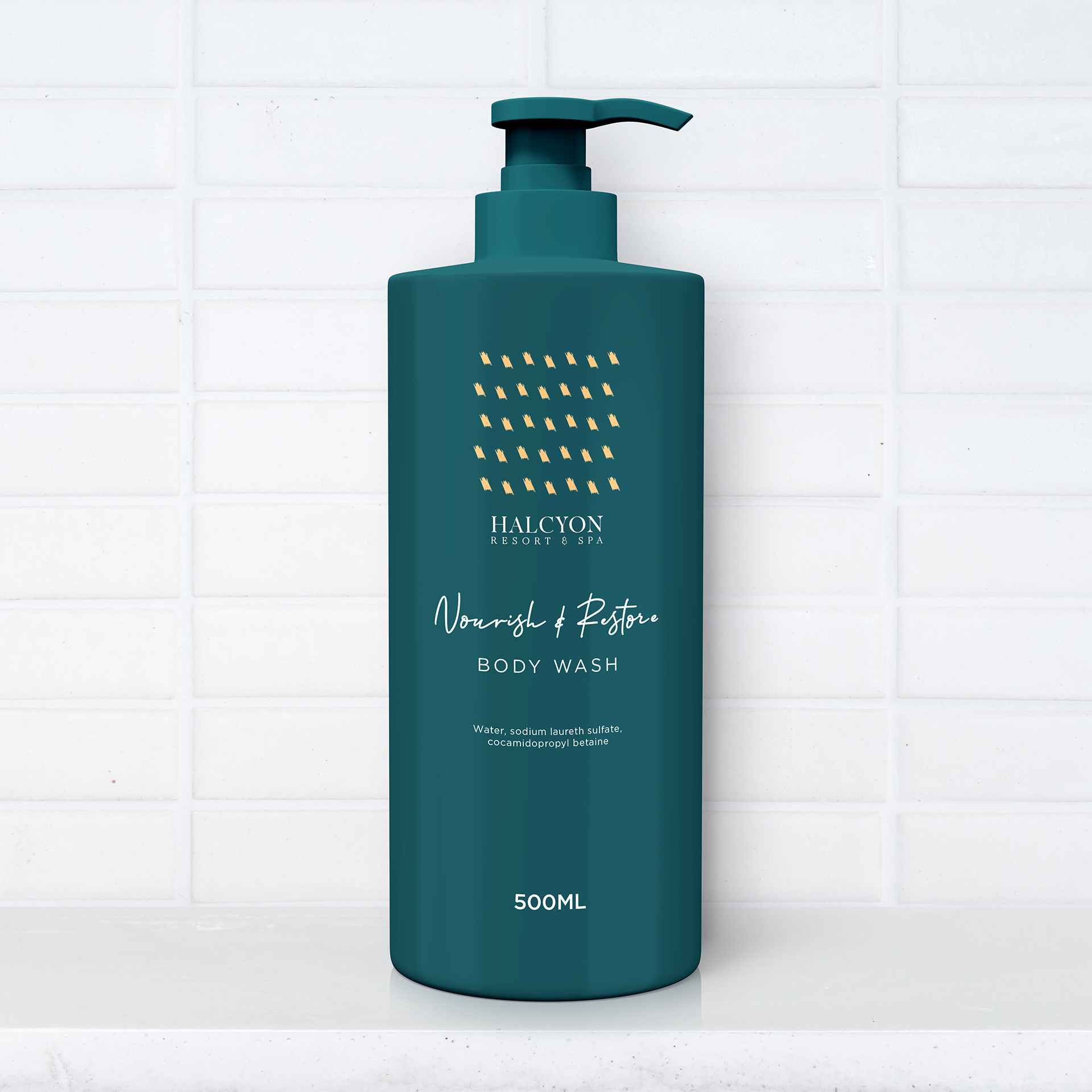
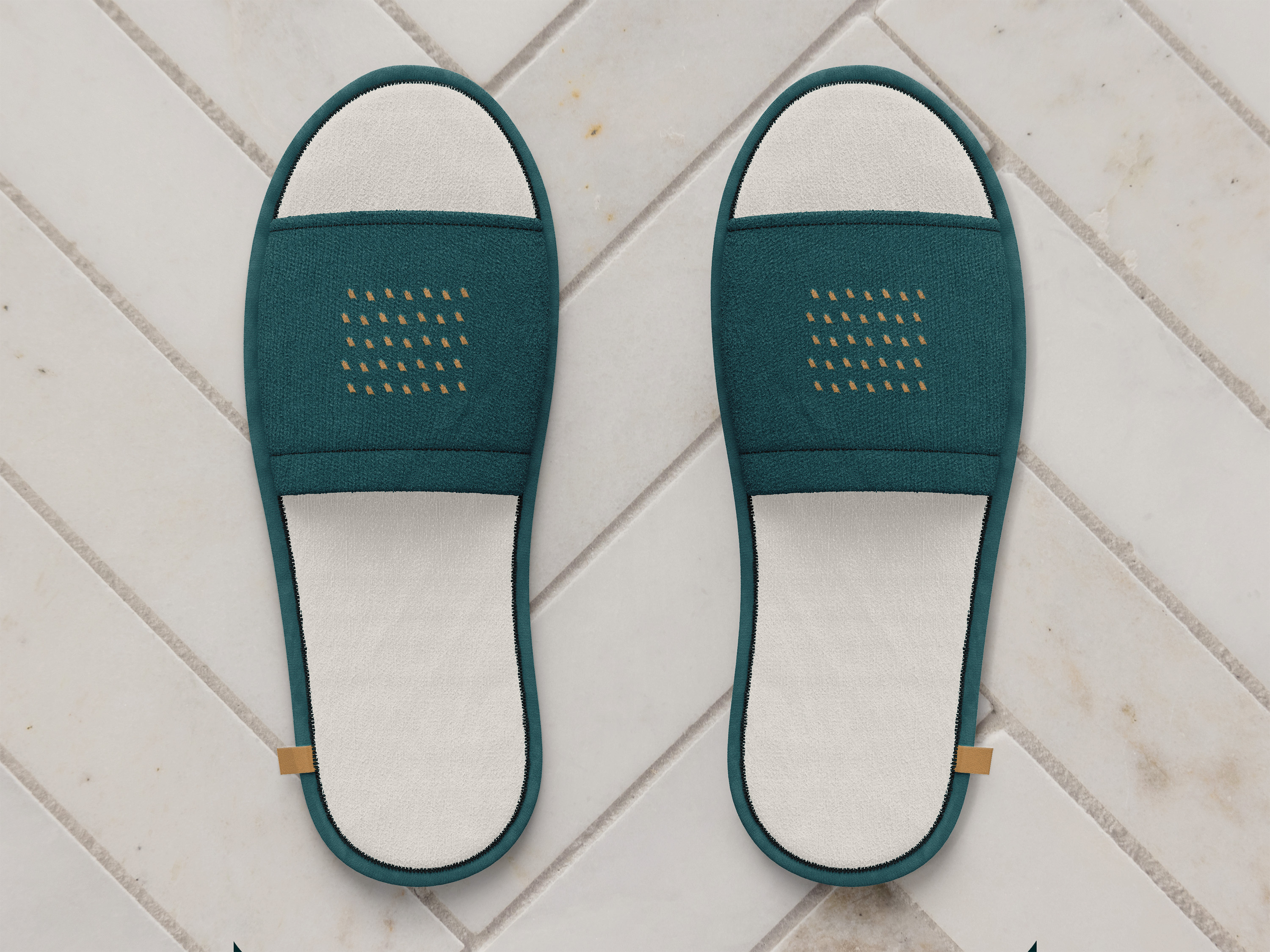
Built the wing mark as the primary sigil and the dotted plumage pattern as a secondary, used loosely rather than locked to fixed rules, standing in for the brand on packaging and pattern work where the full identity would be too heavy.

The Outcome

The pattern isn’t a fixed alternate logo, it’s a flexible extension of the primary mark’s DNA. That looseness is what makes the system feel considered rather than assembled after the fact: the pattern shows up where it earns its place, not everywhere the primary mark does, and it still ties back to the same resolved form from Key Decision 1.

Process Step 4

Color & Typography Foundation

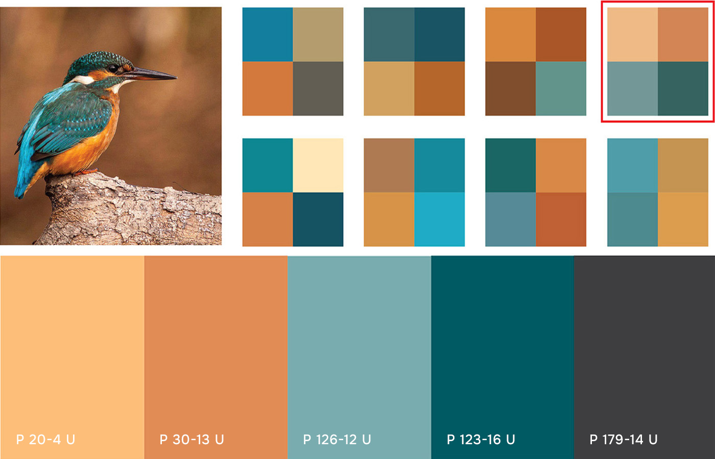
Color development pulled directly from the kingfisher’s own palette, cross-referenced against Pantone equivalents to land on a workable four-color system. Typography exploration ran in parallel, testing candidates against the finished mark before committing to a hierarchy.
Kingfisher-derived color studies and Pantone equivalency testing. Serif and sans-serif typography tests against the resolved mark.

Key Decision

Testing Serif Vs. Sans Before Committing

The Tension

The resolved mark was simple enough that almost any clean typeface would sit next to it without clashing, which made it easy to default to whatever looked fine instead of testing for what was right.

The Choice

Set a serif and a sans-serif candidate head to head against the finished mark. The serif won on proportional character width relative to its x-height, holding up at both stationery scale and small print. Built the hierarchy from there: serif primary, sans-serif secondary, script for accent copy.

The Outcome

A typeface chosen by comparison survives scrutiny in a way “it felt right” doesn’t, and it mattered more here because the mark had given up its literal imagery in Key Decision 1. The wordmark had to carry more of the brand’s tone on its own.

Process Step 5

Proving the System Across Guest Touchpoints

With the mark, pattern, and type hierarchy resolved, the last test was whether the primary and secondary marks could hold up once they left the page entirely: on print materials a guest would actually handle, and on product and in-room surfaces where the brand has to read at a glance against the resort’s own materiality. Each surface asked something different of the system, detailed touchpoint by touchpoint below.
Applied system across print, product, and digital touchpoints.

Showcase 1

Physical & Digital First Impressions

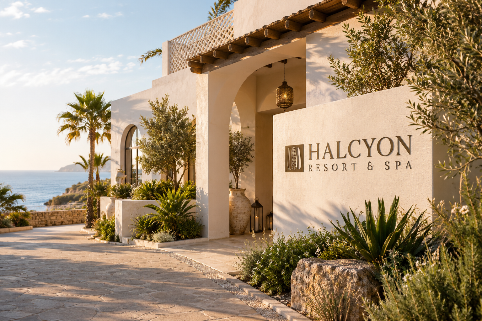
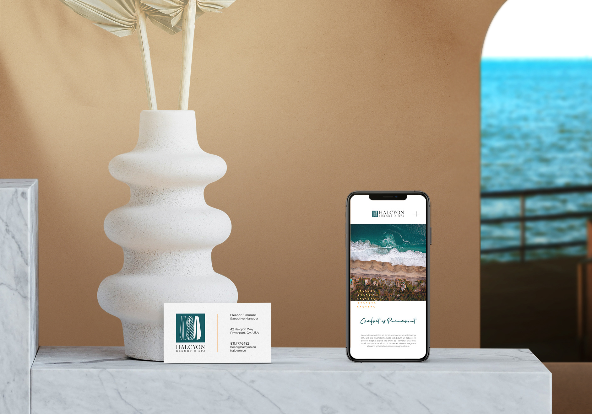
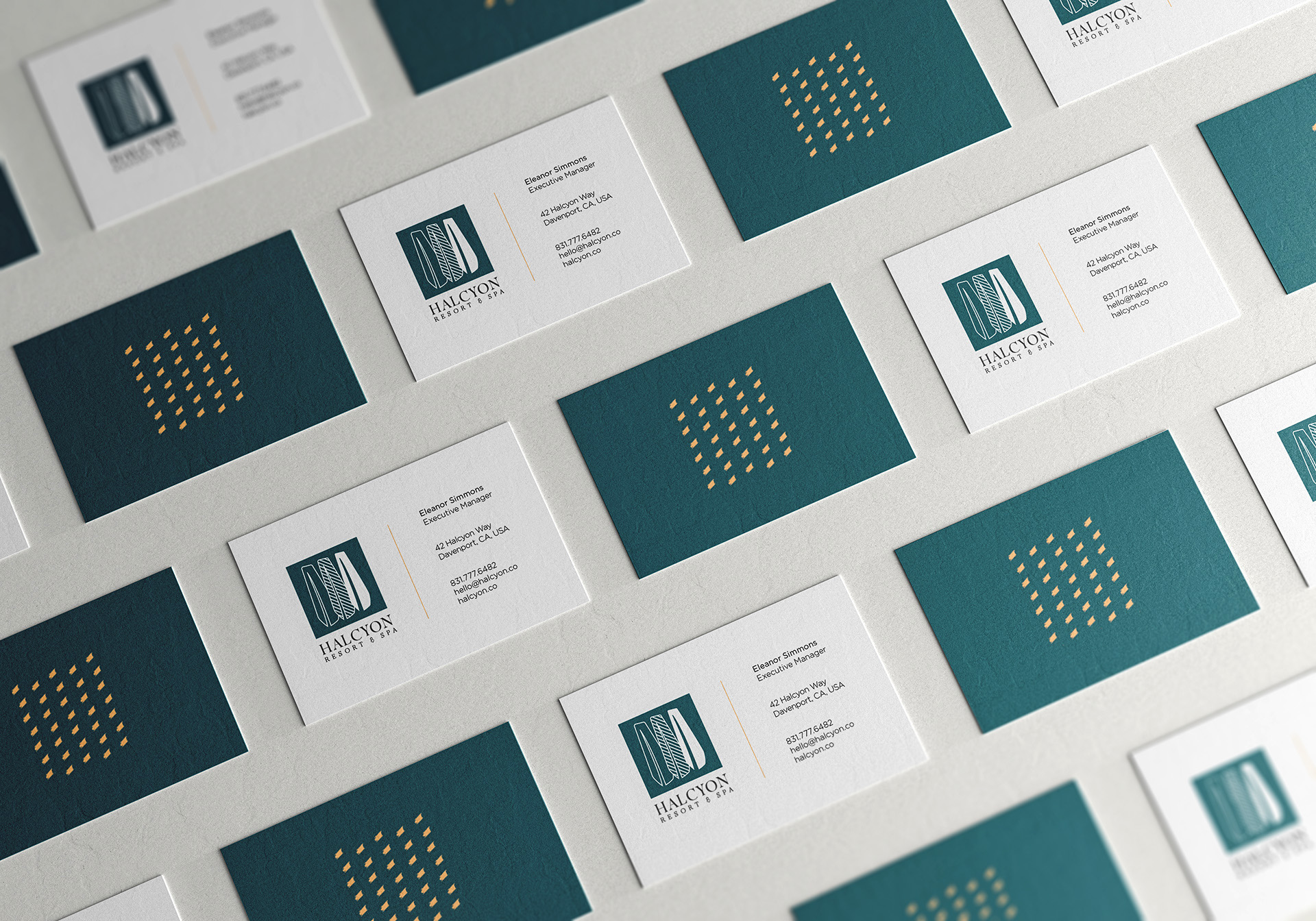
The mark had to prove its range early: large and dimensional on exterior signage, then reduced to card scale on the business card array and phone composite. The cards themselves needed to stay clean and information-forward while still carrying the mark’s bolder, modern character.
Exterior signage mockup, business card array, business card and phone composite.

Showcase 2

Guest Welcome Essentials

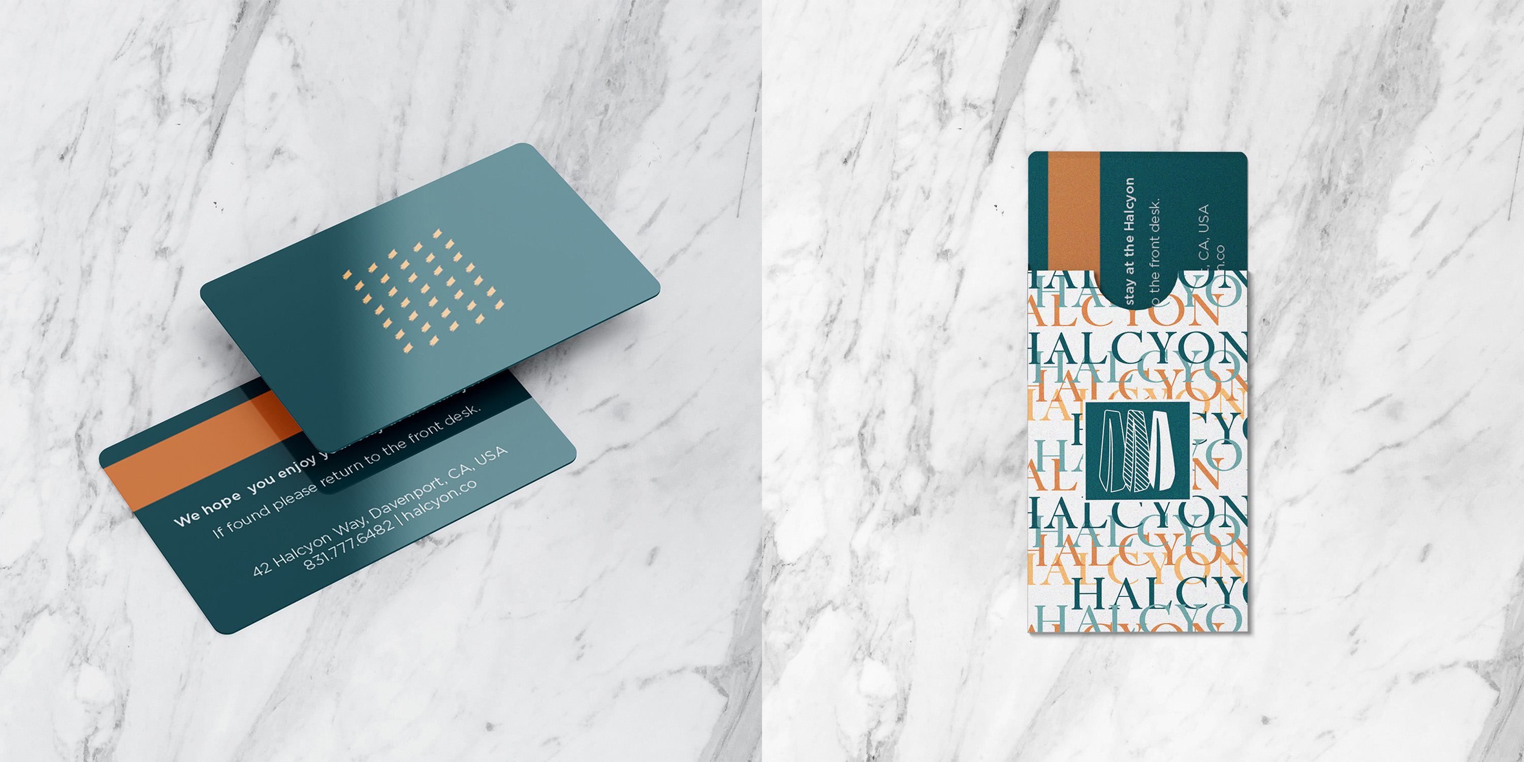
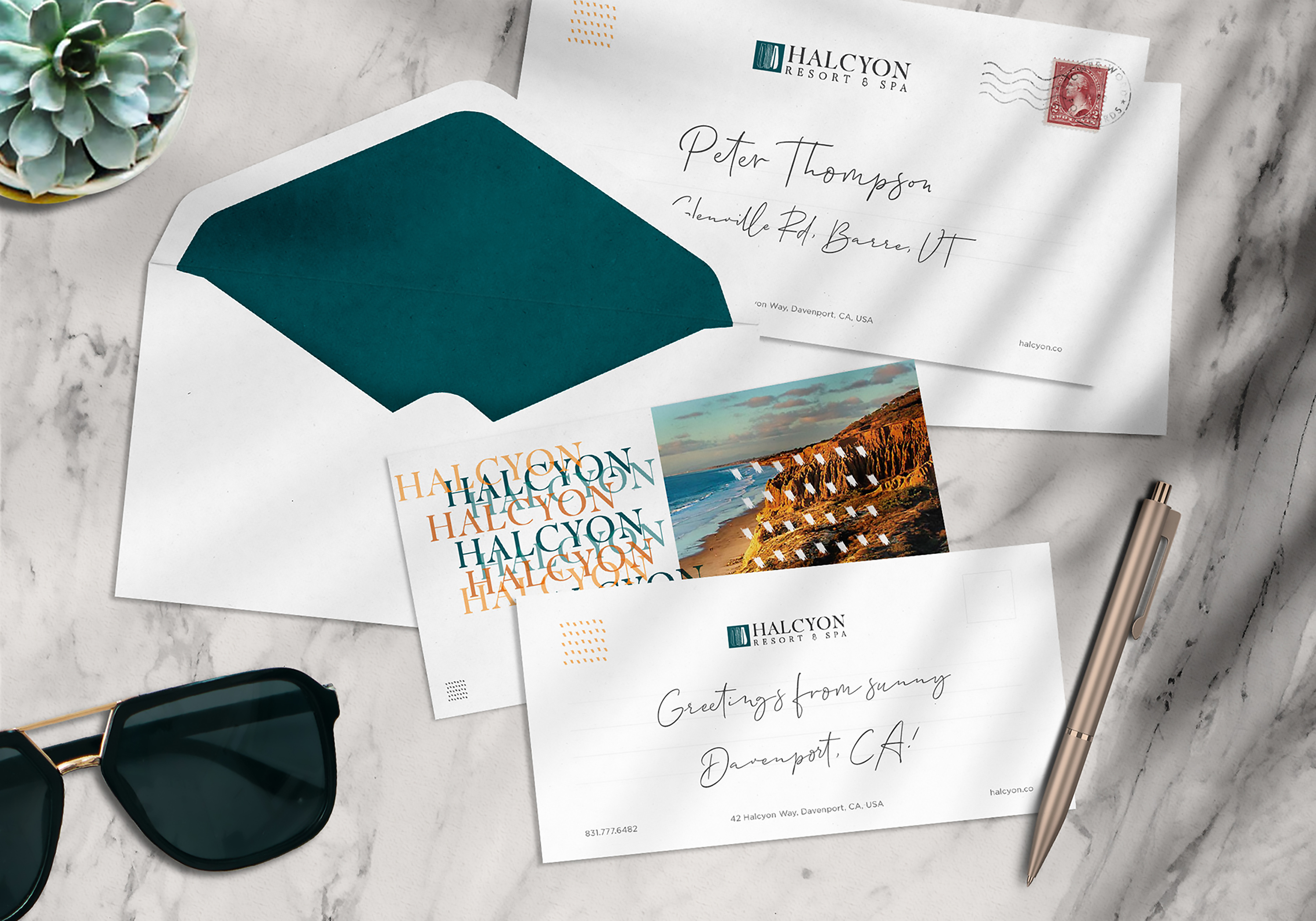
These are the items a guest actually holds, and they draw on the secondary pattern’s full range. The key card sleeve is bold and colorful, built to be recognized months later. The greeting card suite shifts to something fresher and more organic, nodding to the resort’s natural setting. Together they show the primary-and-secondary system flexing rather than just scaling down.
Key card and sleeve, greeting card and envelope suite.

Showcase 3

In-Room Amenities & Full Resort Experience

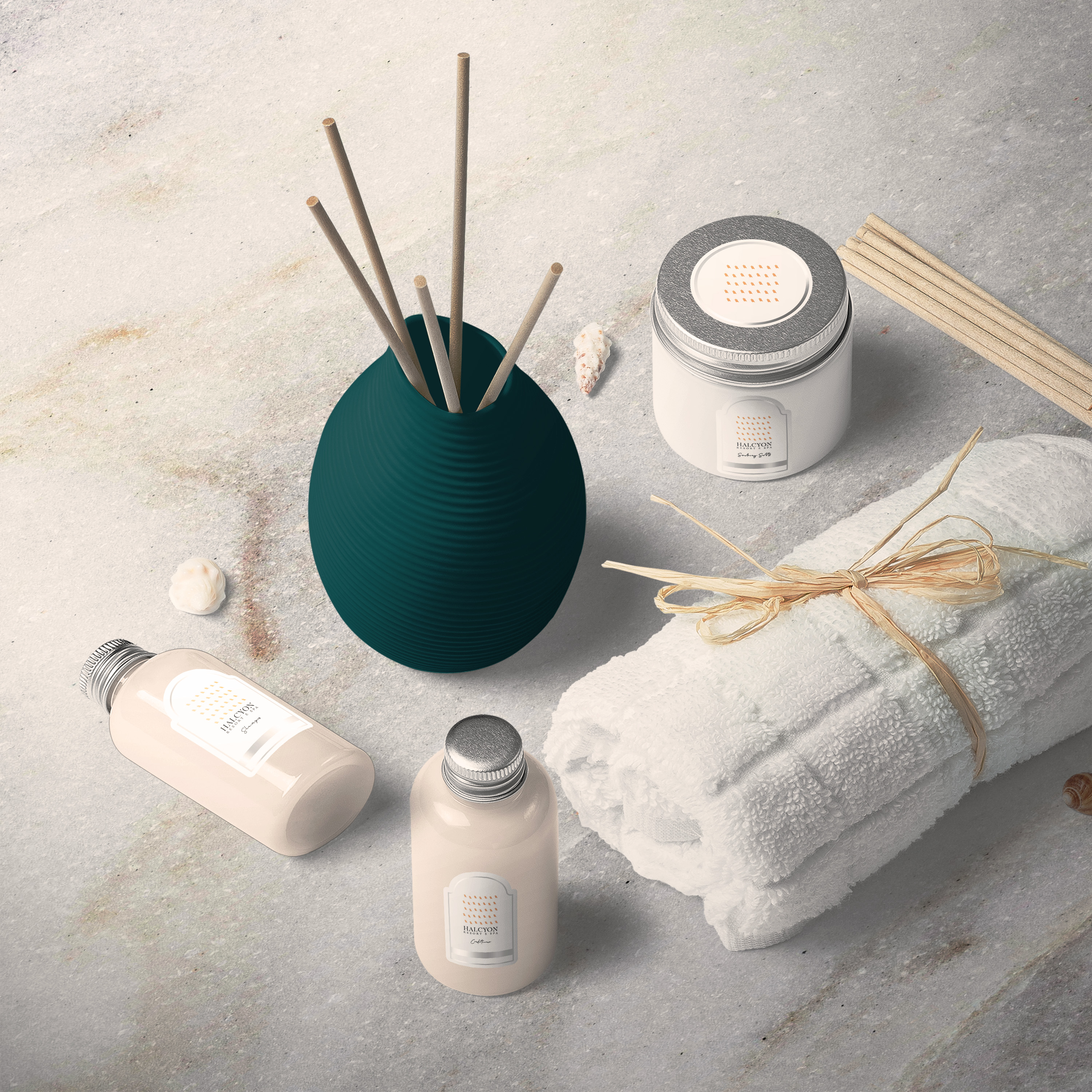
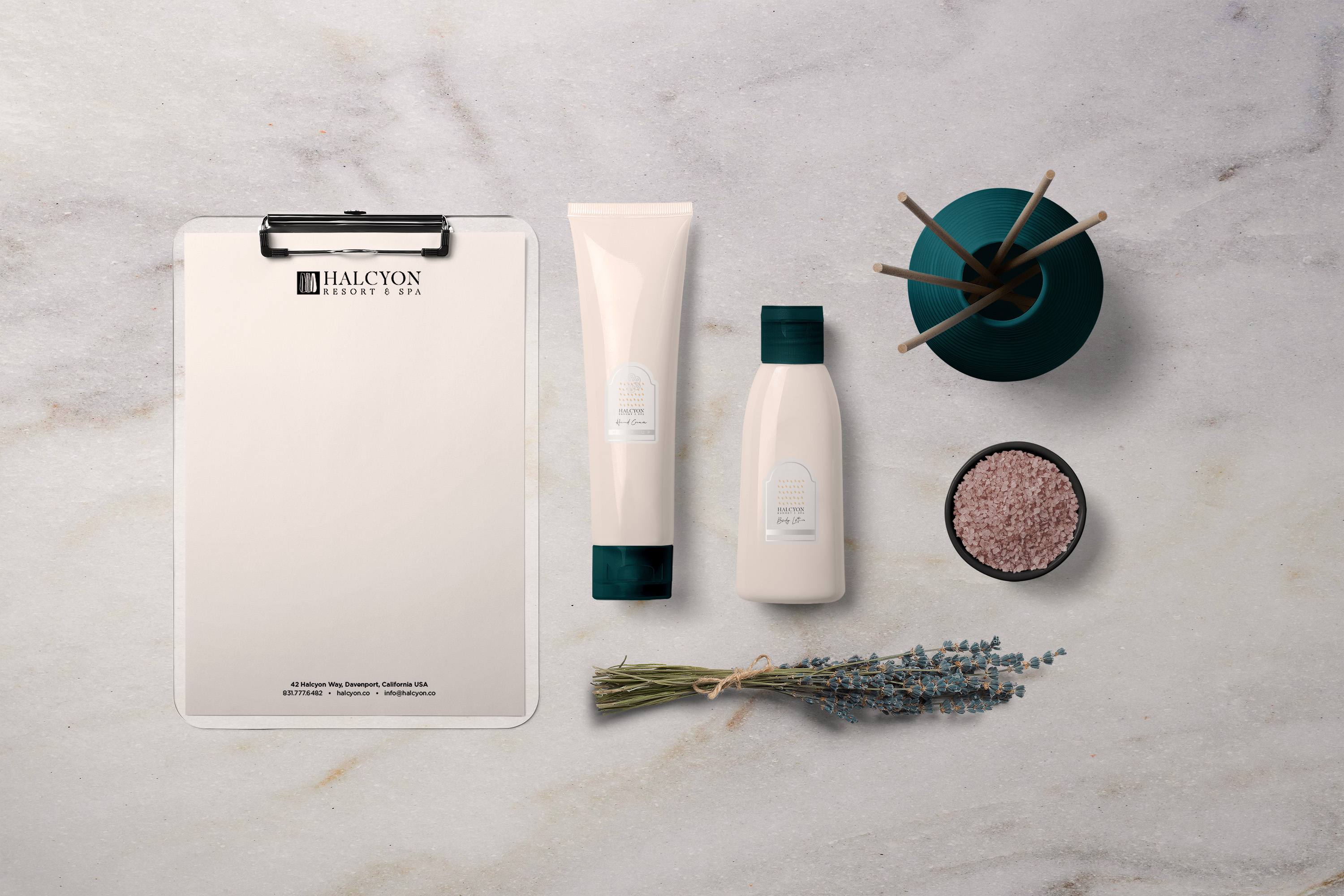
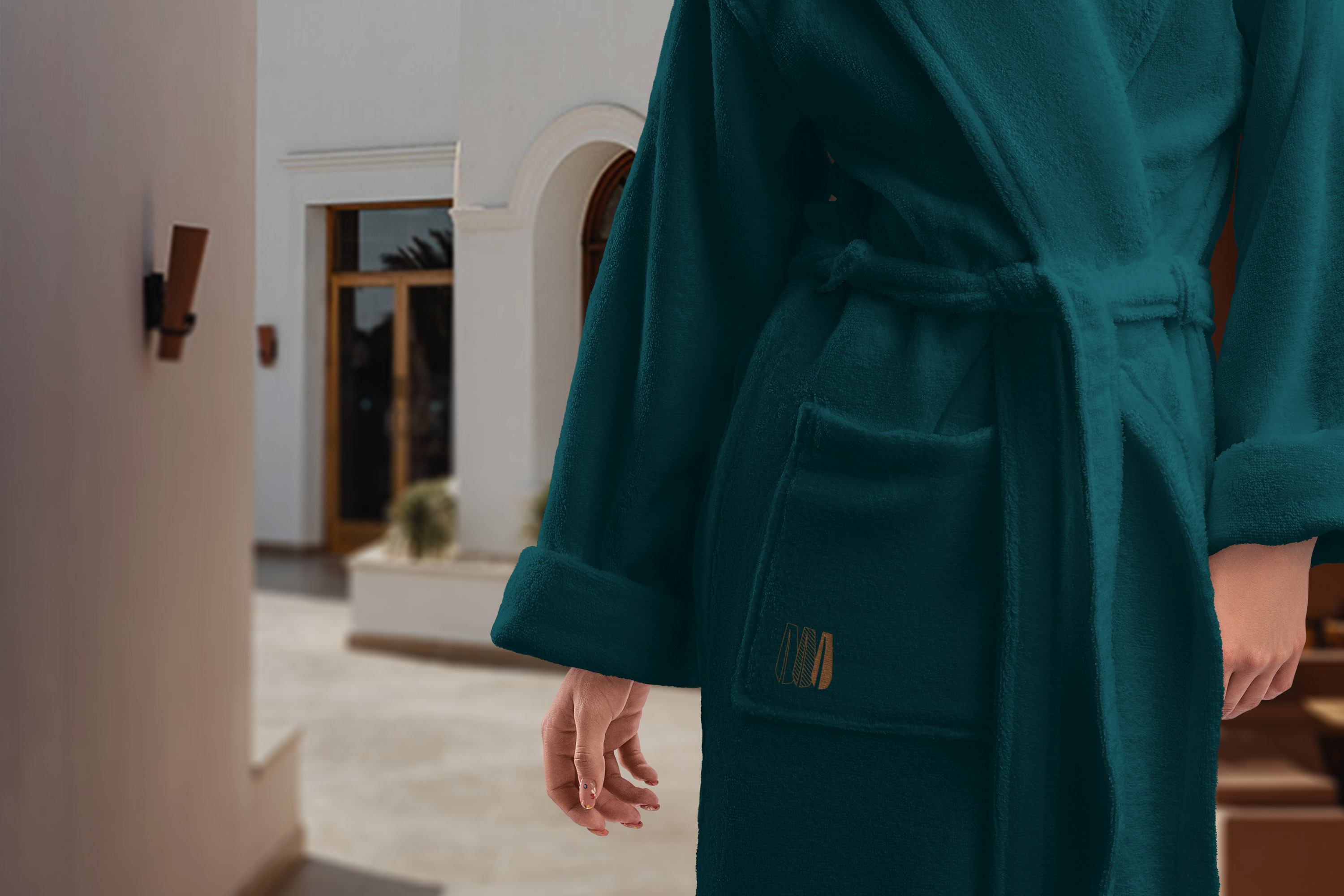
This is the quietest test of the mark. Bath amenities and robe embroidery both needed to read as high end through restraint: minimal composition, quiet color, and the wing mark at its smallest, most confident scale. If the mark couldn’t hold up this small, the system would have failed exactly where it mattered most.
Bath amenities (candle, diffuser, lotion), robe embroidery detail.

Outcomes

Halcyon exists to prove something the rest of this book can’t: full-system brand thinking, carried from a hand-drawn concept through naming logic, mark development, and a complete set of applied guest touchpoints, built and resolved without a client brief or client feedback shaping any of it along the way. Every decision, from the abstraction of the mark to the primary and secondary system to the typography, had to hold up entirely on its own reasoning. That’s the case this project makes: given a category with no prior professional exposure, this is what a full identity system built from zero, start to finish, looks like.